Categories
Animation Assignment 5 Final Work Parallel Project Part 5 Research Uncategorized

Assignment 5/Parallel Project

After talking to my tutor, we decided it was a good idea to make my work so far for the Parallel Project into Assignment 5.

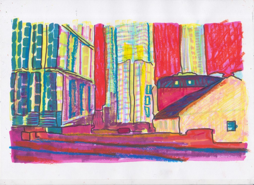
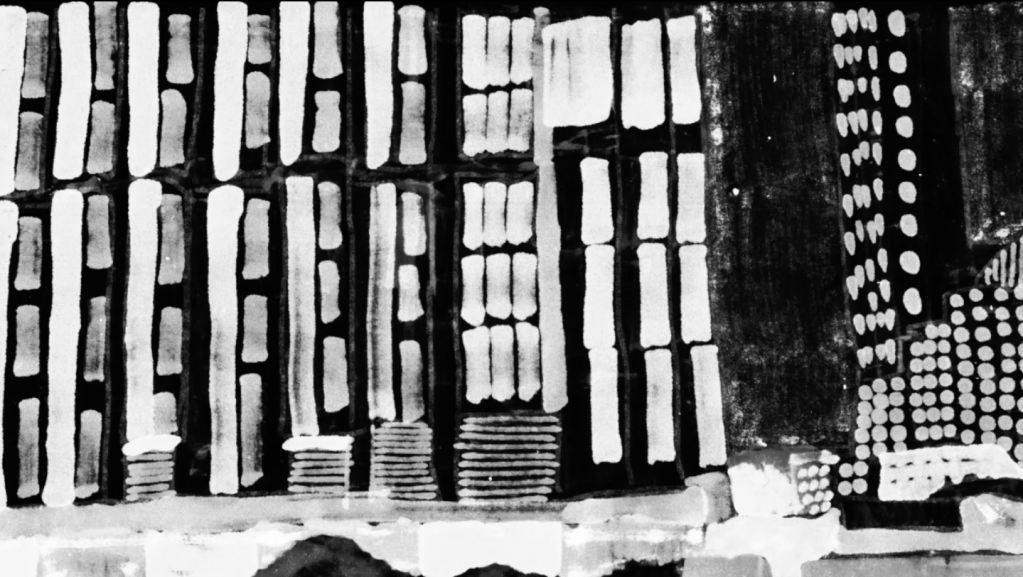
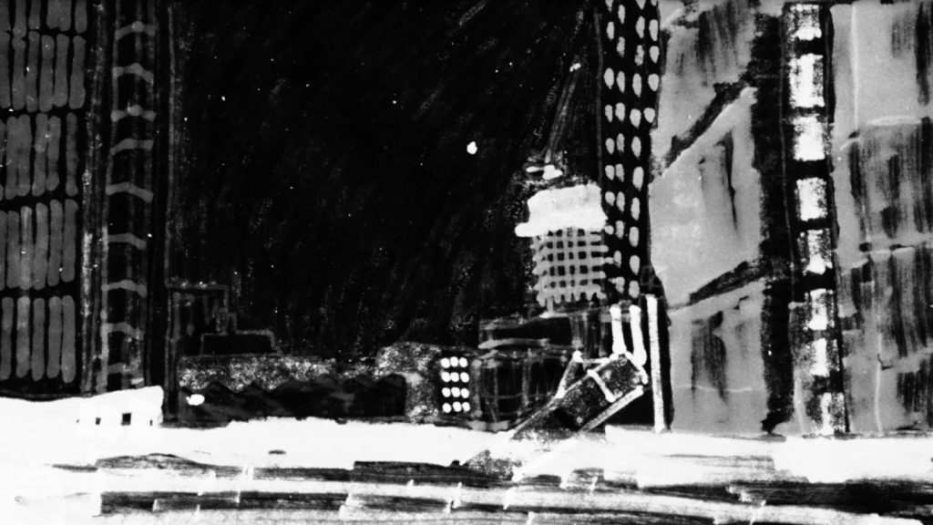
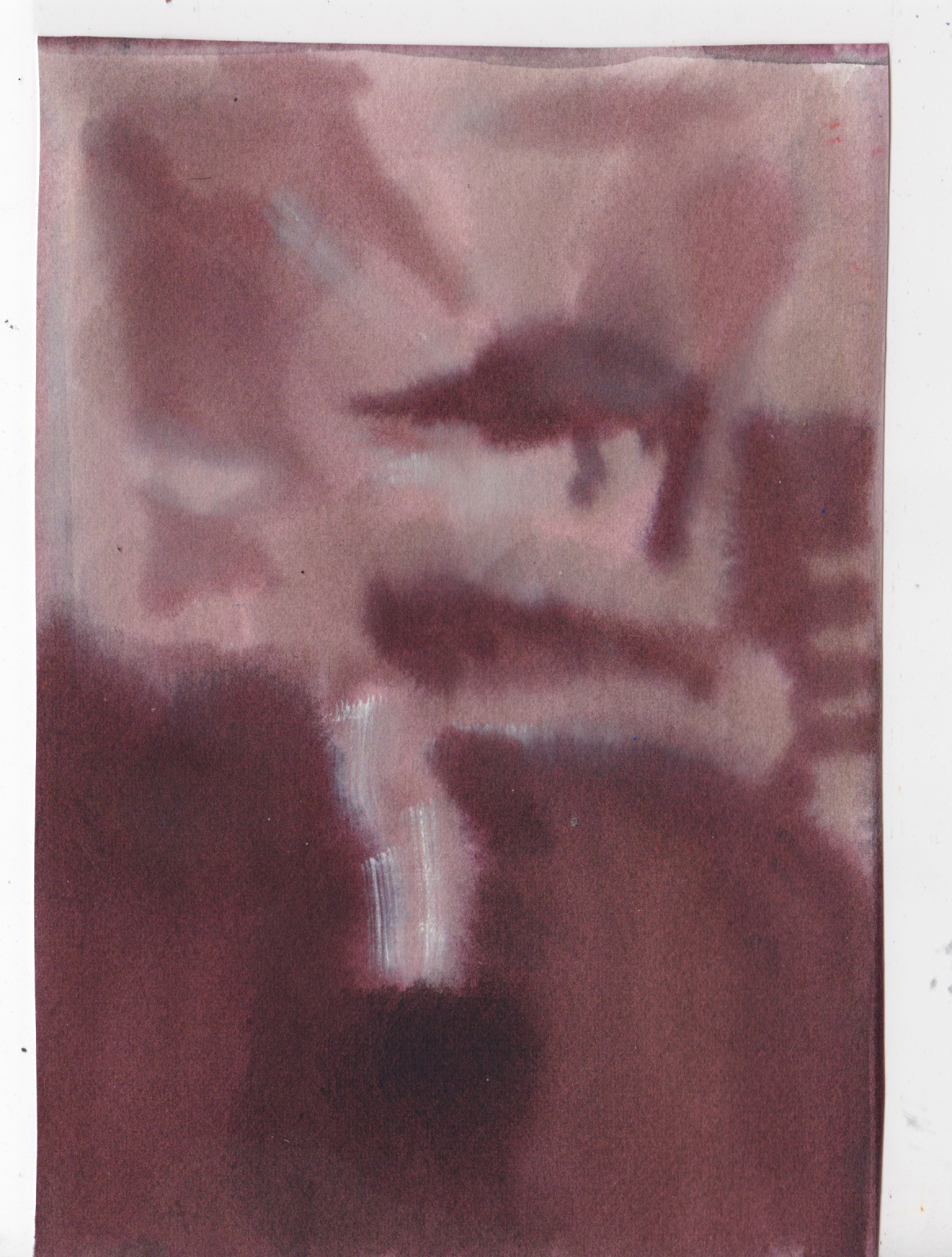
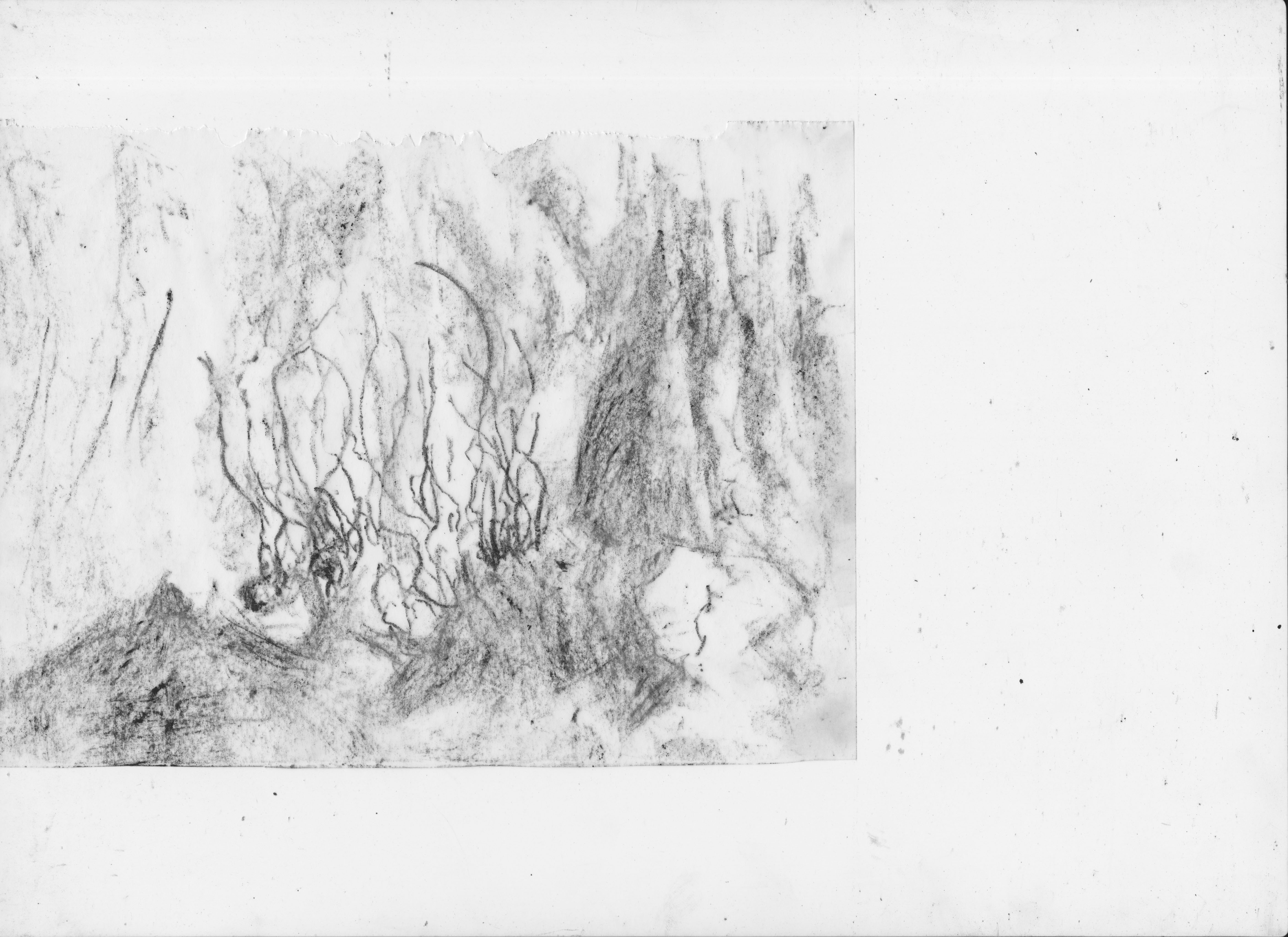
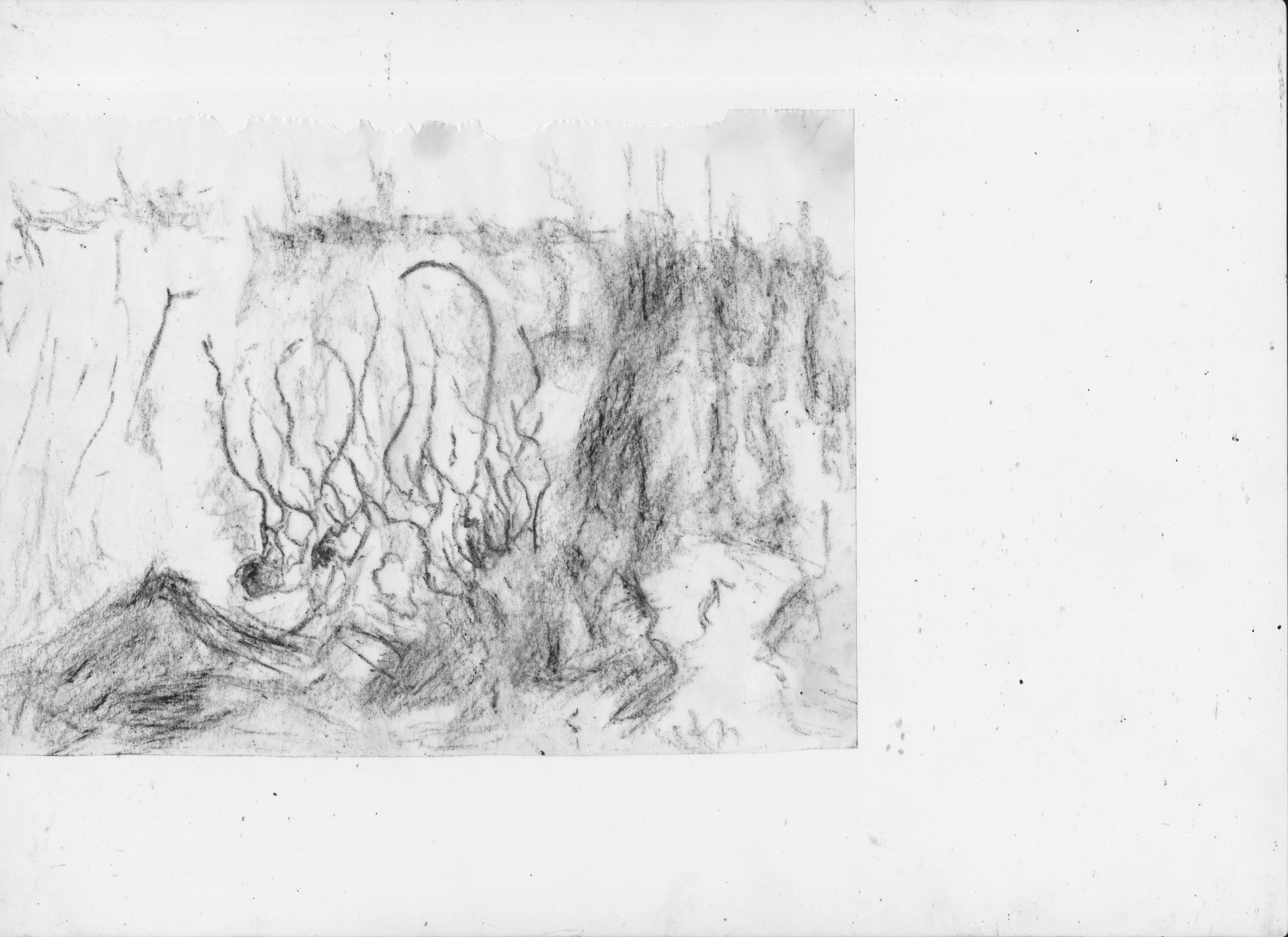
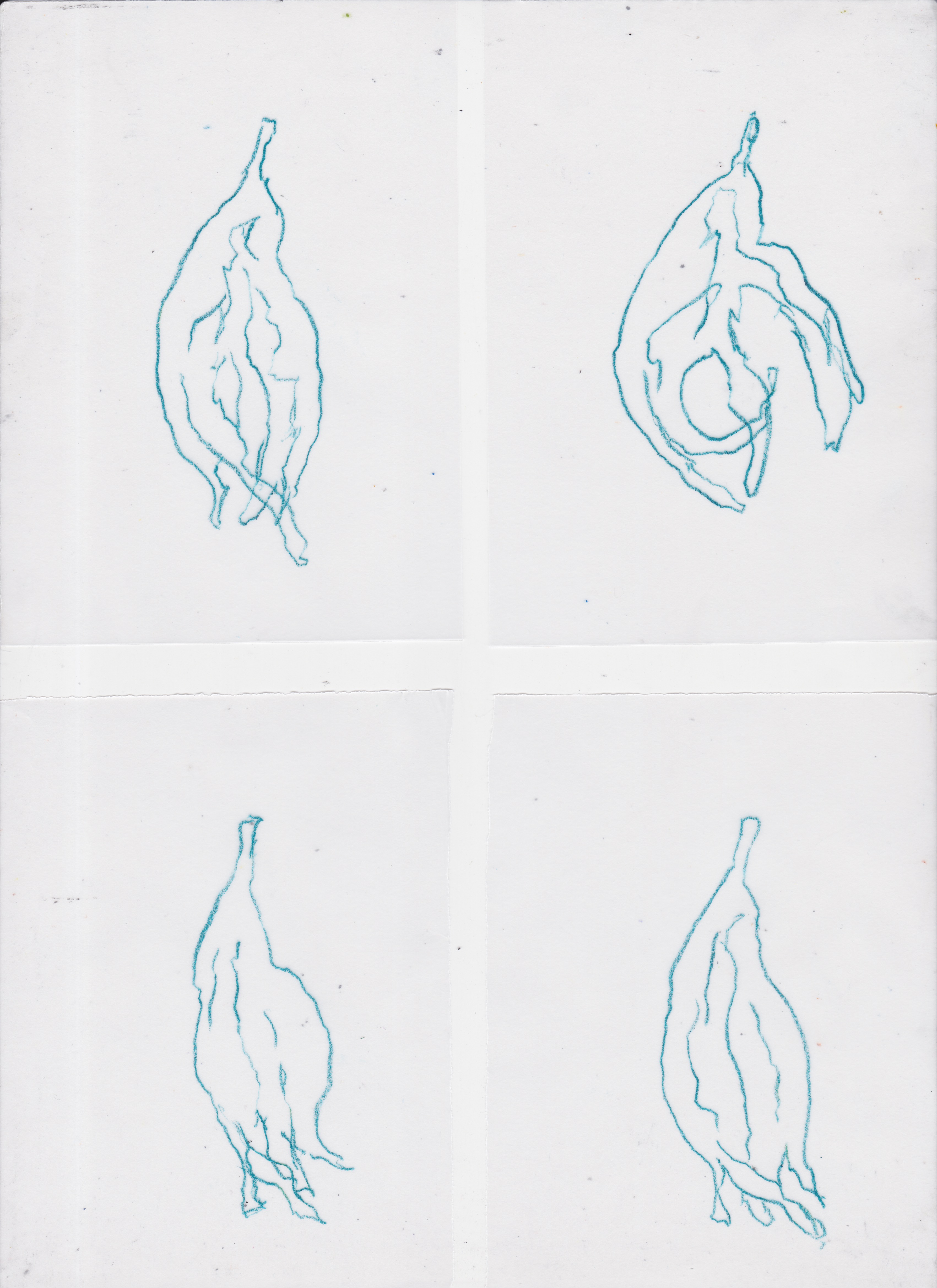
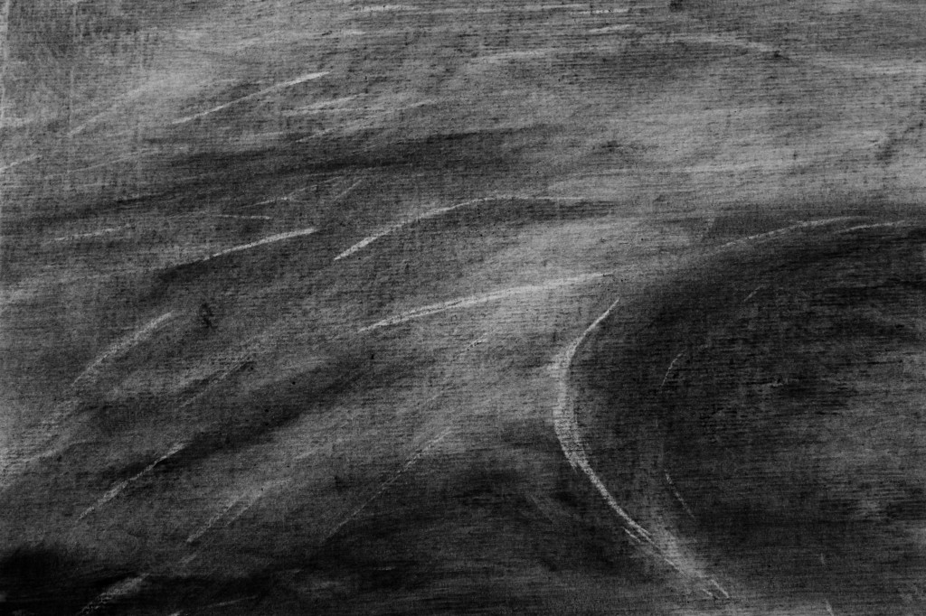
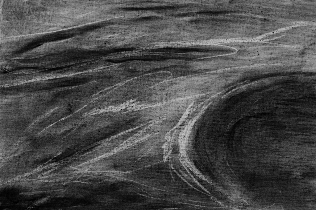
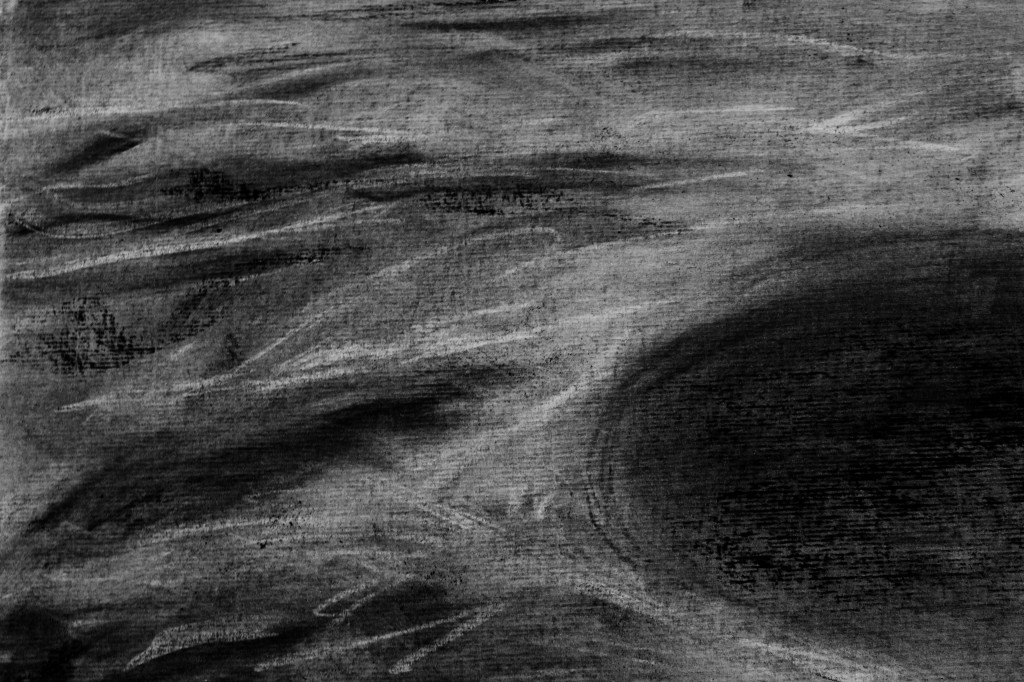
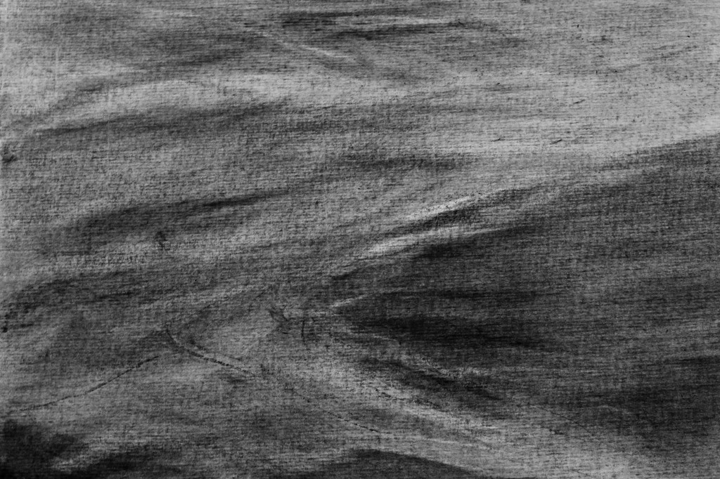
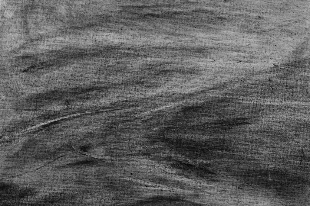
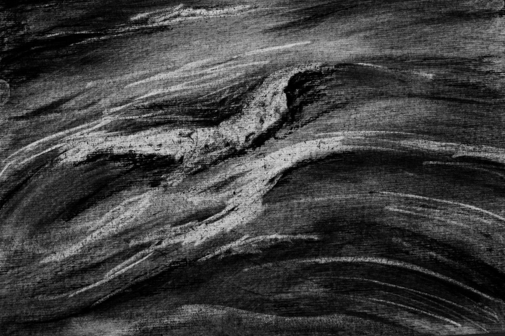
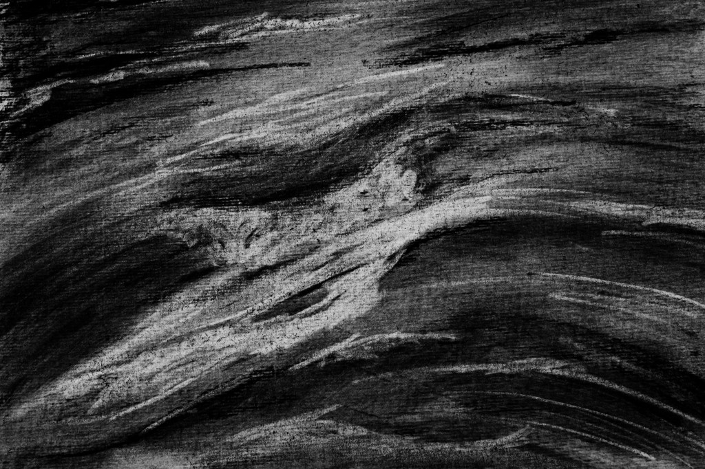
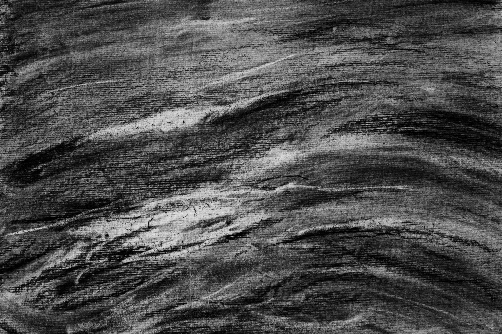
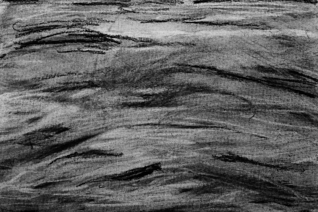
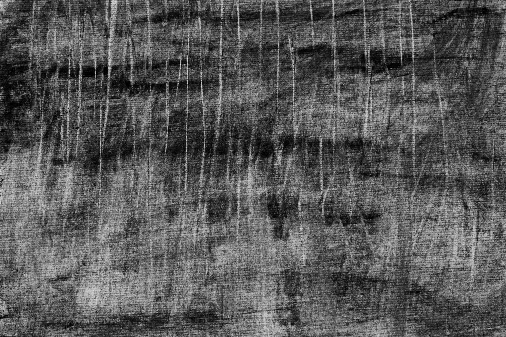
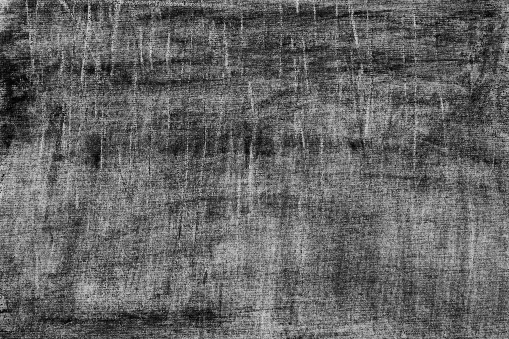
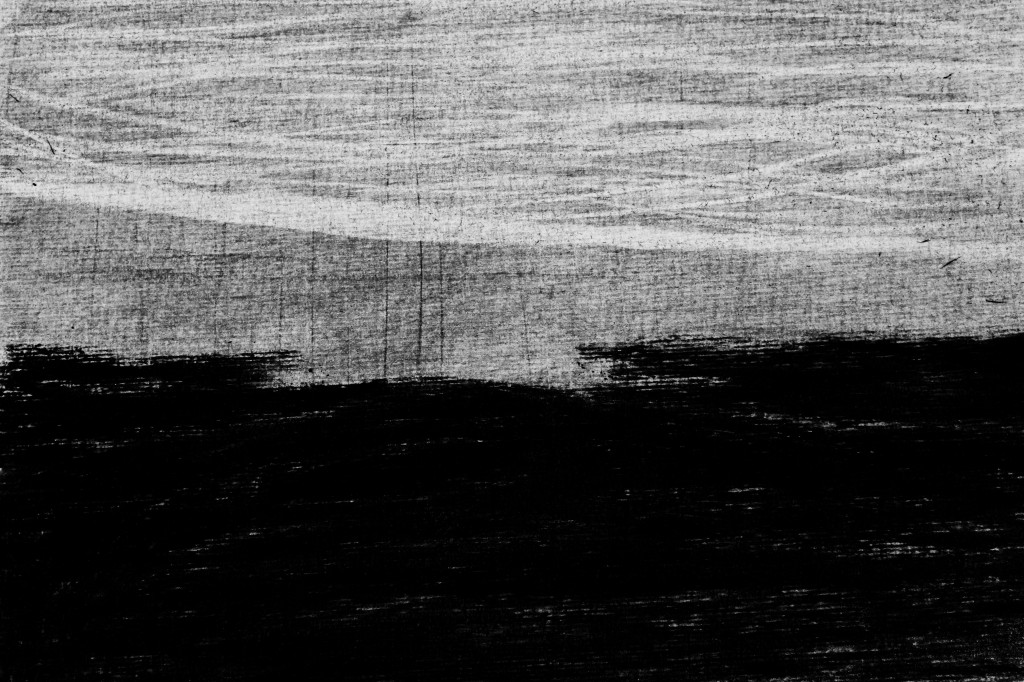
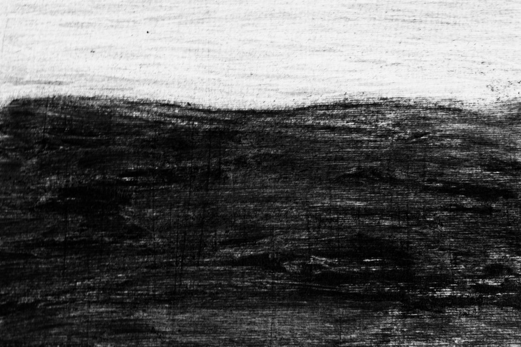
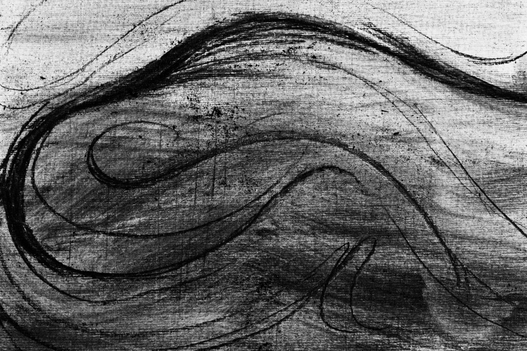
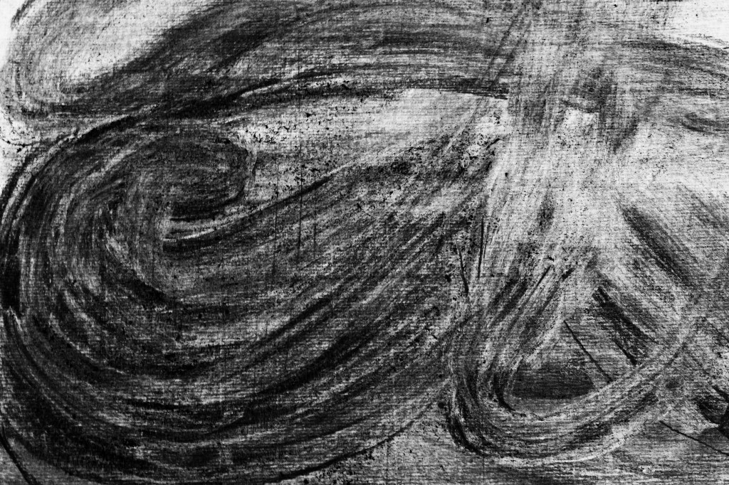
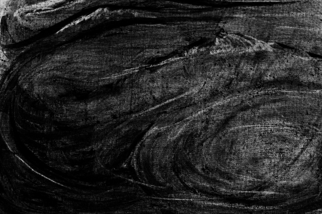
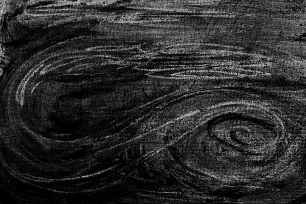
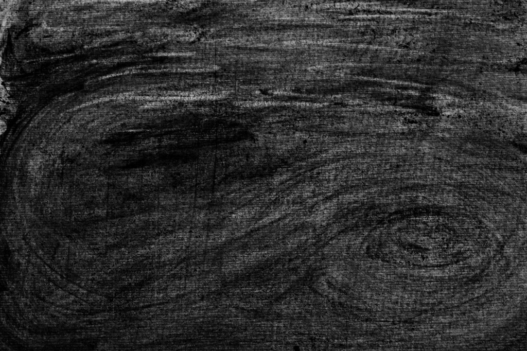
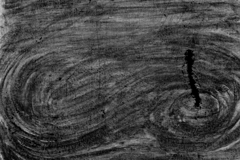
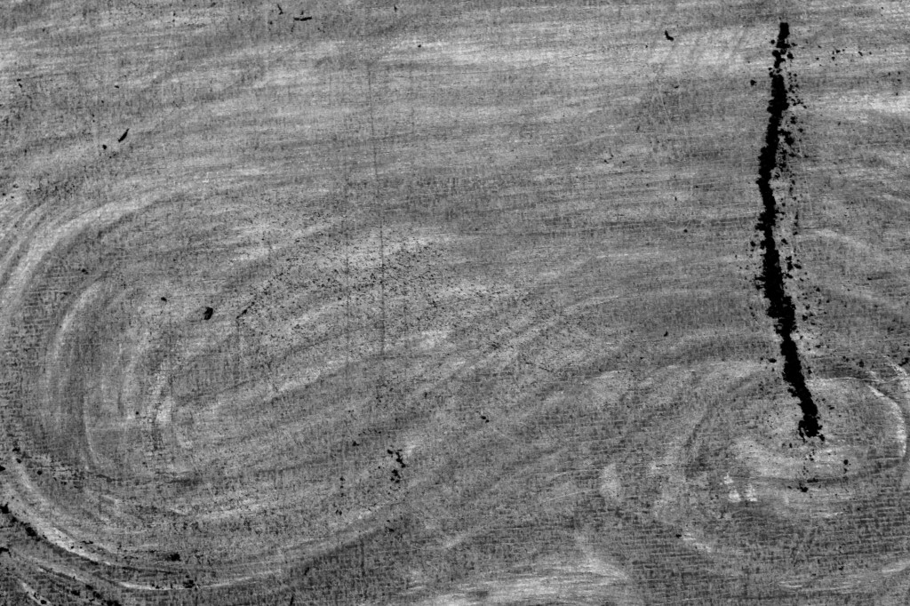
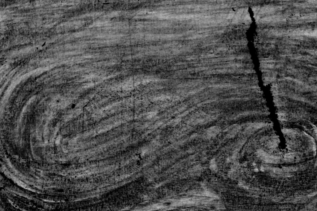
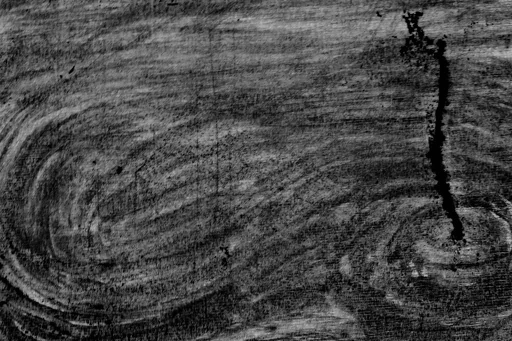
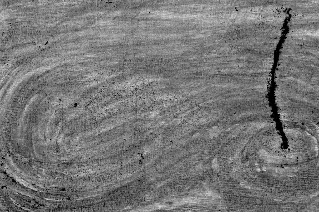
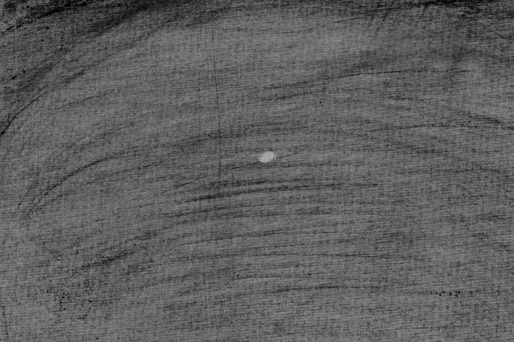
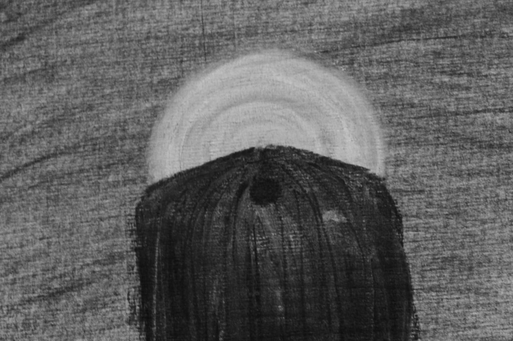
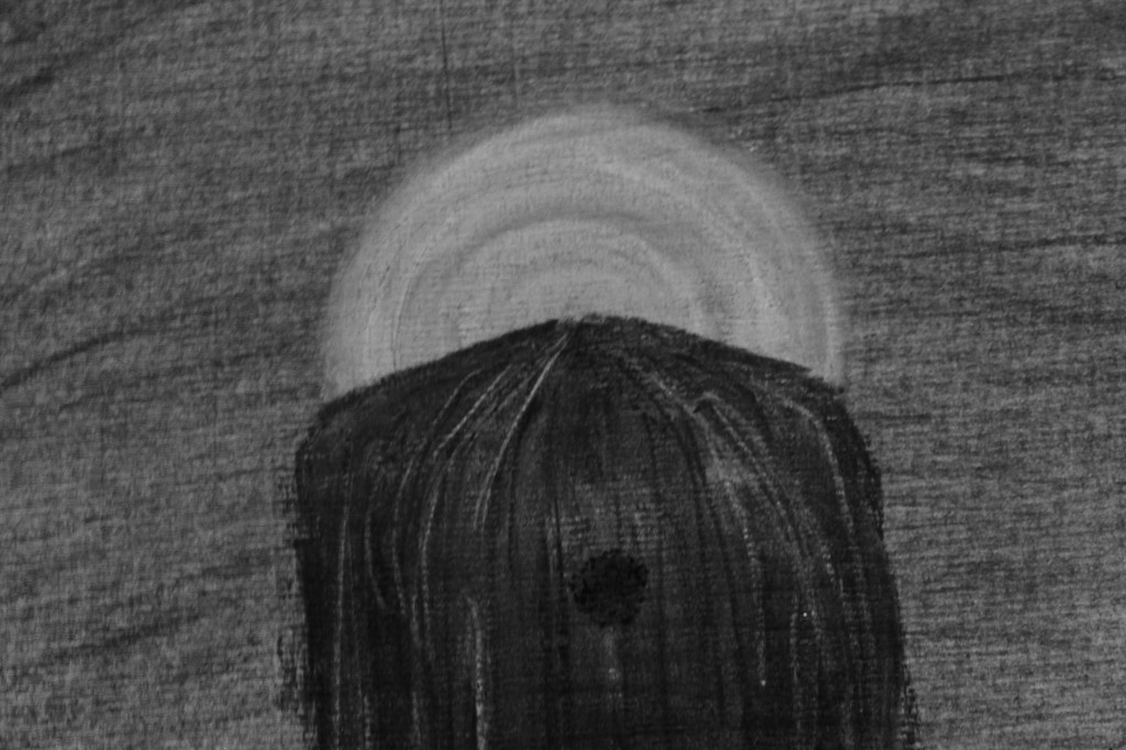
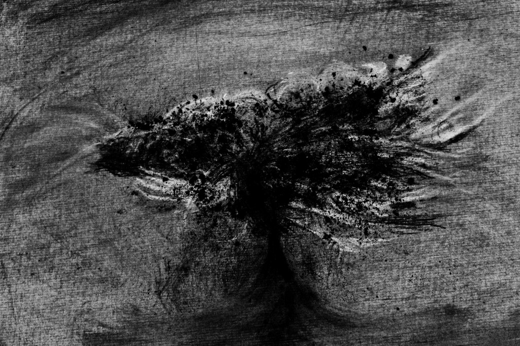
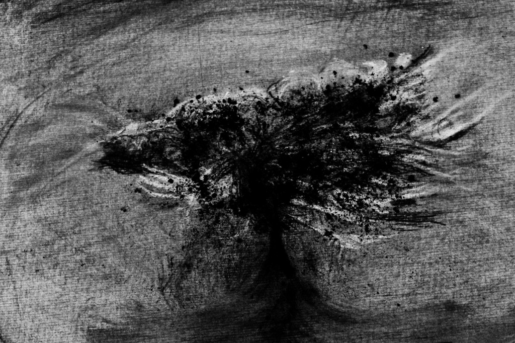
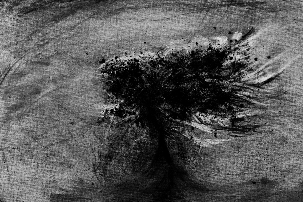
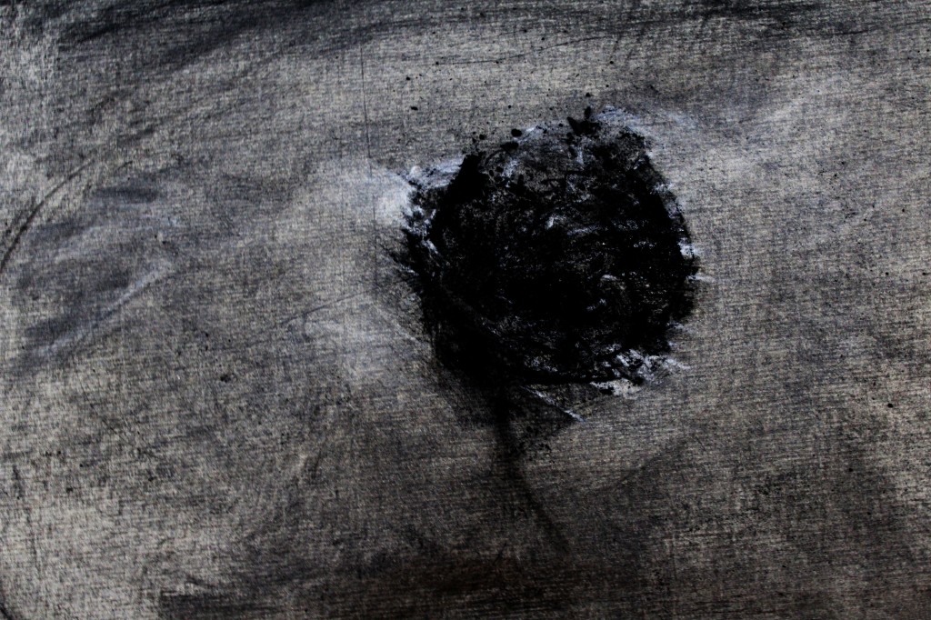
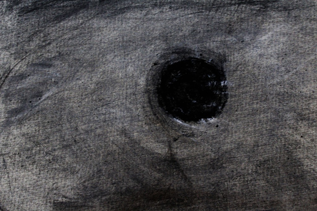
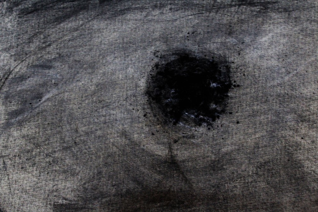
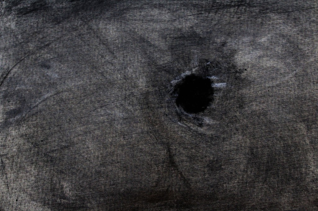
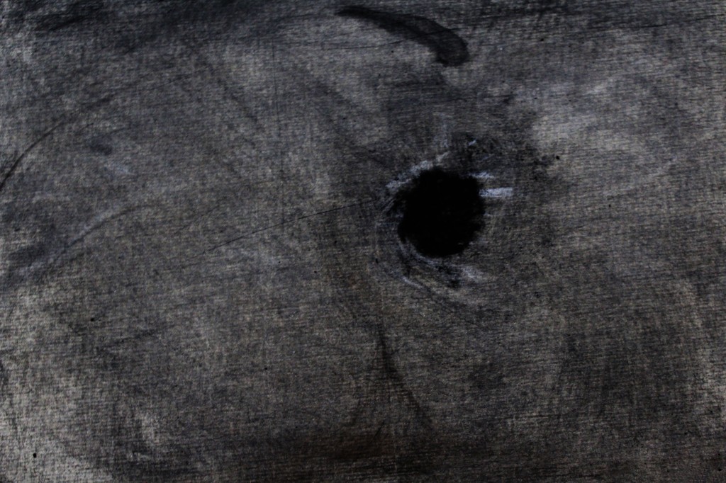
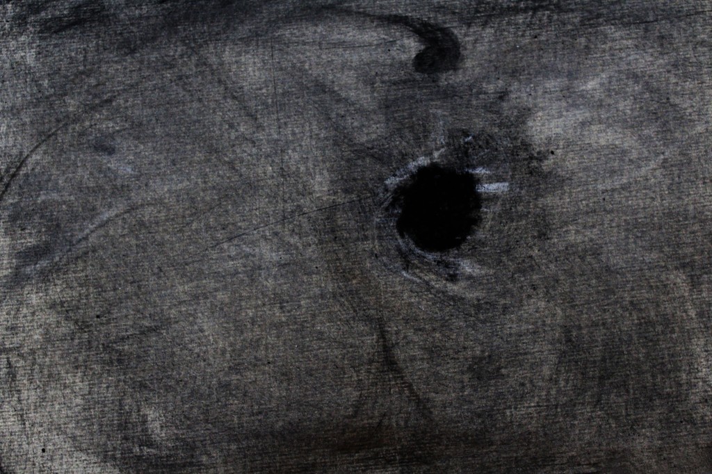
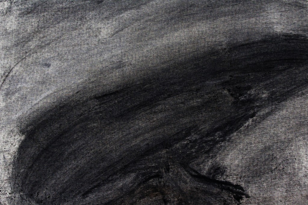
I borrowed William Kentridge’s process of creating an animation in charcoal from one sheet of paper, taking a photograph to make up each frame. I was very worried about doing this as the entire image is a lot to think about when animating, and how would I know that what I was producing was any good if I can’t replay it? My tutor reminded me that I had done something similar with my crow animation (see Parallel Project page), which gave me the confidence to accept the challenge of working with an entire scene at once. I really love the way Kentridge’s work does not hide his process, he can erase the charcoal but faint signs of what was there before are still present, e.g. a boy hopping across rocks (San Francisco Museum of Modern Art , 2010). This is a completely different approach than what I usually read and see, in for example Richard Williams’ Animators Survival Kit, there is an obsession with creating the “illusion of life” which is strict in its goal of getting the audience to forget that they are watching drawings. It was very freeing to discover that this is doesn’t have to be the case, and I decided that whatever I ended up drawing, I wasn’t going to try and hide that the images are only charcoal on paper. I later found the work of Daisy Jacobs, her film The Bigger Picture revels in how the characters are two-dimensional drawings and pairs them with real three-dimensional sets and props in order to exaggerate this (Jacobs, 2014), sometimes for comedic effect.

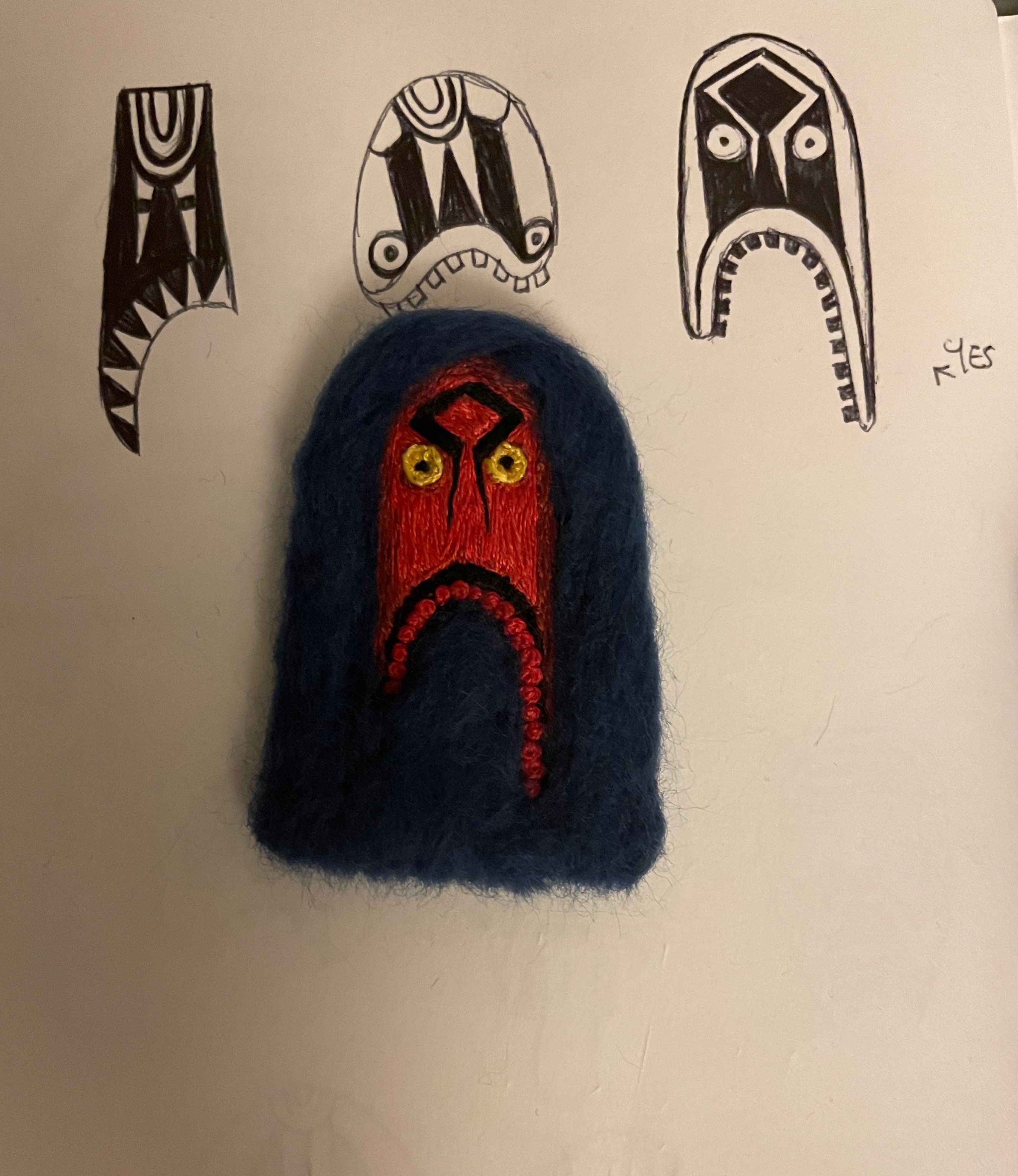
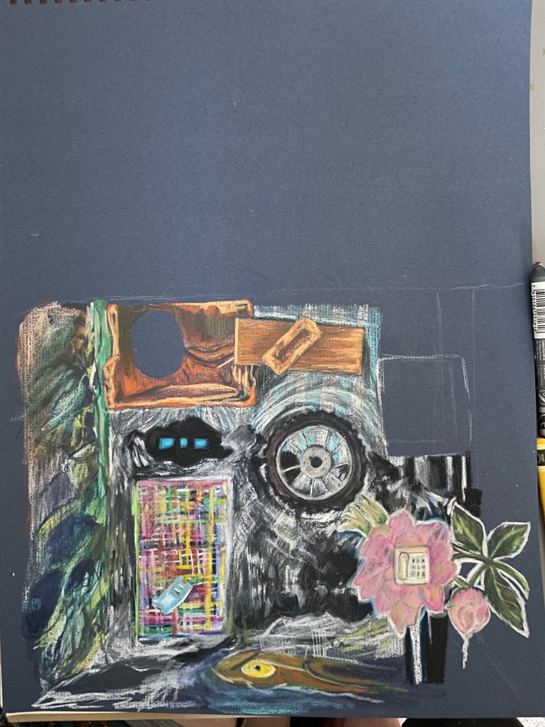
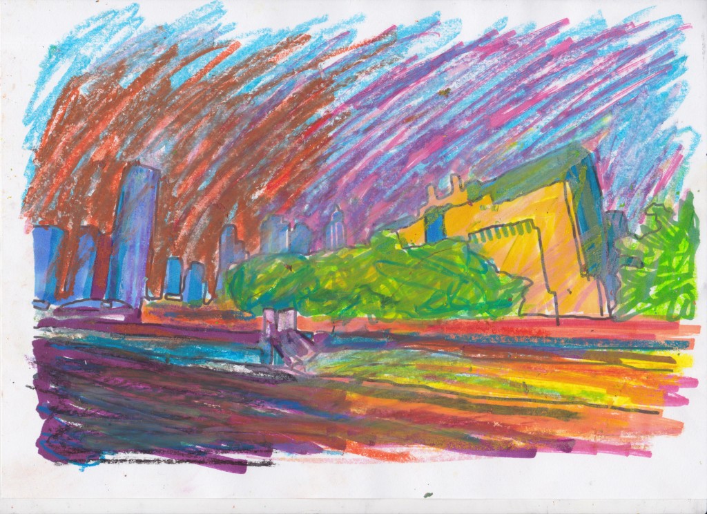
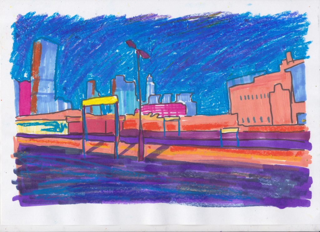
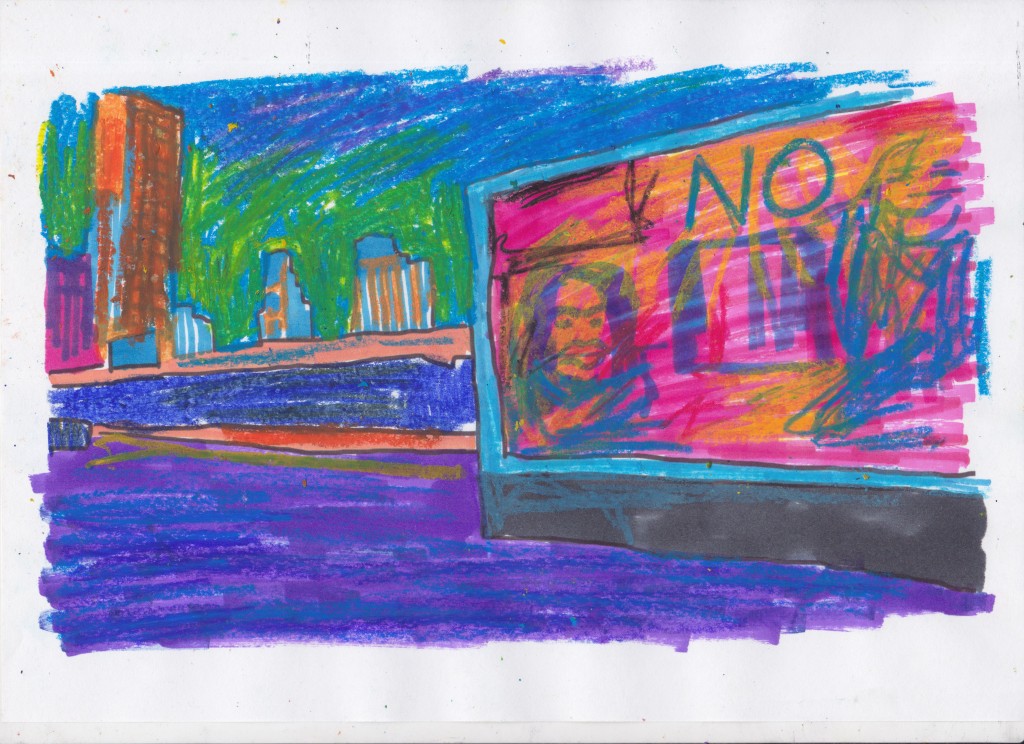
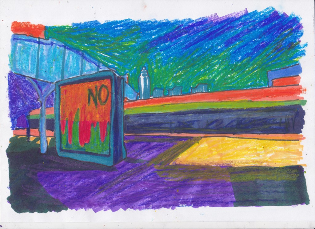
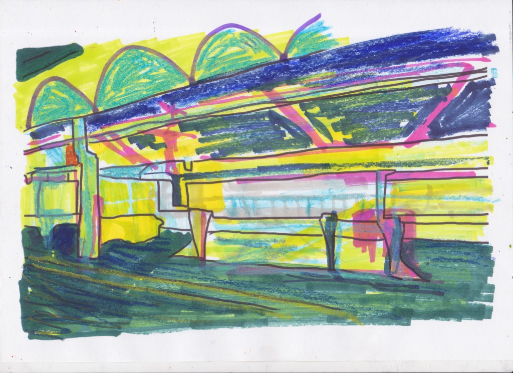
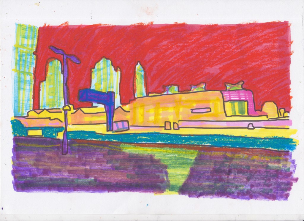
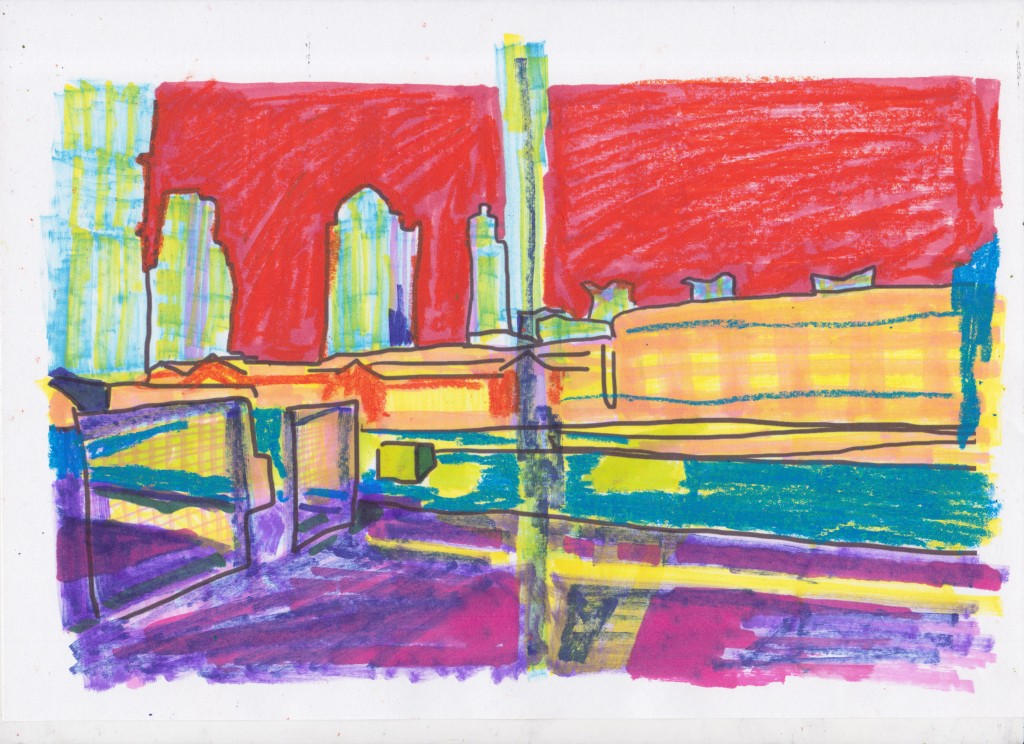
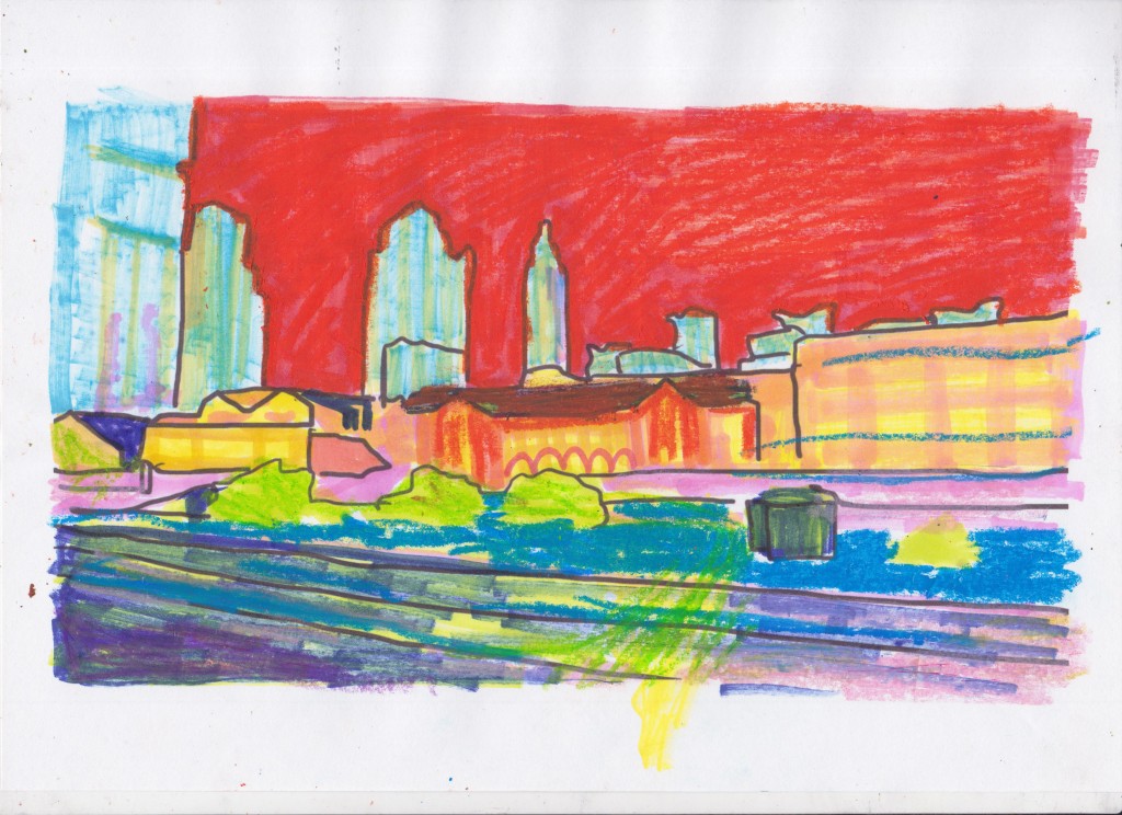
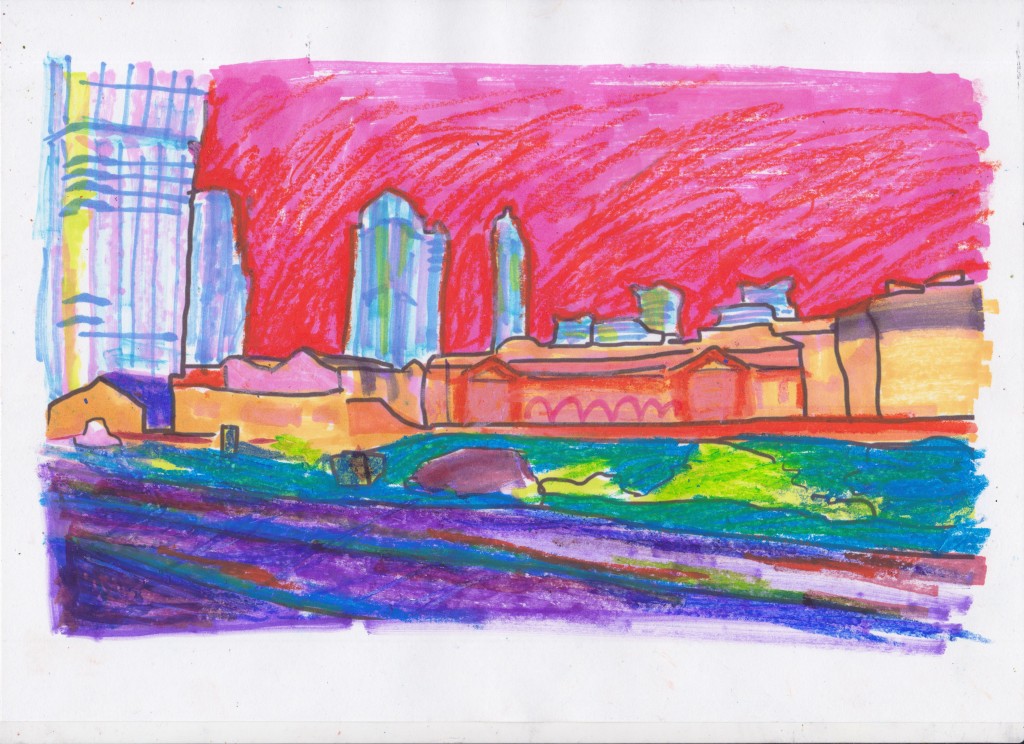
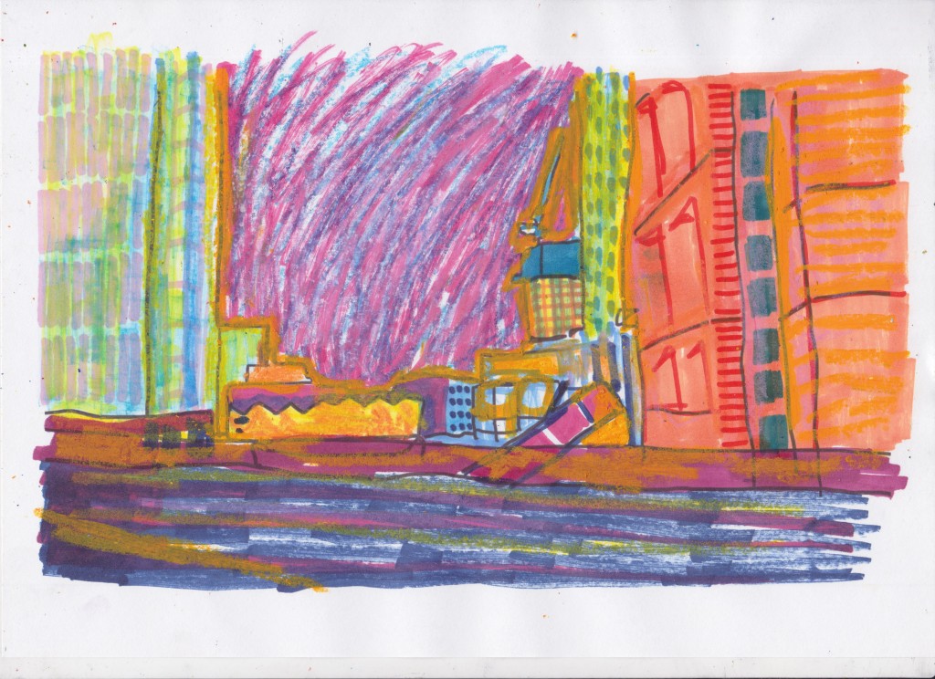
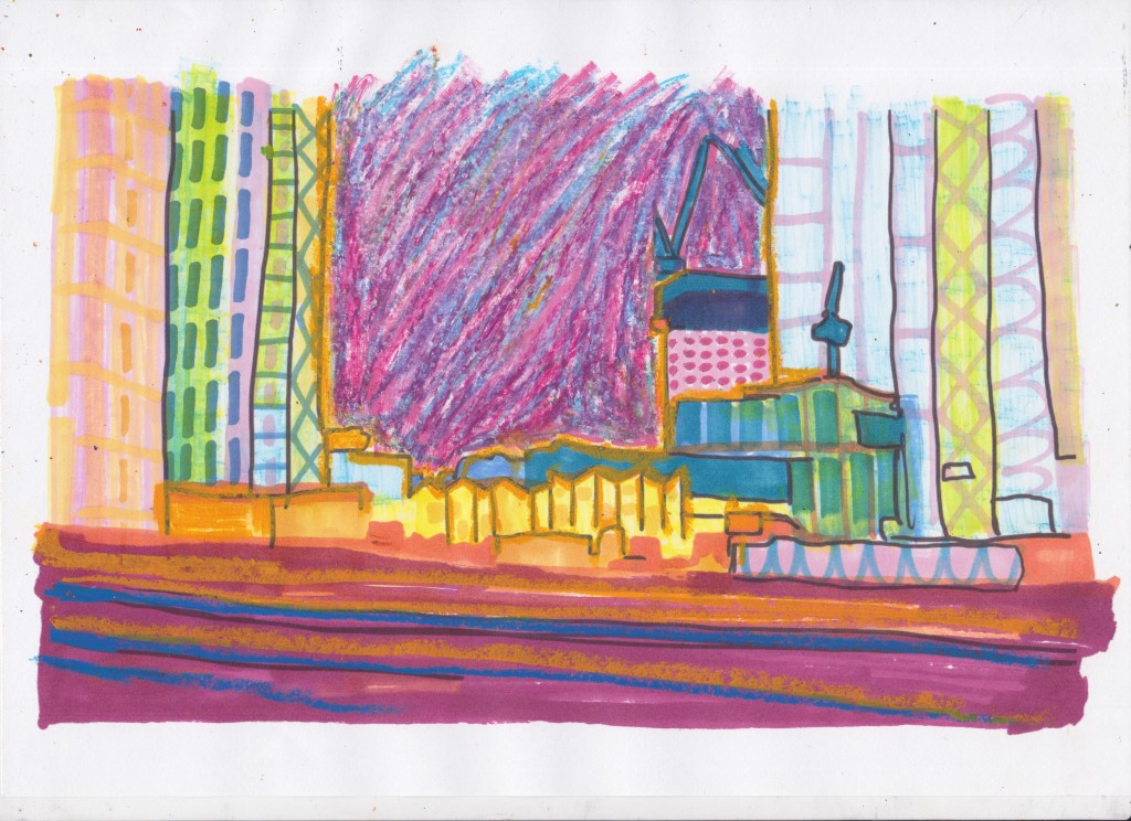
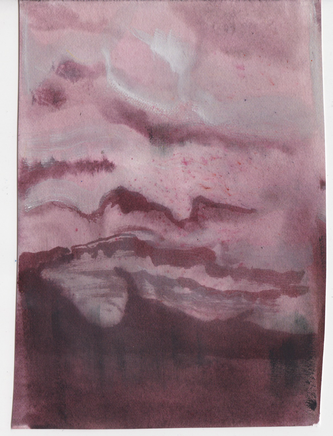
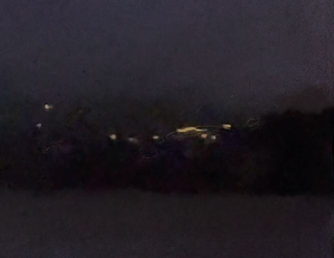
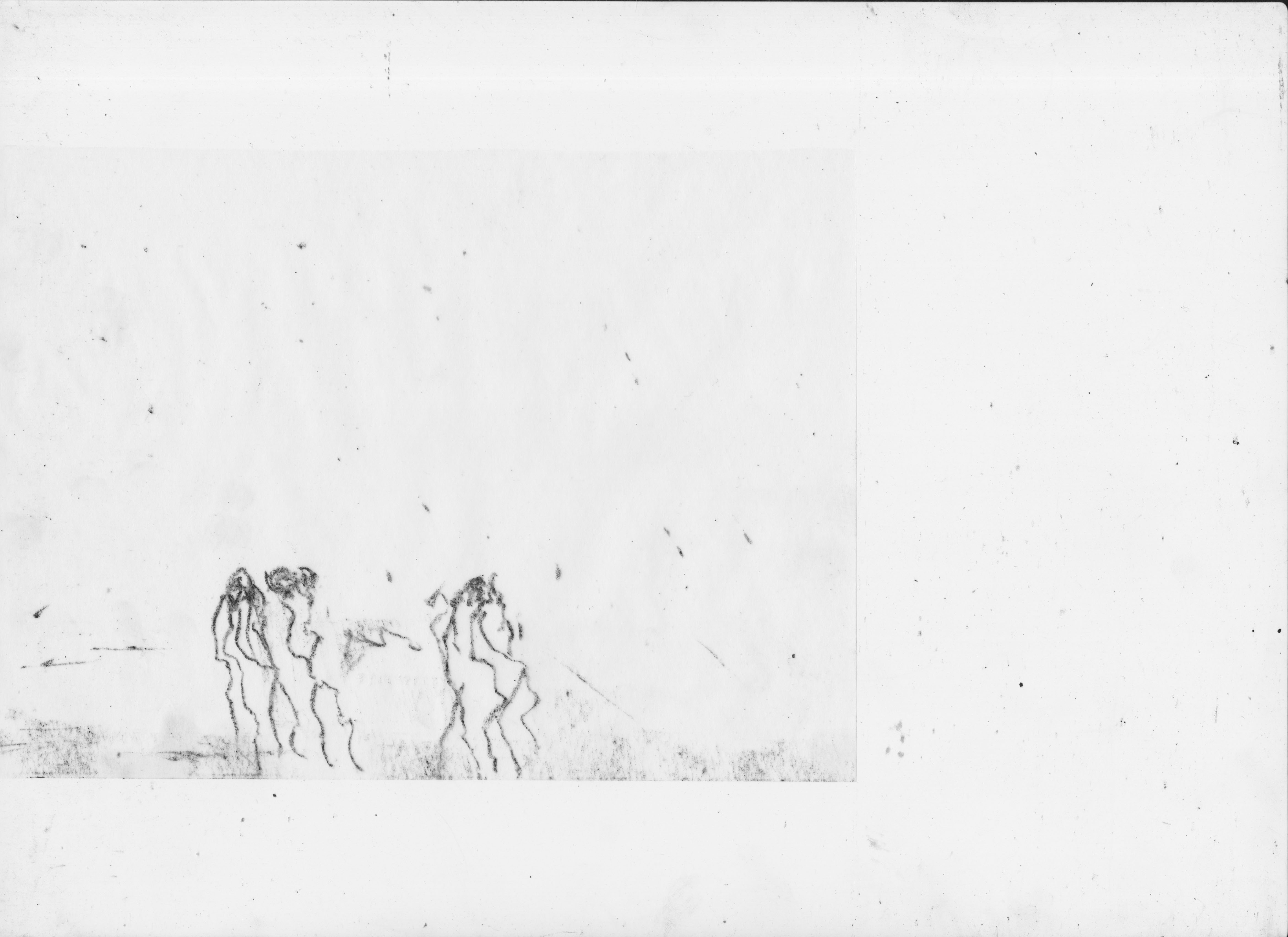
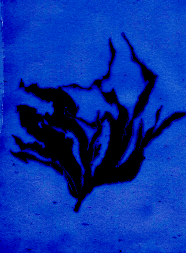
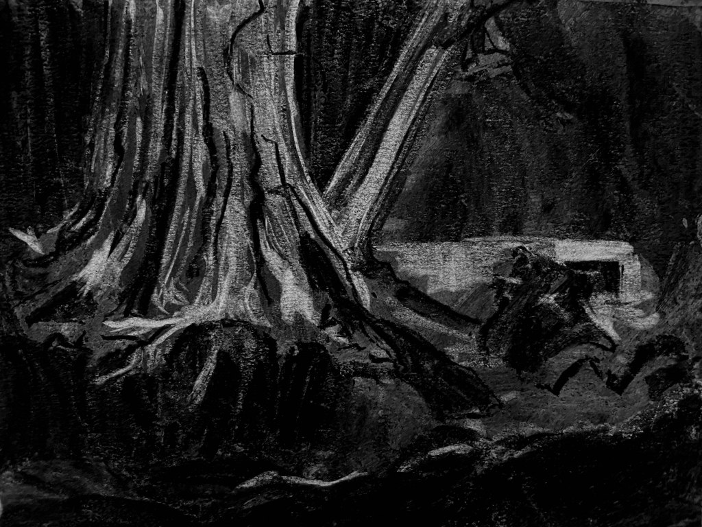
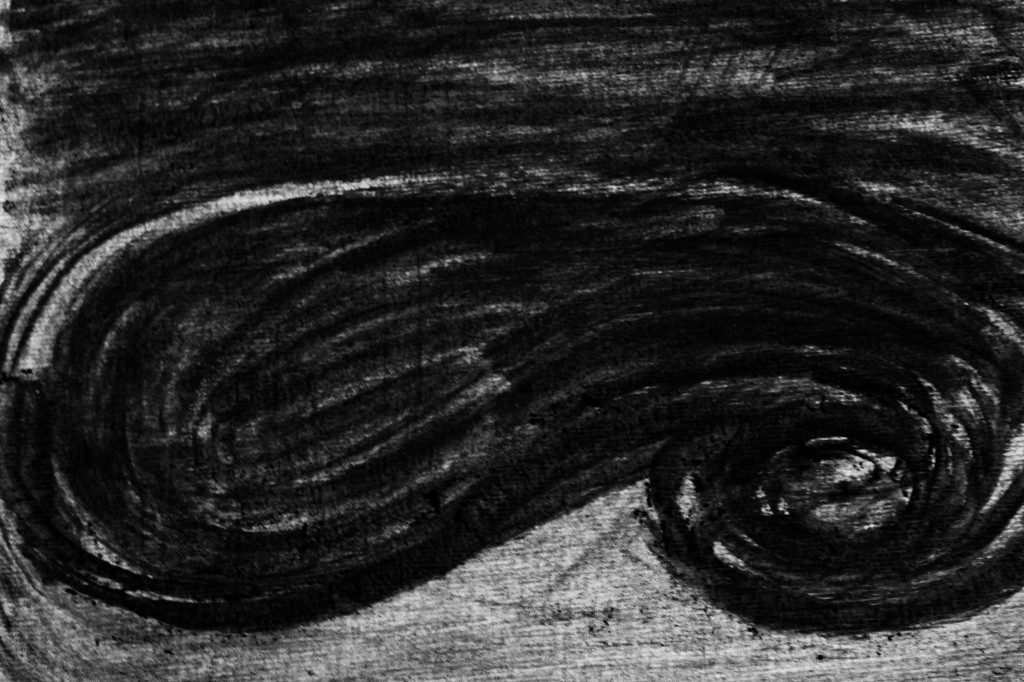
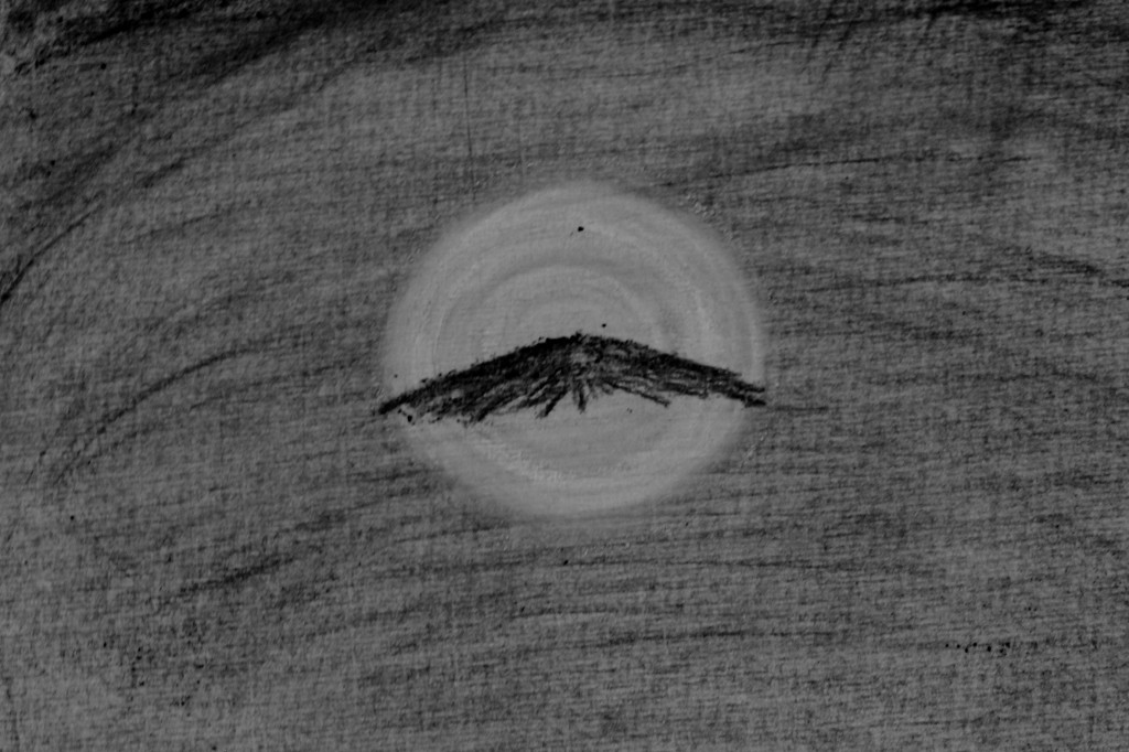
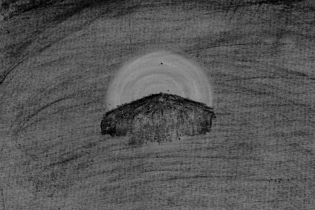
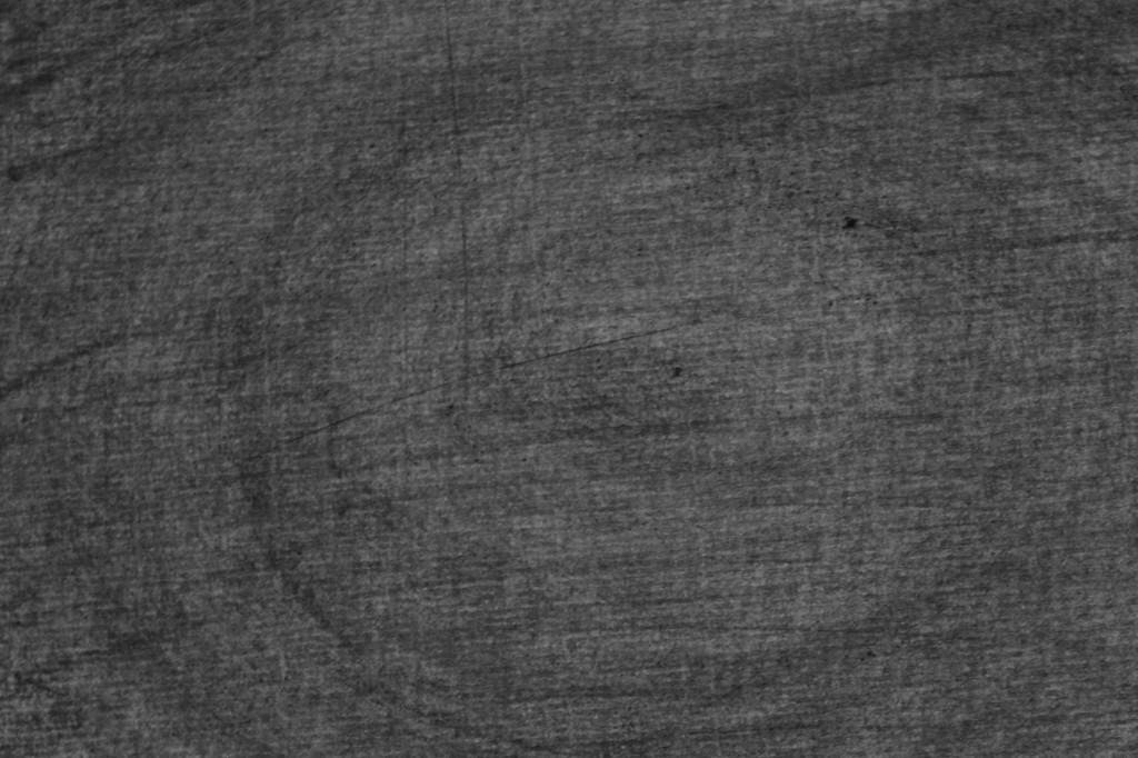
When it came to knowing what to draw, I didn’t know where to begin. Creating a storyboard was the opposite of what I wanted to do, I had a feeling it would be stifling and it would minimise the chances of having happy accidents, or going off in a direction I hadn’t expected. I found the article recommended by my tutor on Animism by Grace Ndiritu very interesting, and it helped give me starting place for my drawings. Ndiritu explains her realisation that “[she] was created out of the exact same stuff as…the tree blowing outside the window” (Ndiritu, 2021) which made me wonder whether I could try and mentally inhabit the river, and draw what the river feels/thinks. In my research I had found that last year, raw sewage was being released into my local river continuously for over 40 days (even more, depending on how many sewers are taken into account), so over 1/12 of the year. I also discovered via the Rivers Trust that even treated sewage is harmful to the river, so even “good behaviour” is poisoning the water (The Rivers Trust, 2022). I started my drawing/animation by trying to imagine the river as an alive being, responding to being continuously poisoned. She would be angry, wanting revenge, but then this might give way to feeling powerless. I started the drawing with this in mind and just let it develop naturally.

My setup

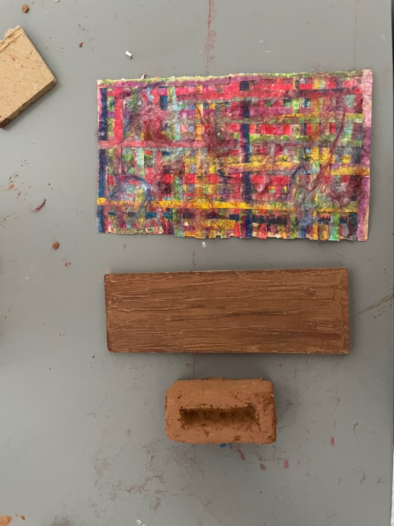
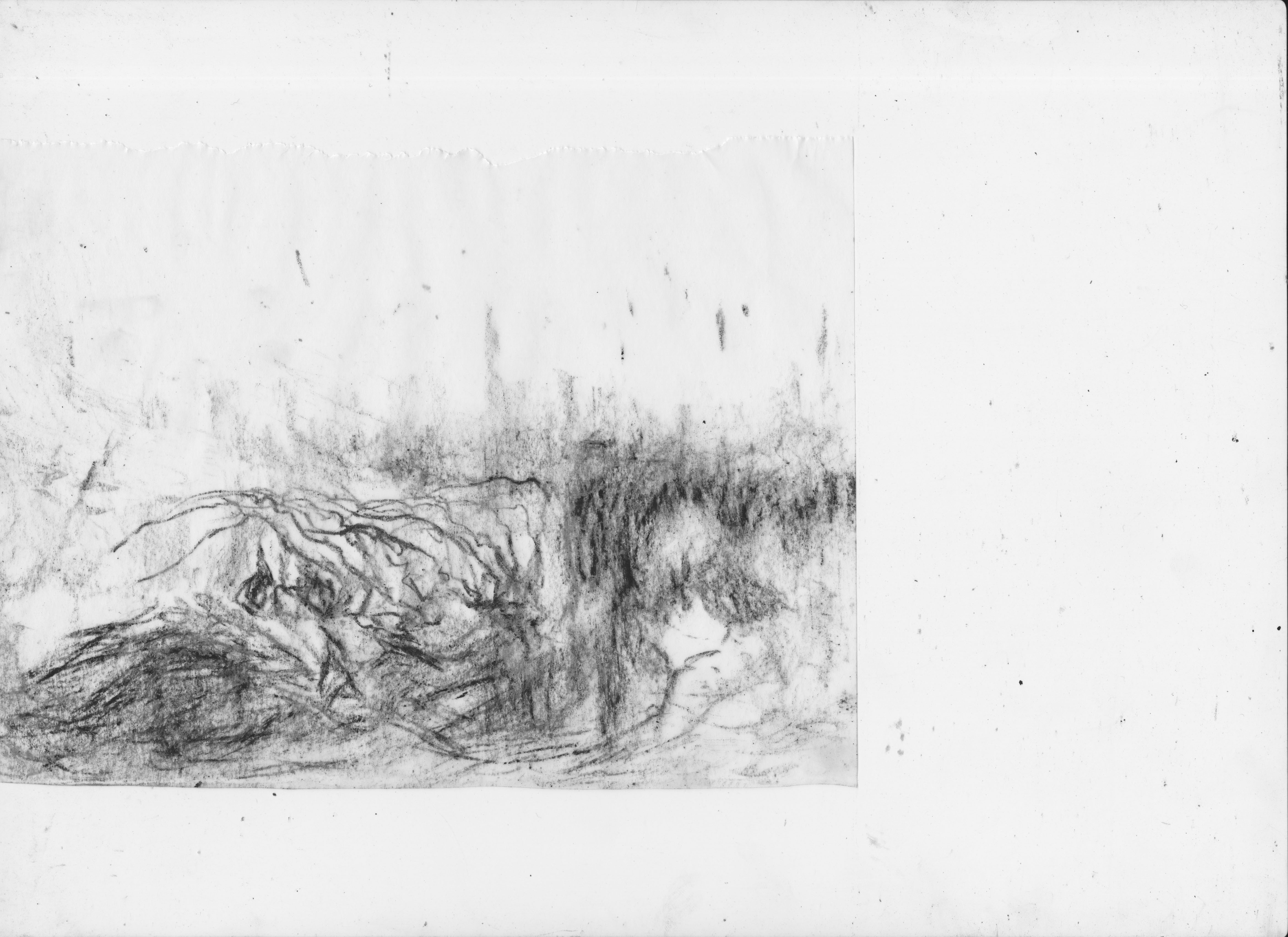
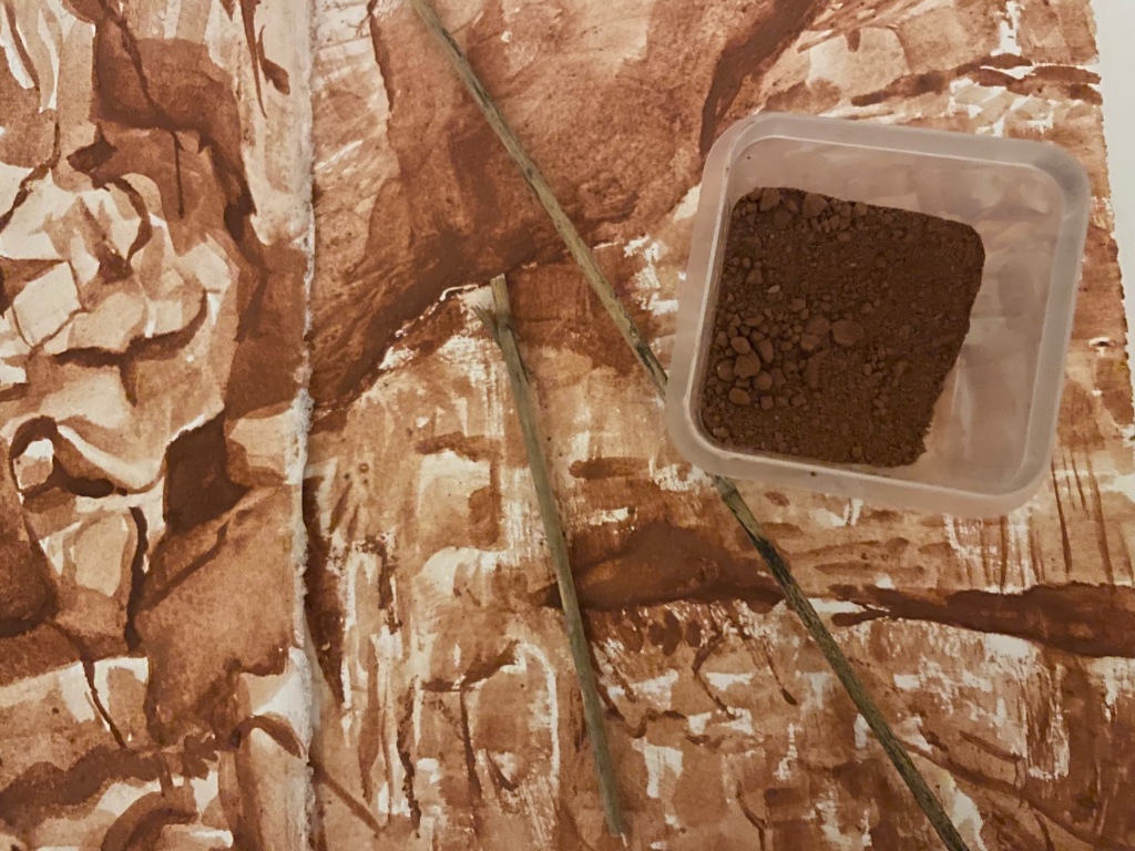
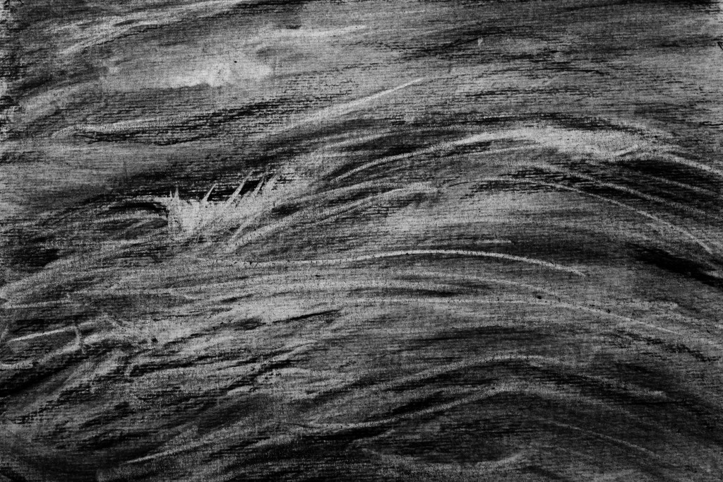
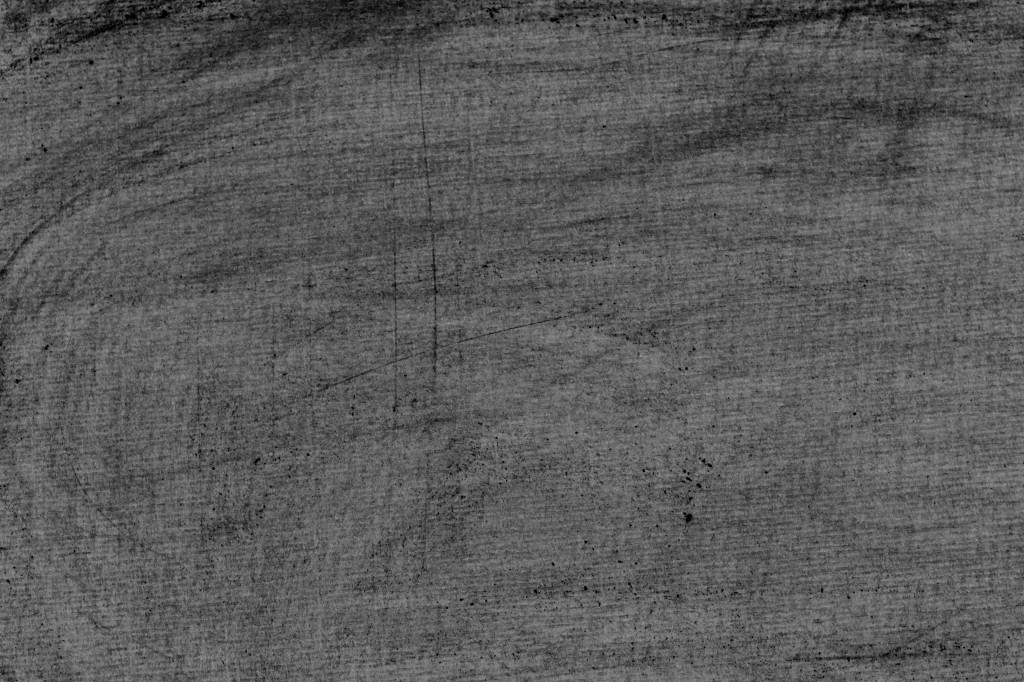
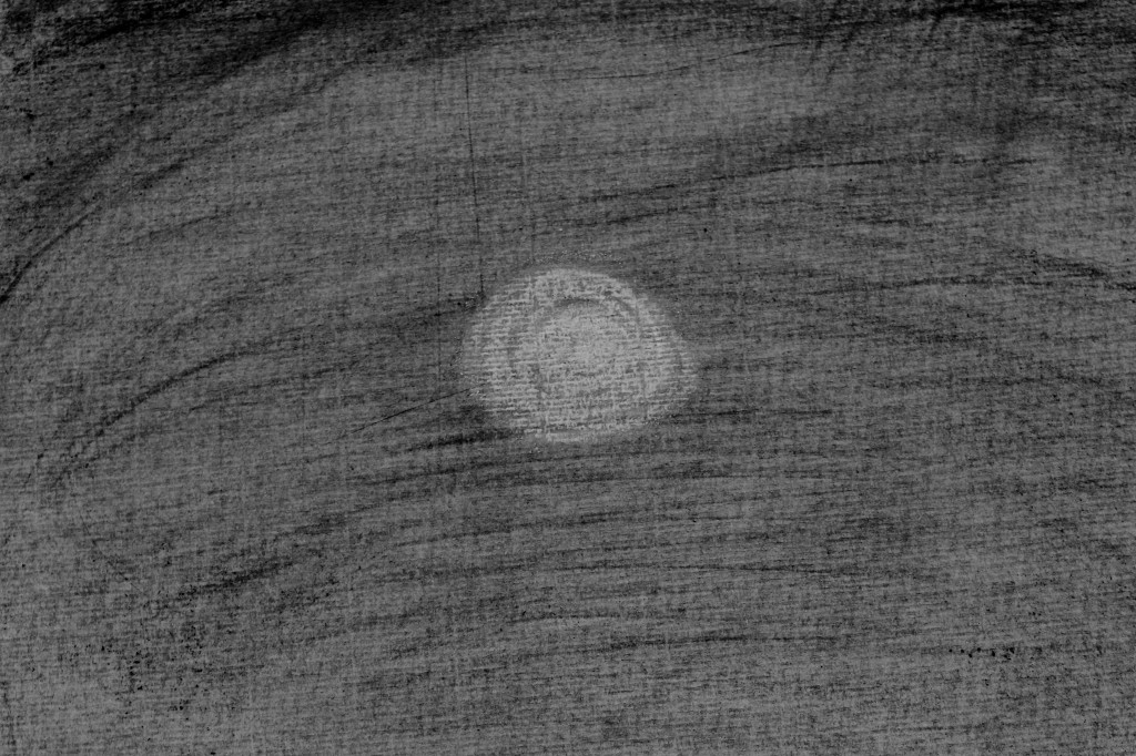
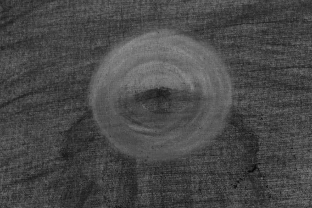
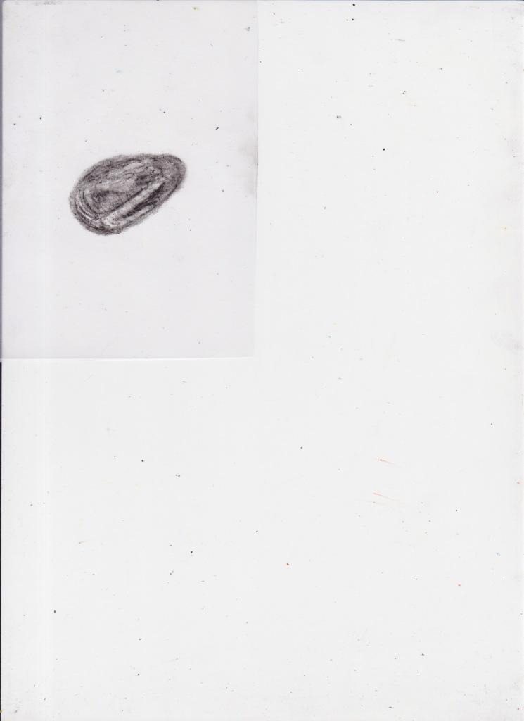
Towards the end of this drawing session, I had accumulated a lot of charcoal dust, which I began to arrange and sculpt into shapes. Quickly running out of camera battery, I added some final sketches thinking about the the pollution of the water. I really enjoyed this way of drawing, once the drawing was gone, that’s it, it was gone, which is great for someone like me who ums and ahs over everything – I just had to accept that I couldn’t go back and fiddle with bits of the drawing. I also enjoyed just going at the page with a solid eraser, which was suggested by my tutor, and not a tool that I regularly use. It was interesting to be able to draw by erasing, usually I use a putty rubber and that doesn’t tend to feel like drawing, more like fiddling.

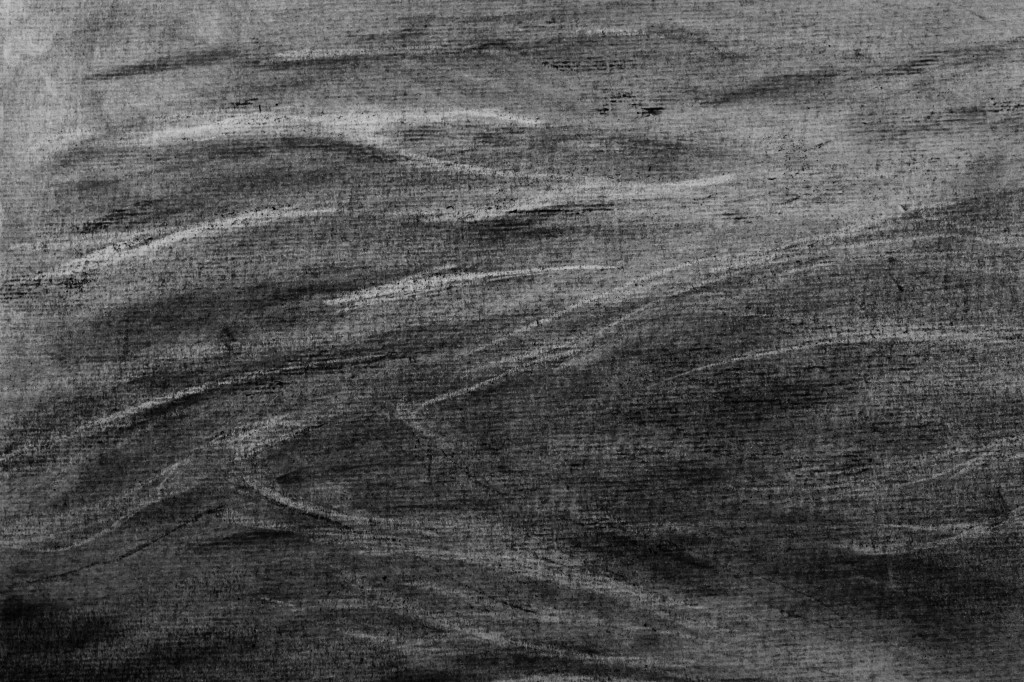
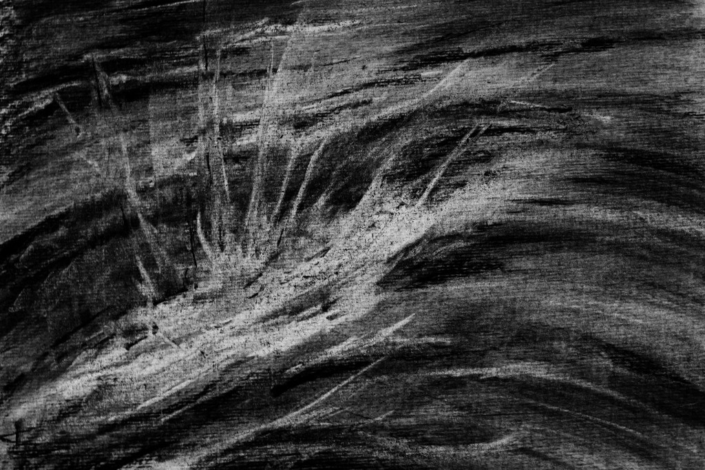
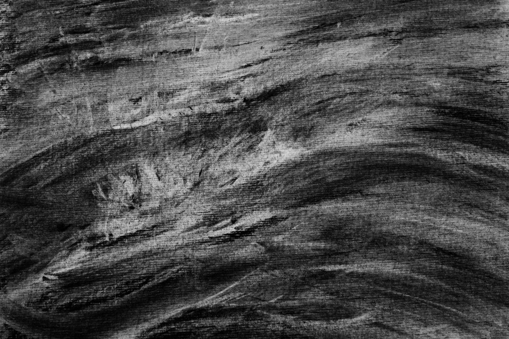
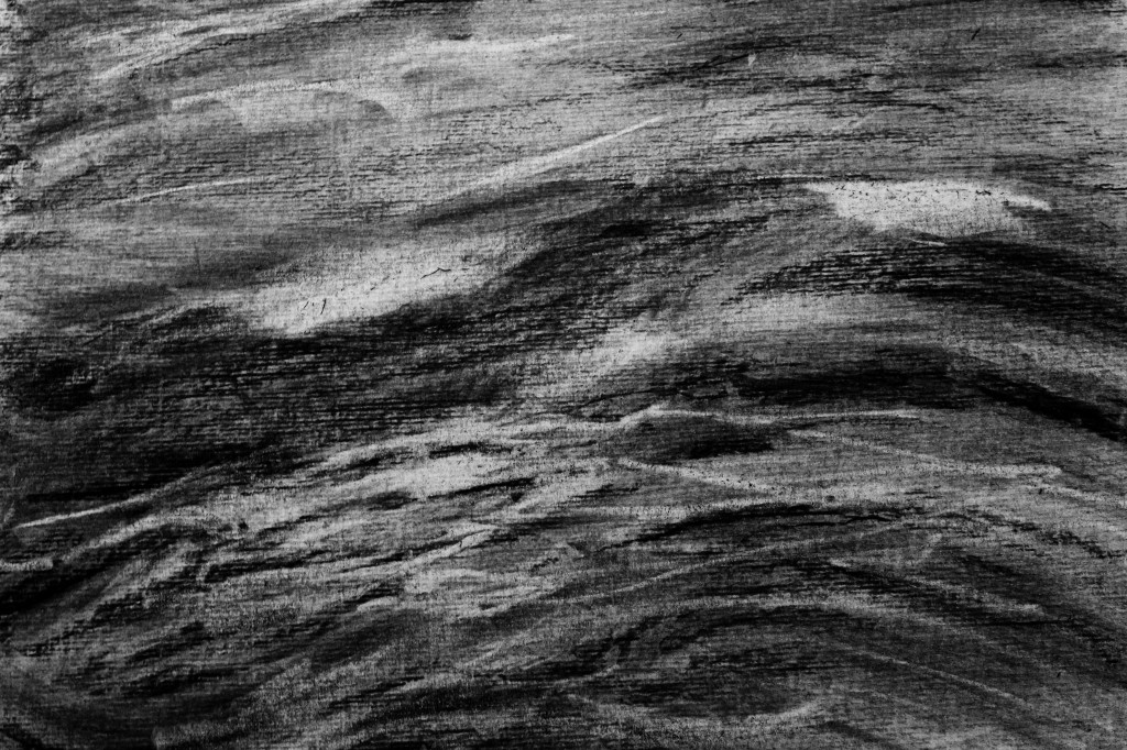
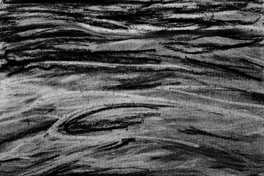
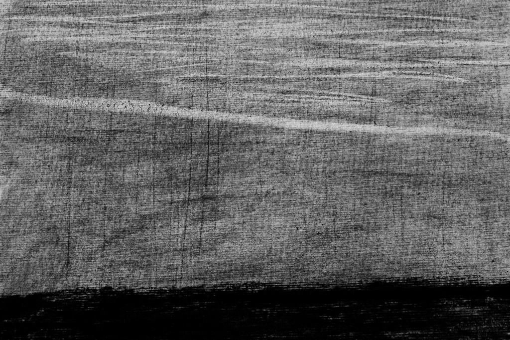
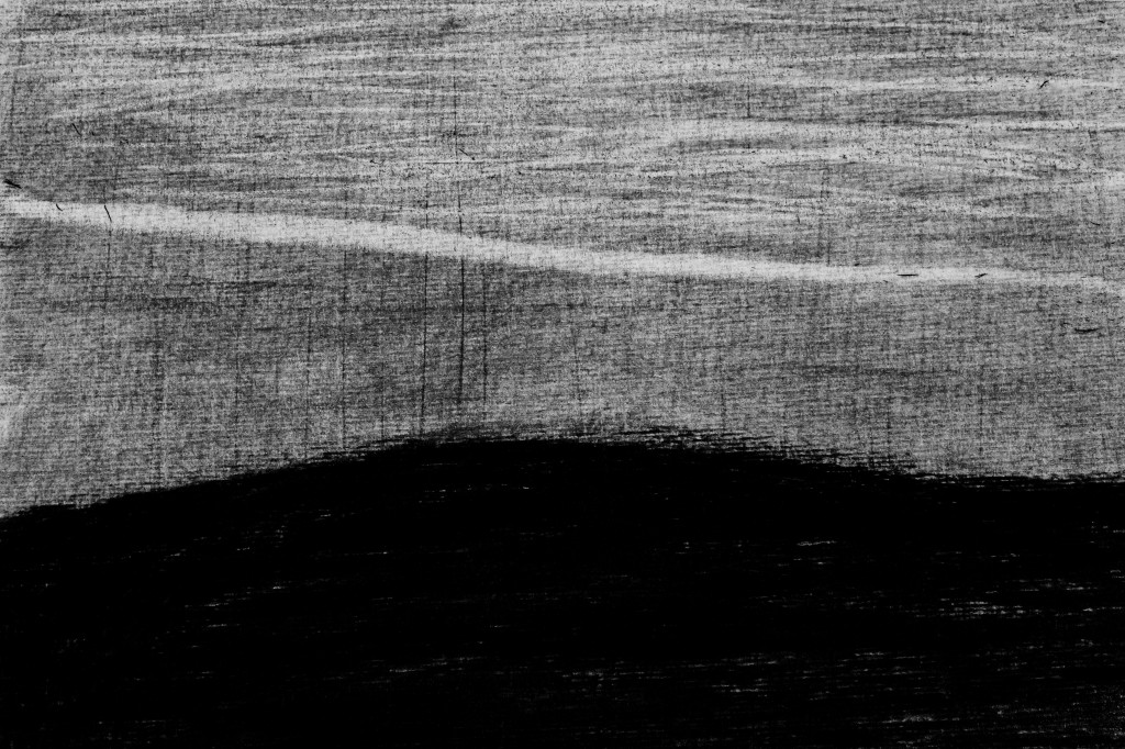
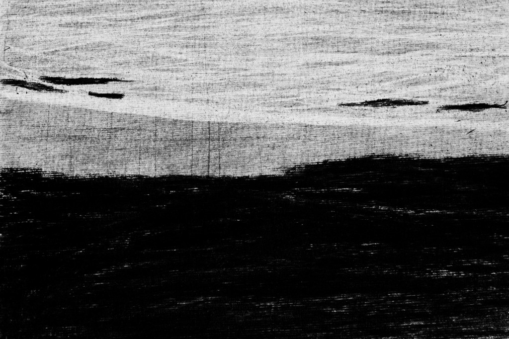
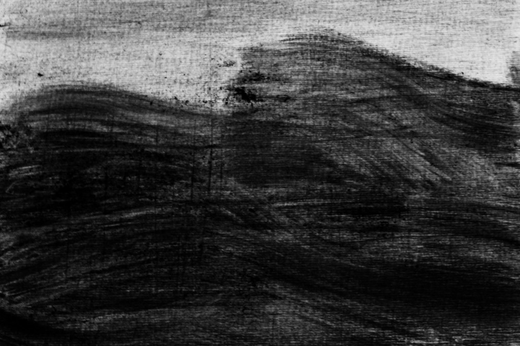
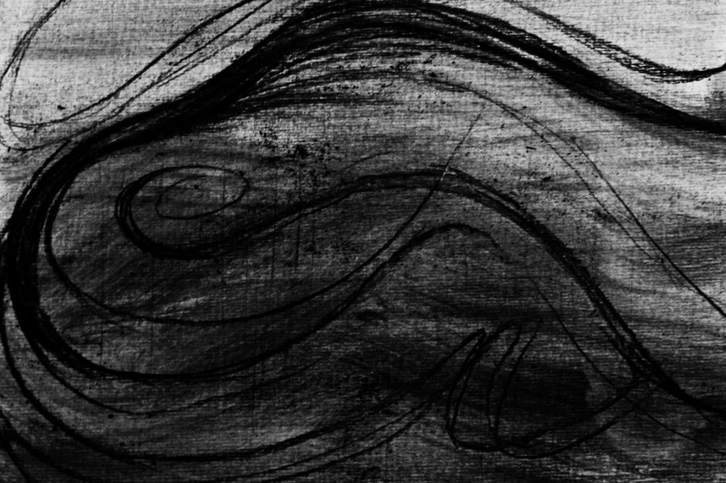
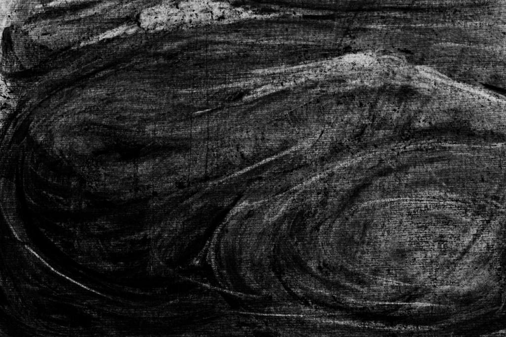
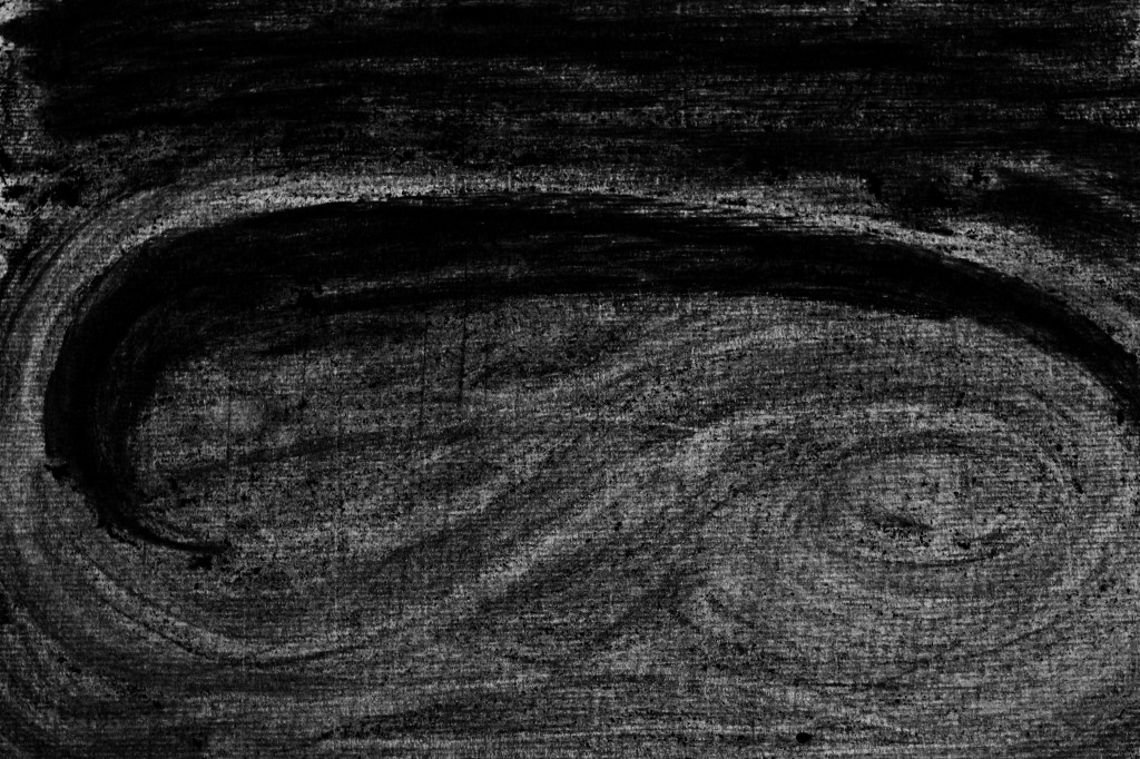
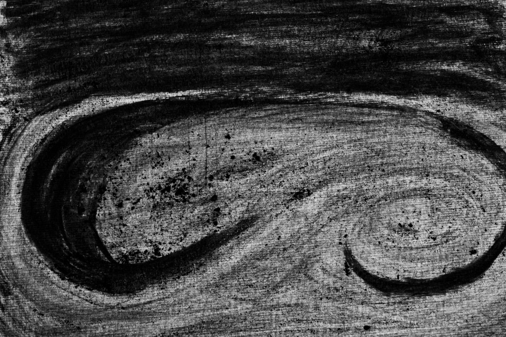
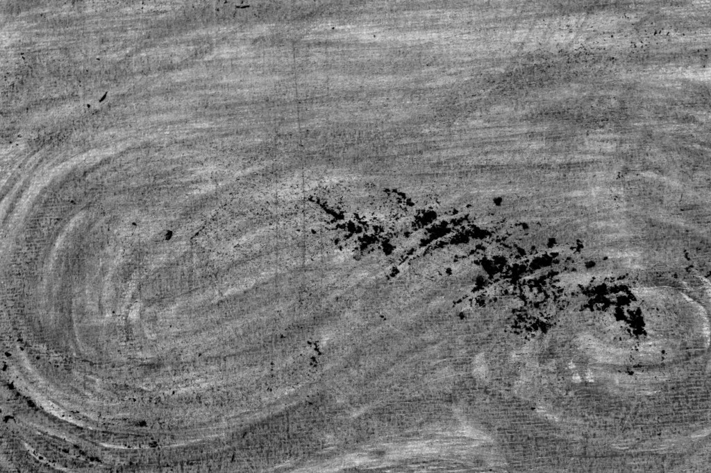
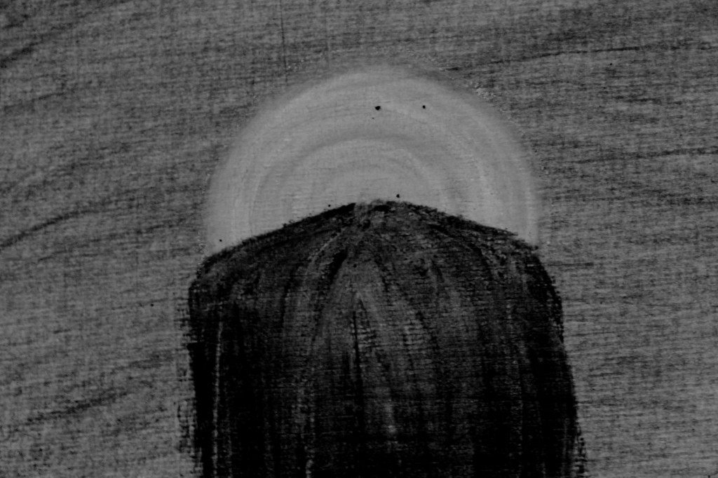
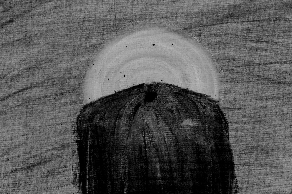
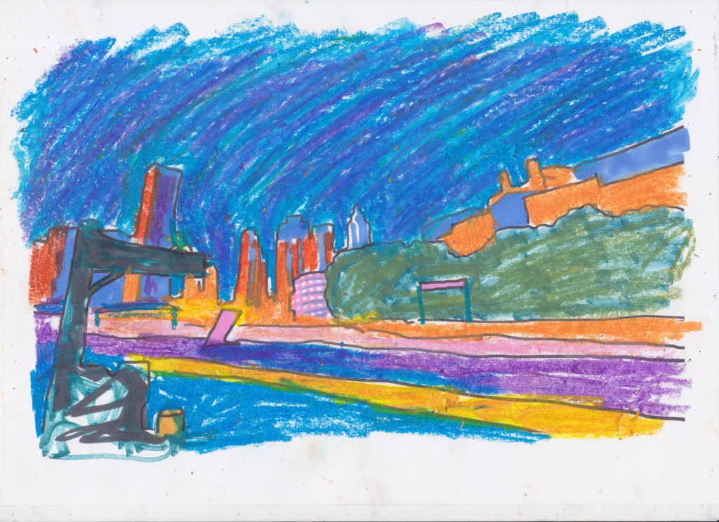
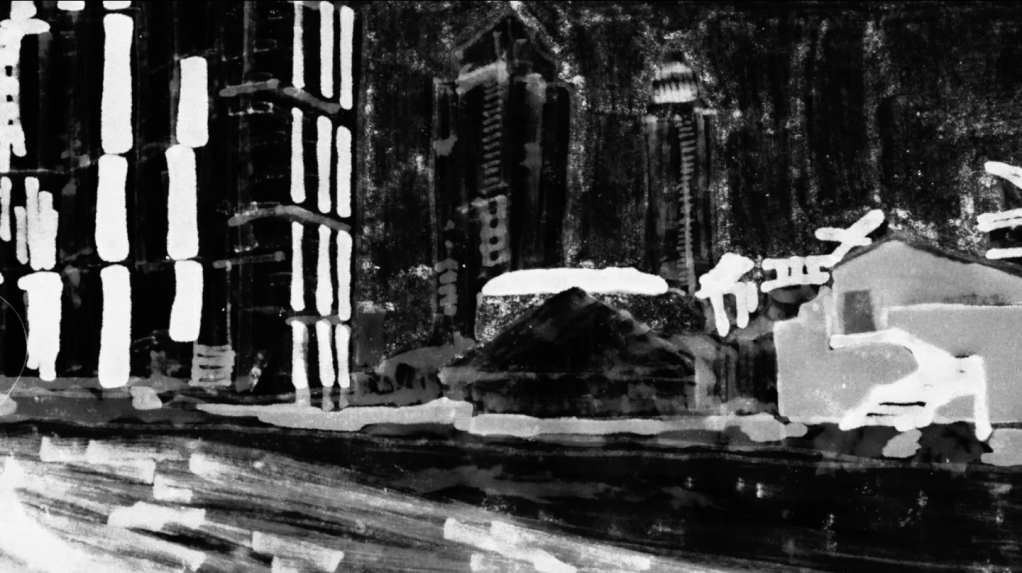
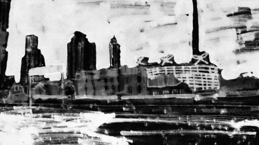
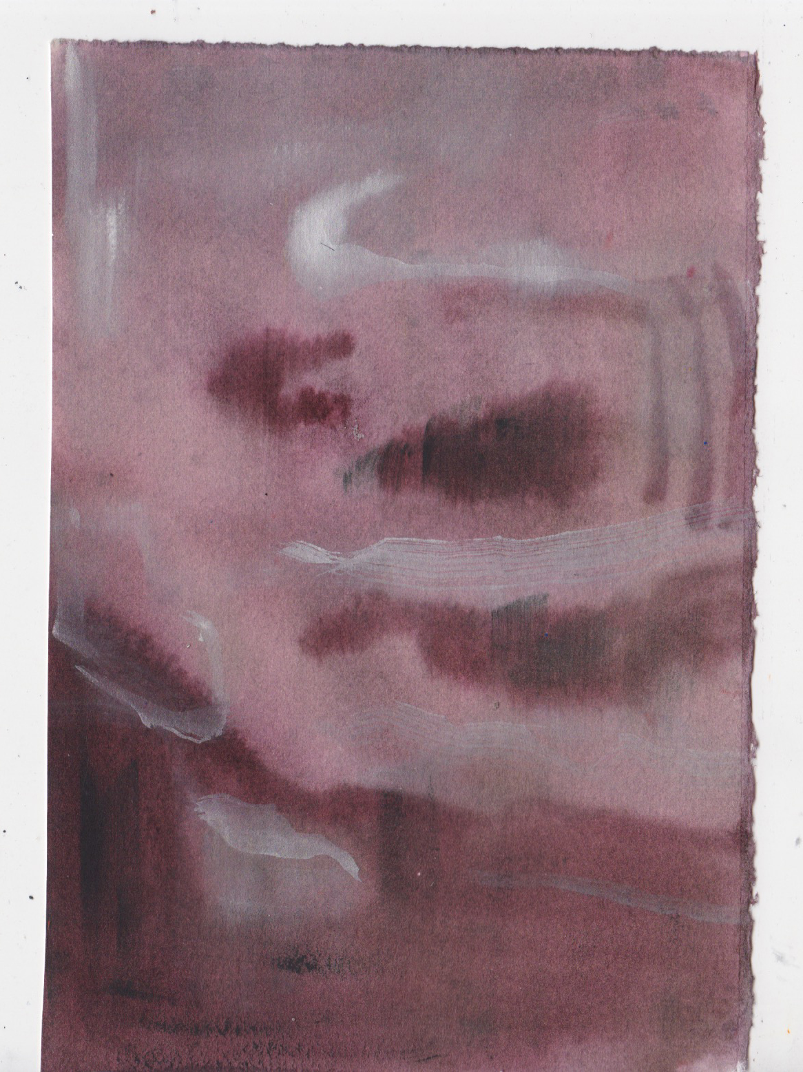
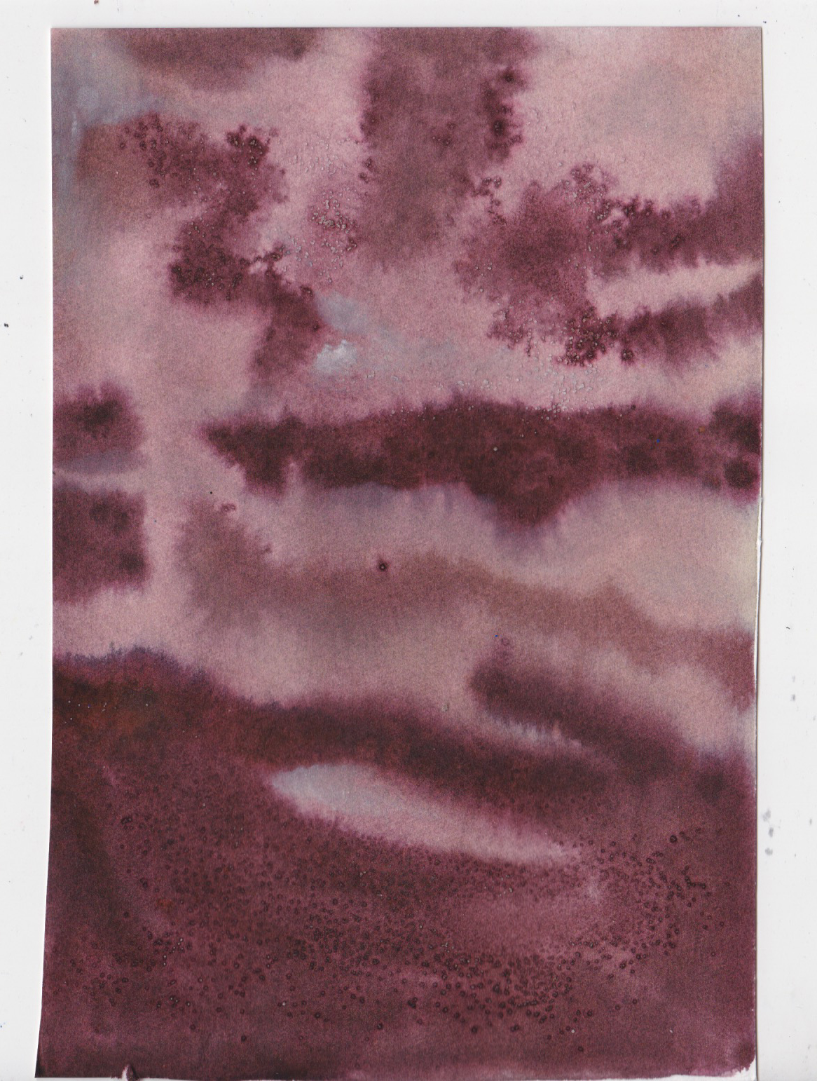
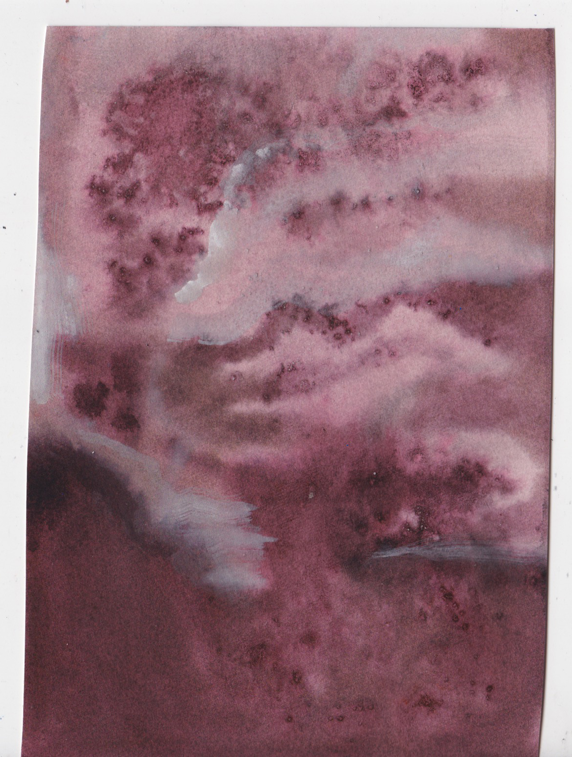
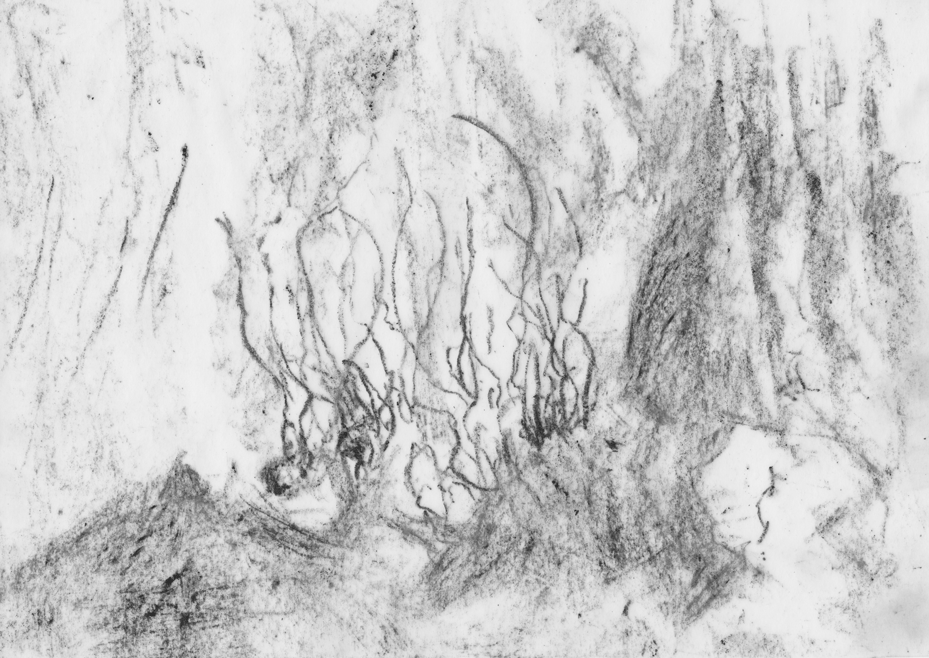
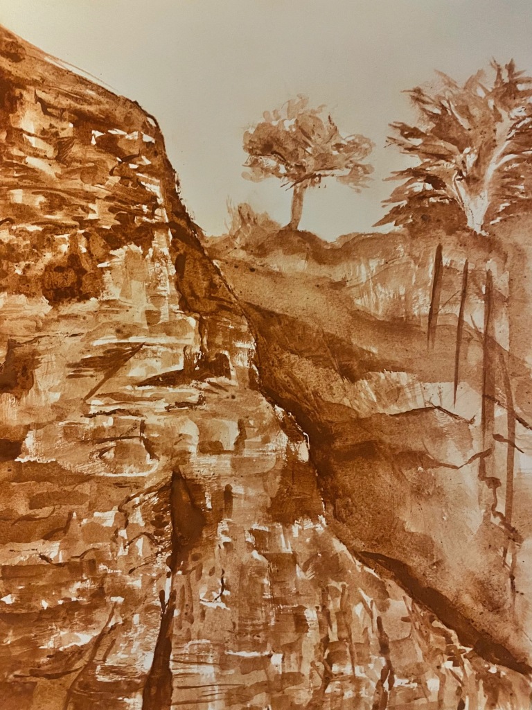
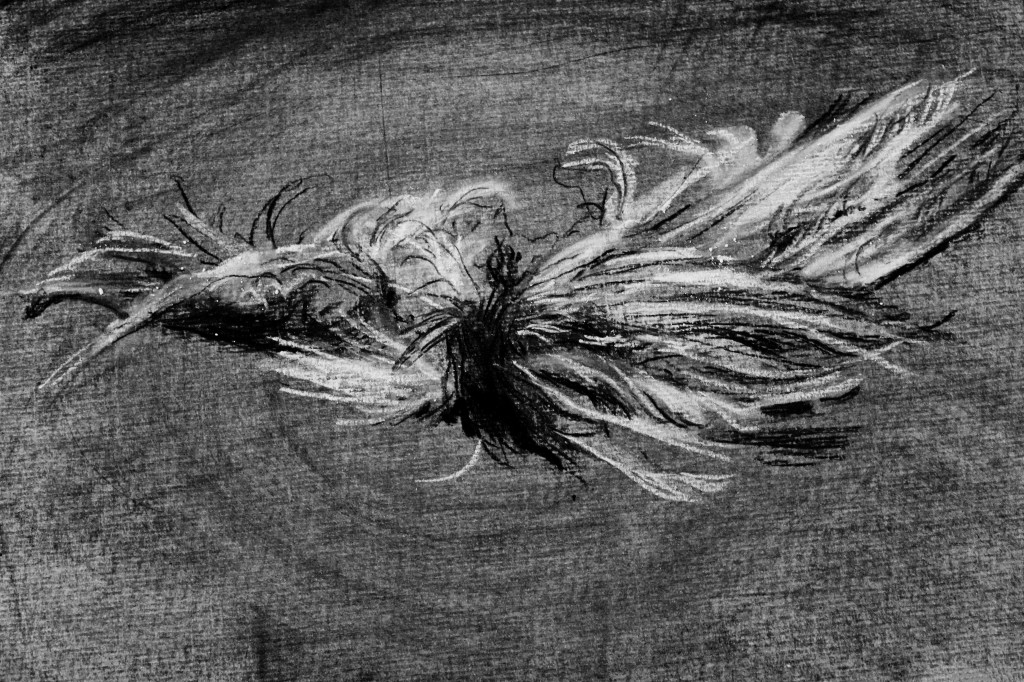
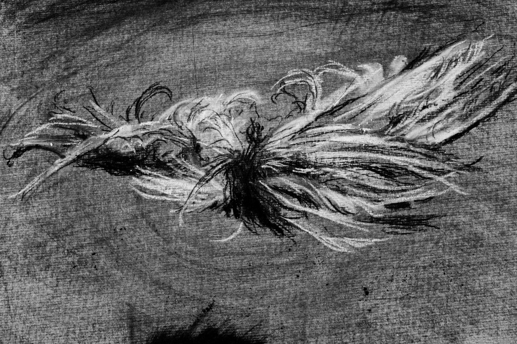
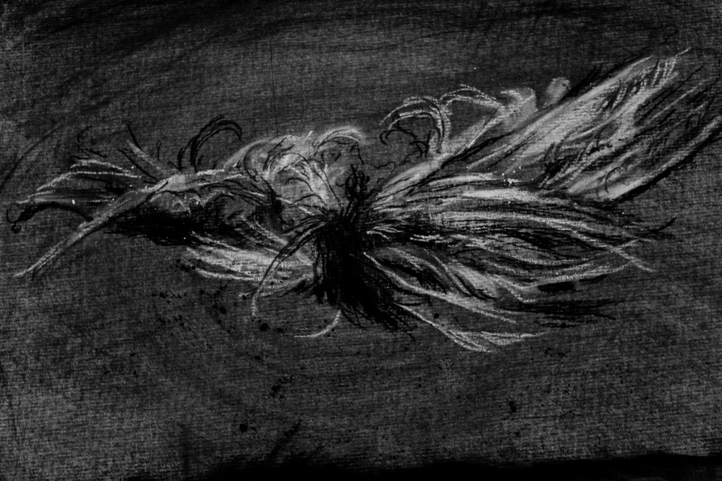
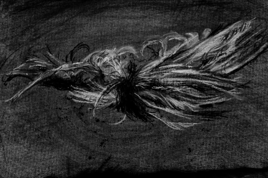
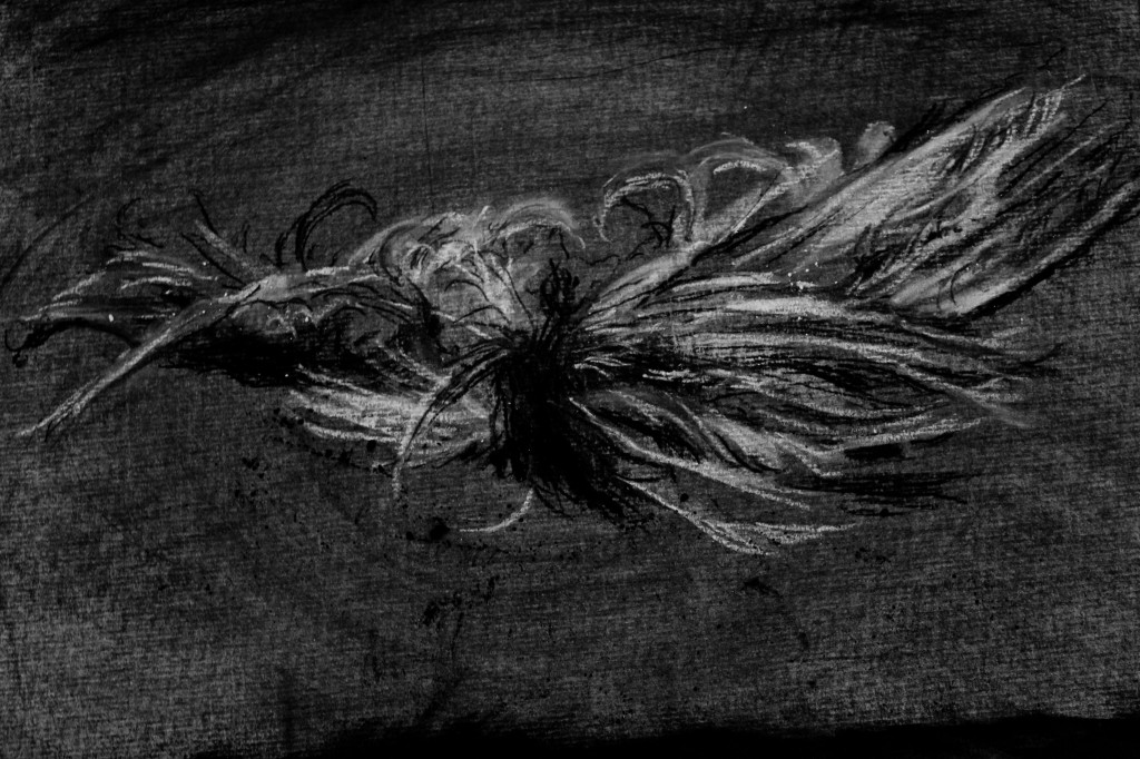
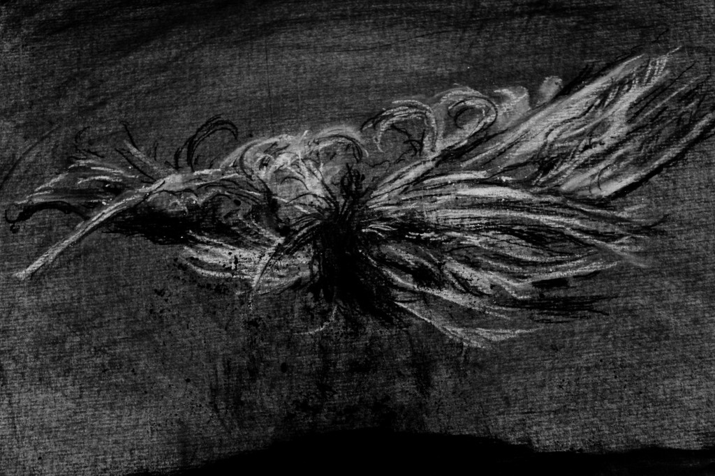
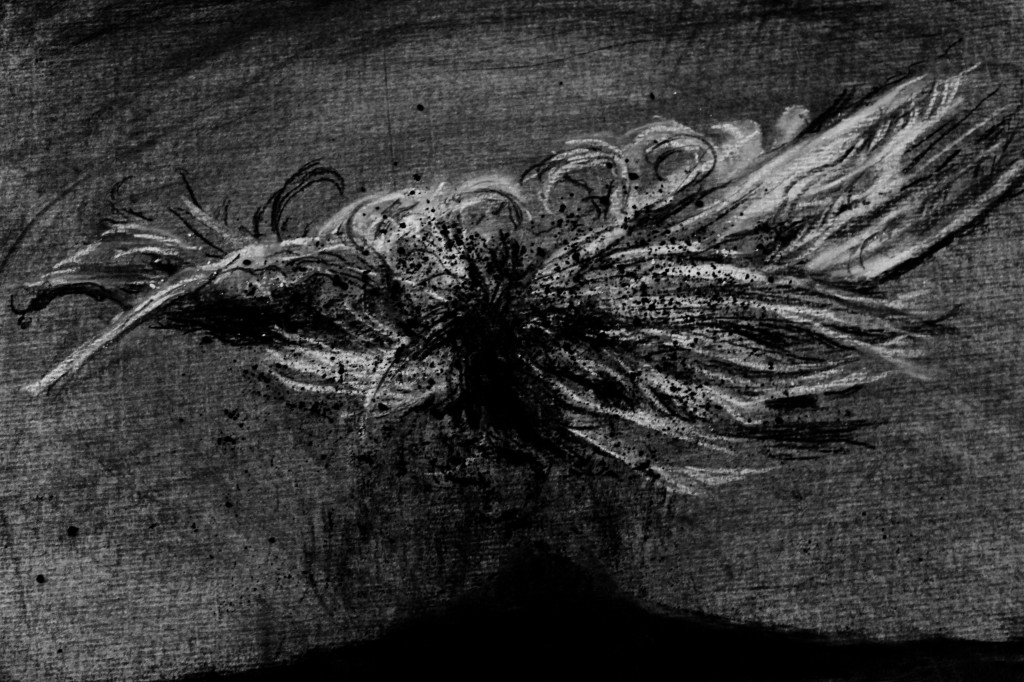
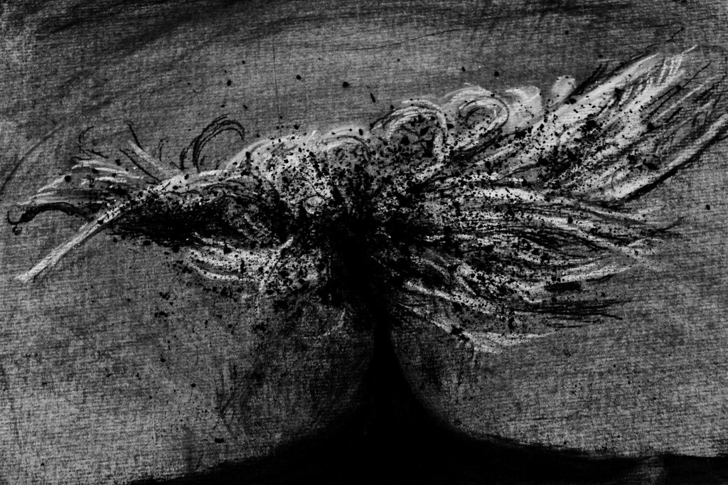
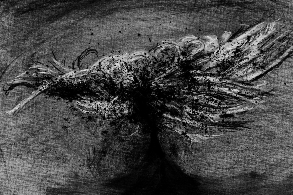
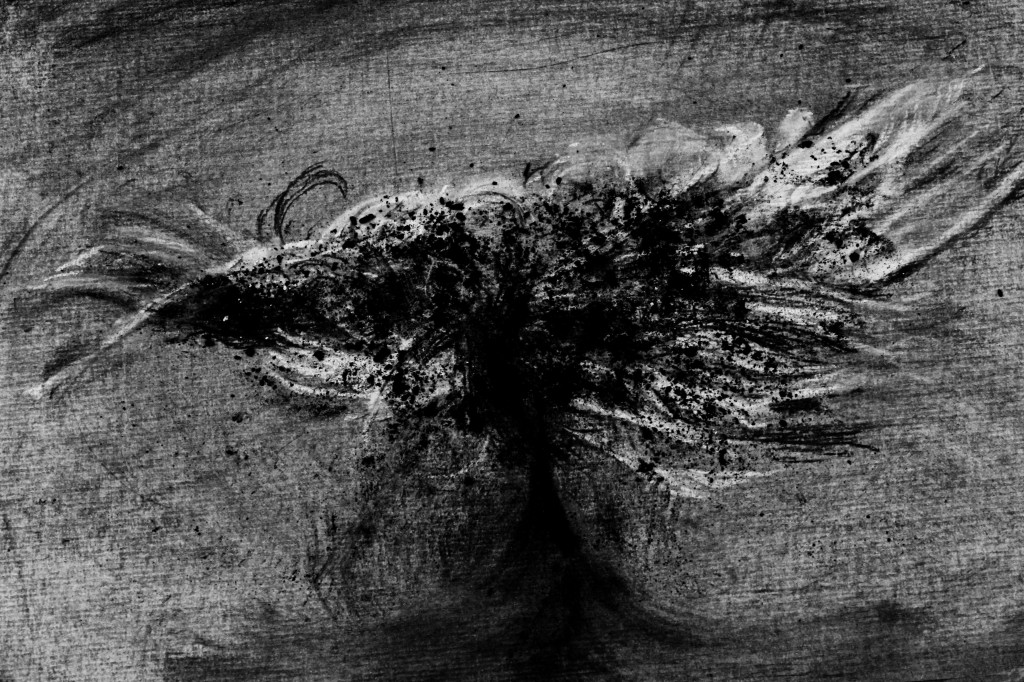
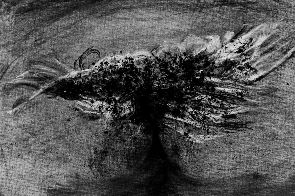
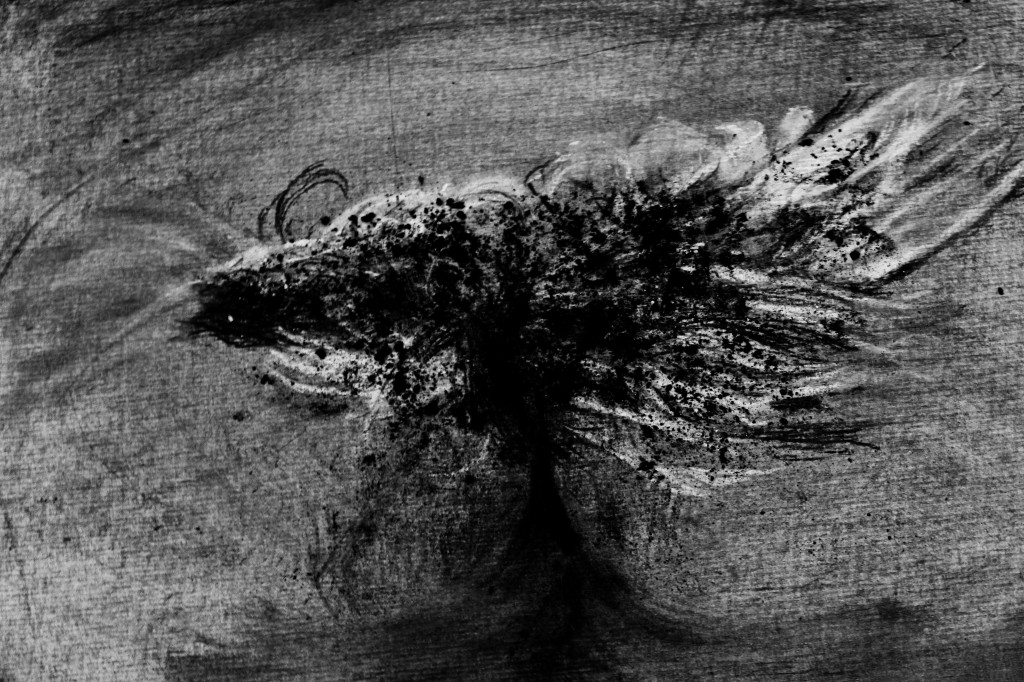
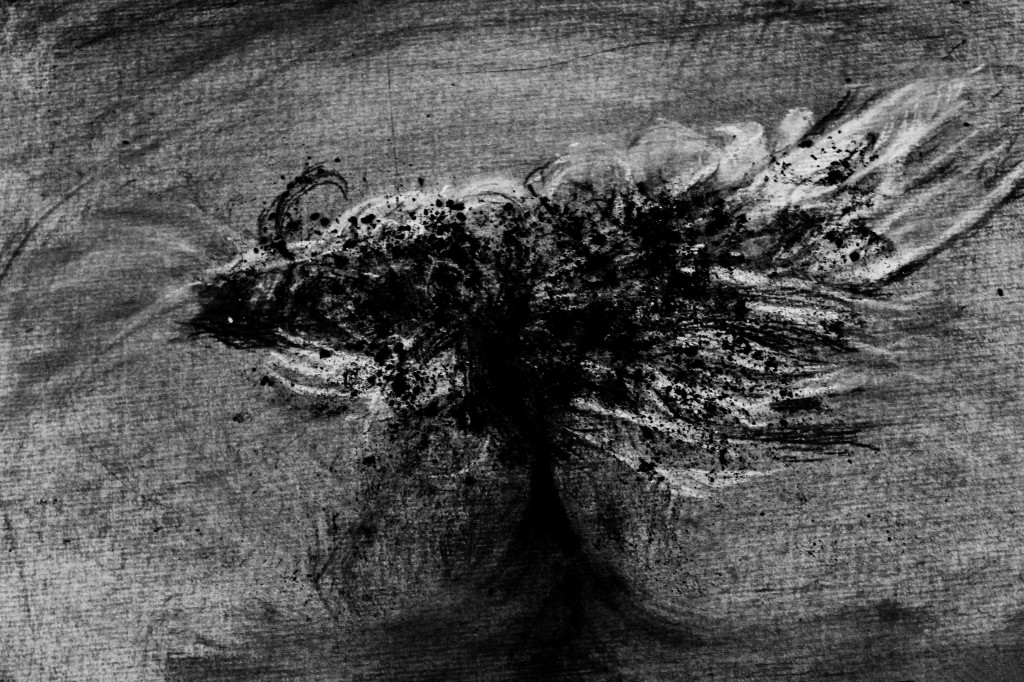
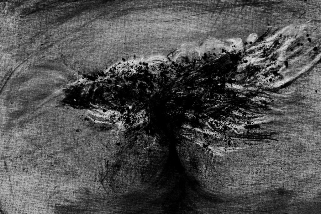
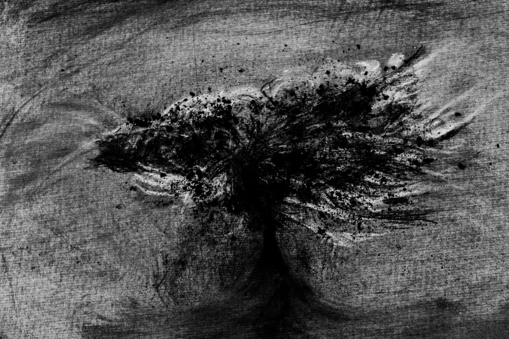
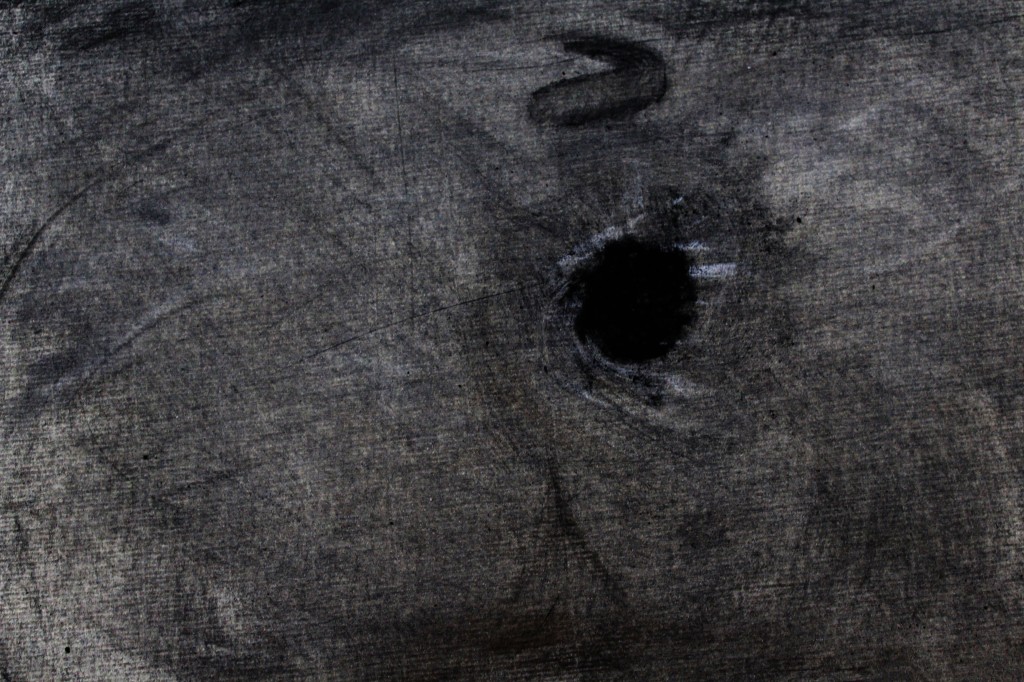
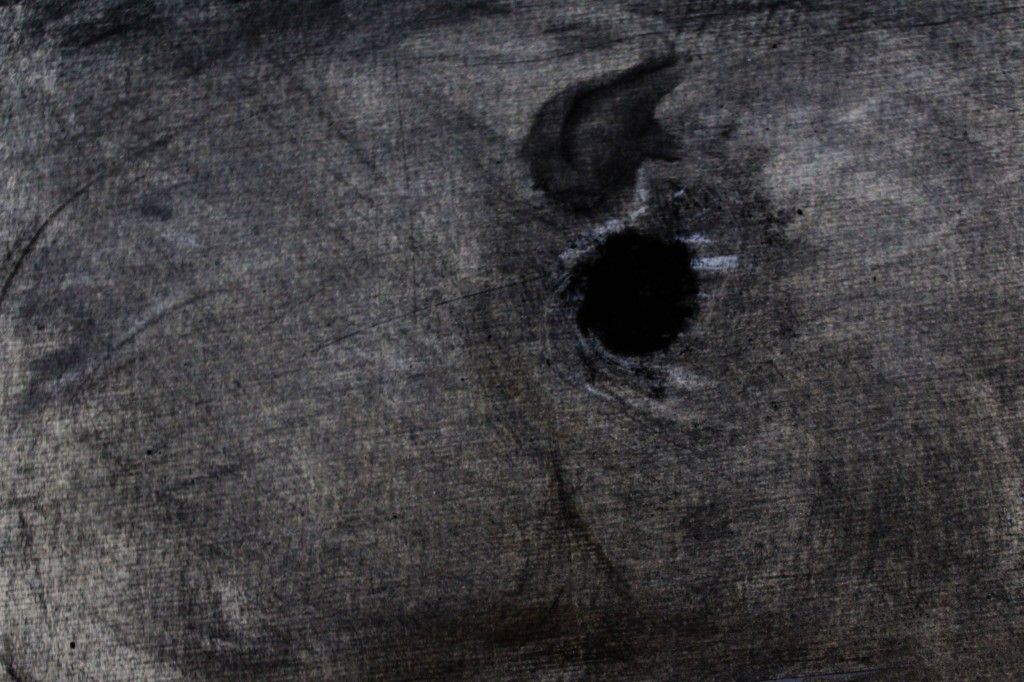
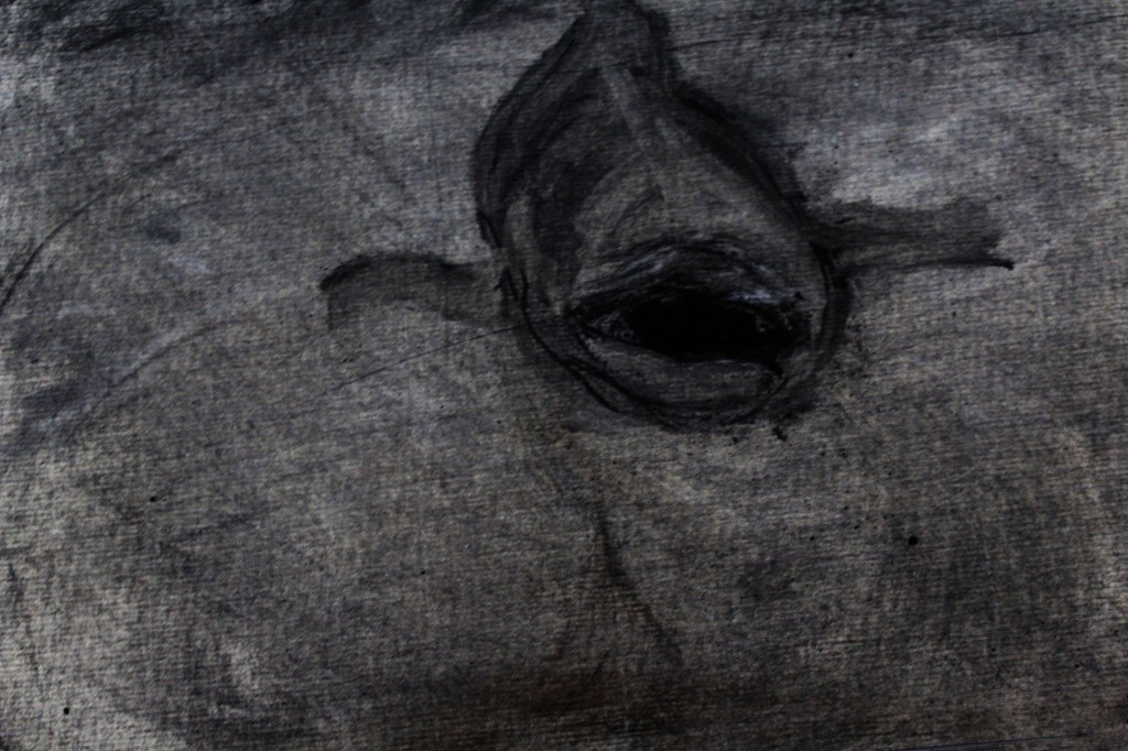
After this session, I wasn’t sure whether I was finished or not, but I went for a walk to the Axe river to see if I could grab any other imagery to start from. There happened to be a dead bird sprawled out on the Axe bridge after being hit by a car, and I felt that I must go back and use this as another starting point for the next session of drawing.

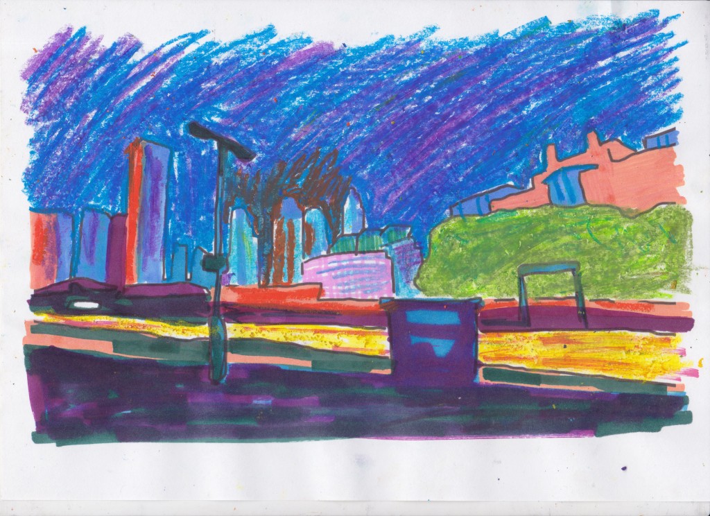
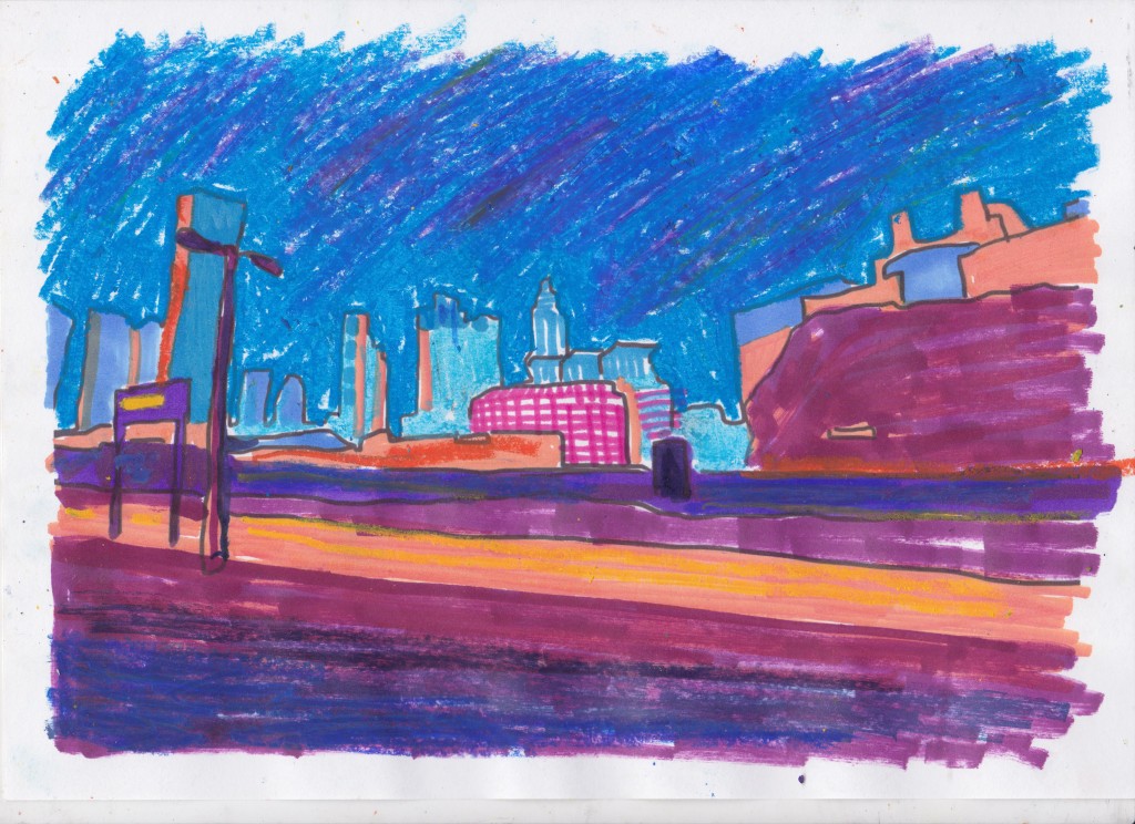
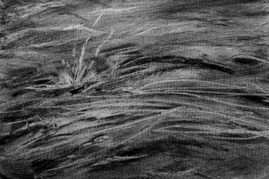
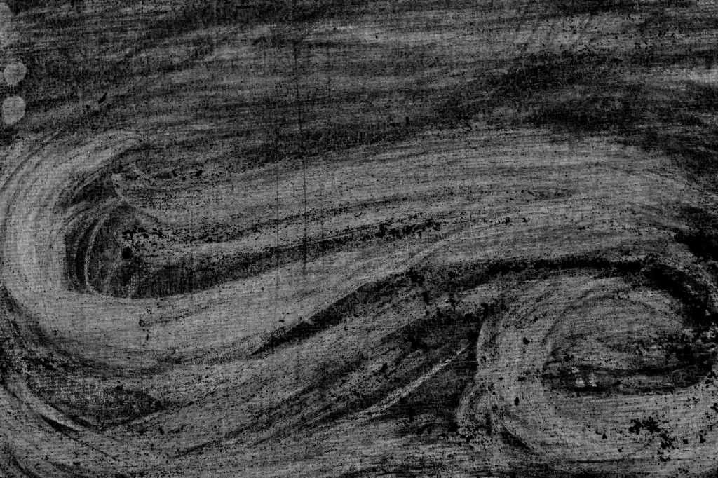
I continued on letting the drawing draw itself, and I don’t think I’ve really drawn this way before, I felt that the drawing was leading me rather than vice versa.

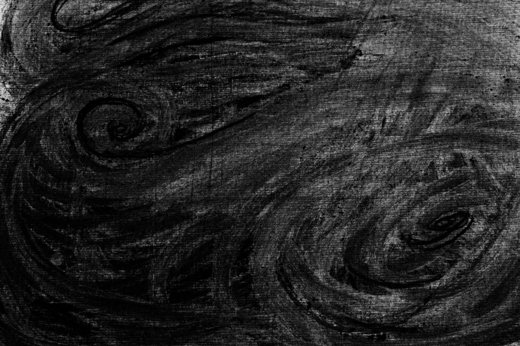
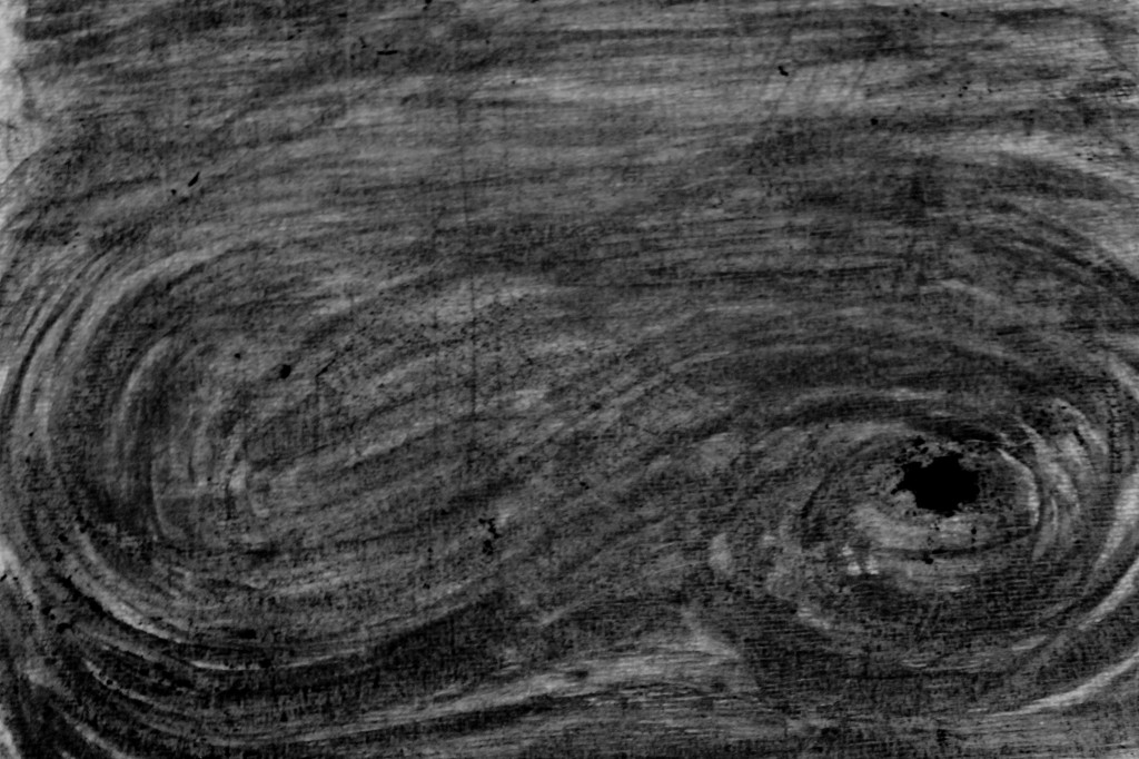
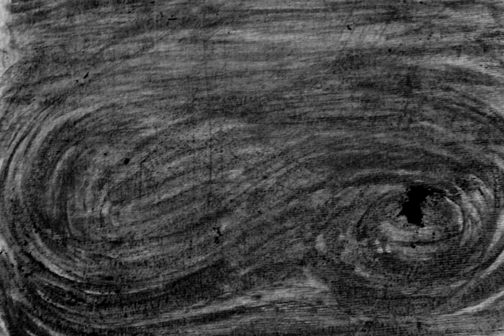
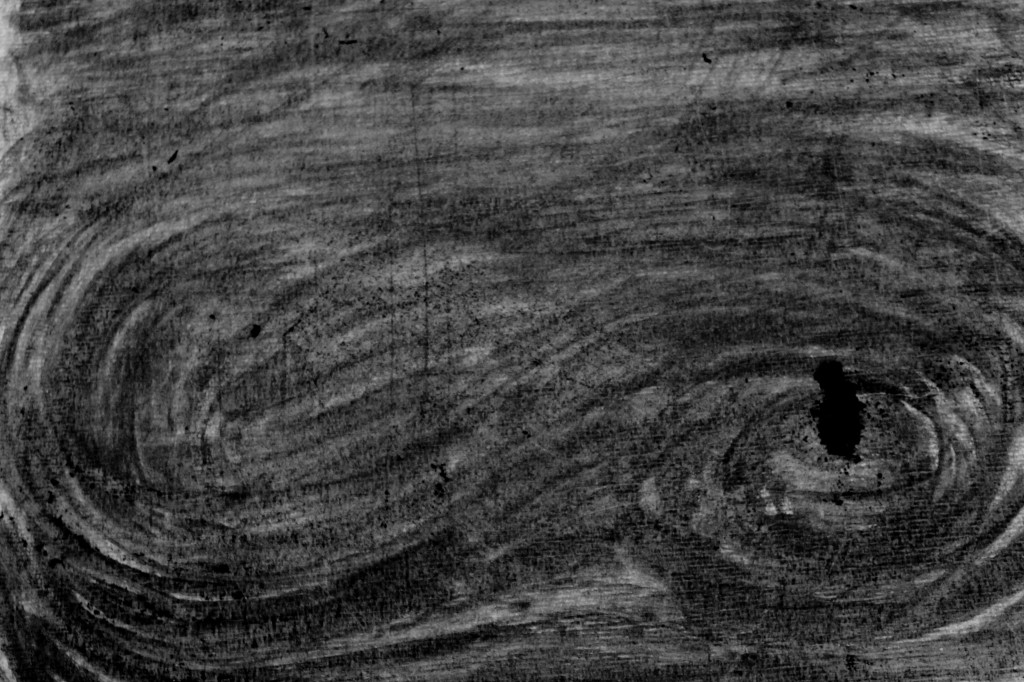
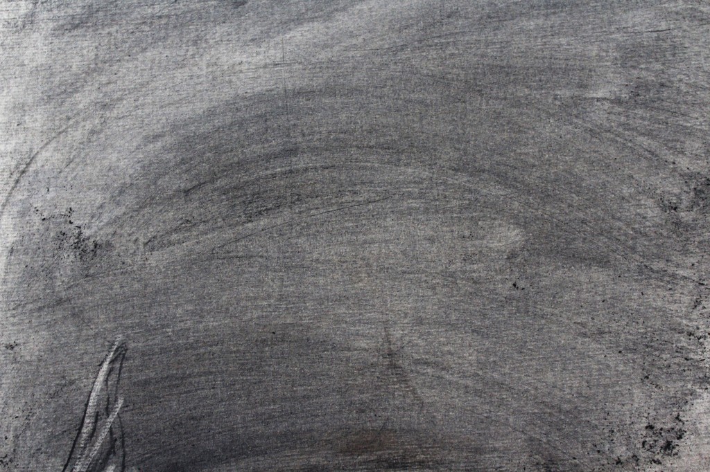
Rather than wait for the charcoal dust to build up in this session, I grated charcoal onto the page with my hands, trying to mimic the organisms that will eventually break the bird carcass down into soil. In Breathe, Kentridge uses assistants to fan pieces of paper and captures their movement on camera (ART21, 2010). Similarly, I bent down to the page and gently blew the charcoal around to try and capture a more organic movement than if I had drawn each speck individually.

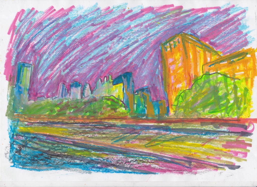
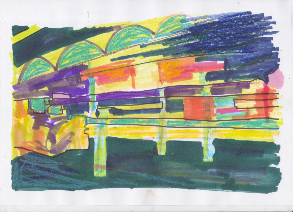
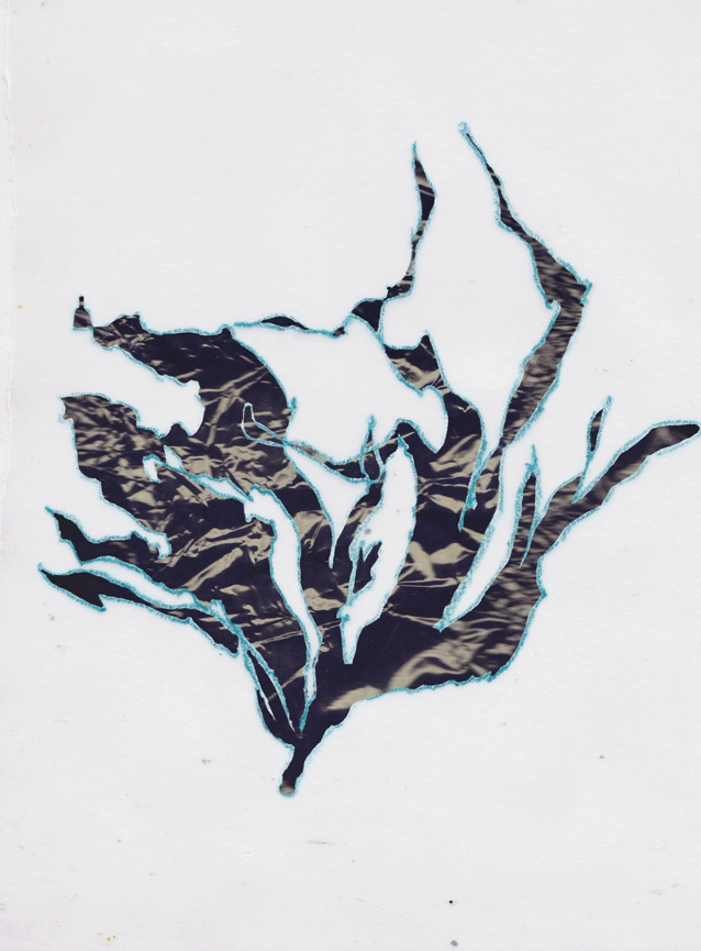
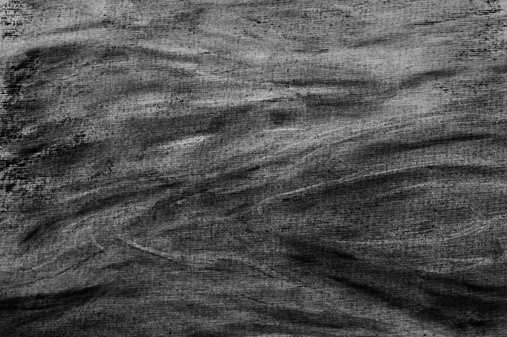
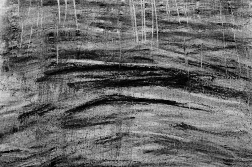
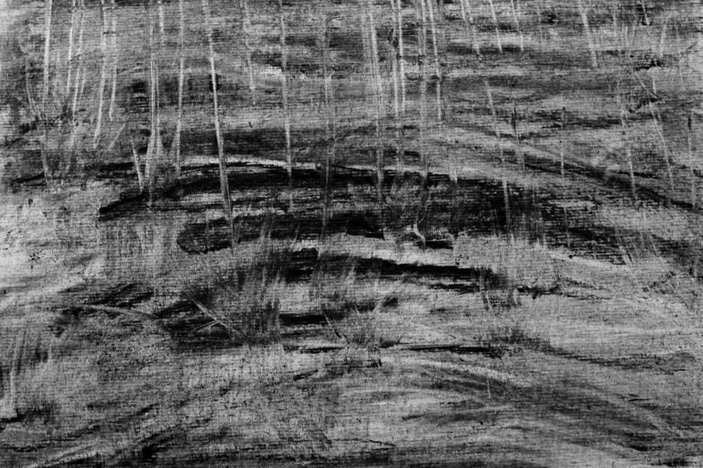
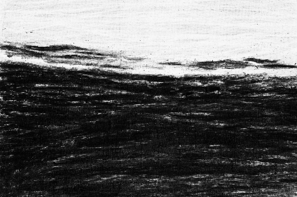
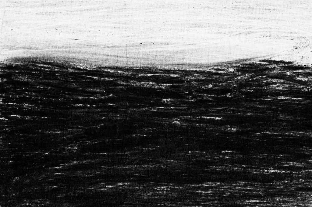
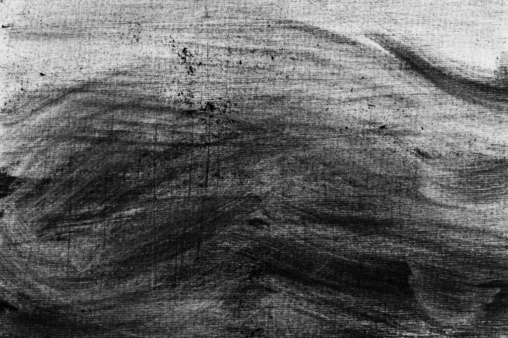
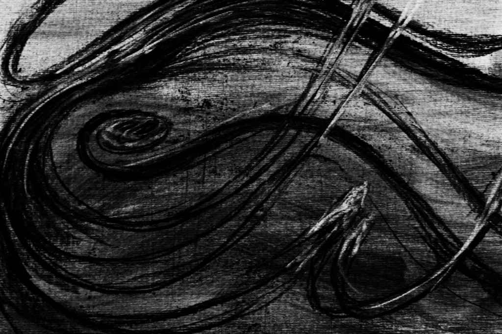
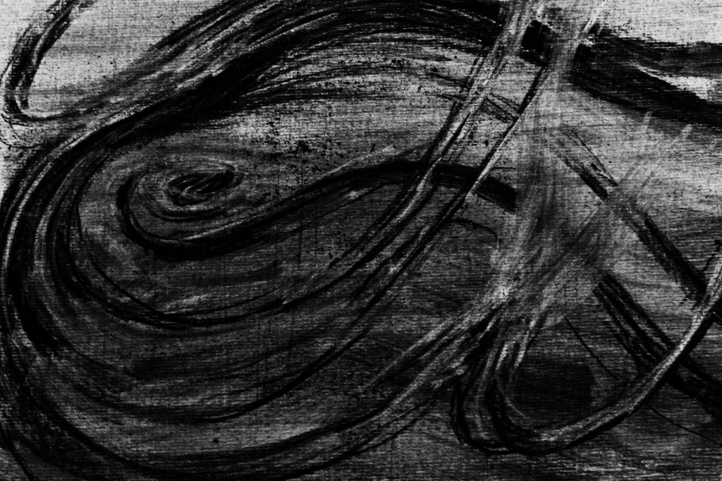
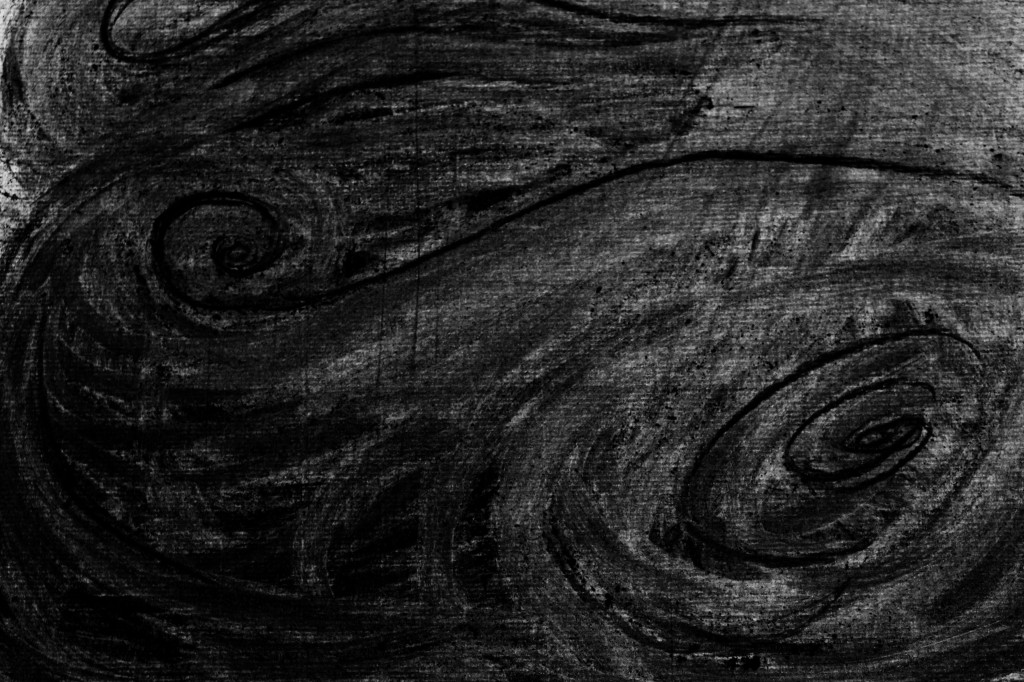
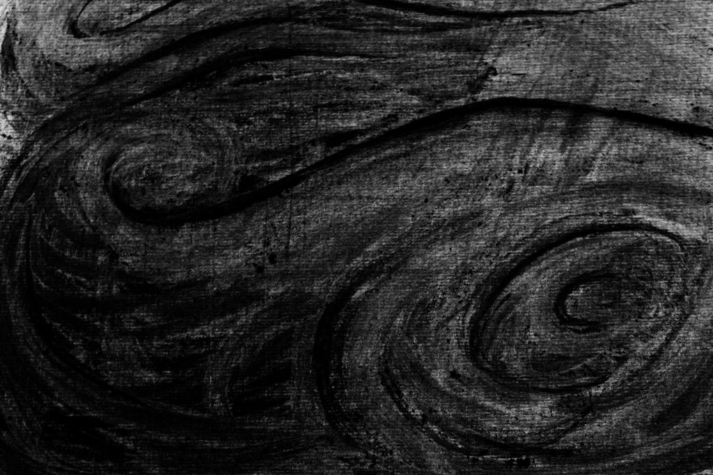
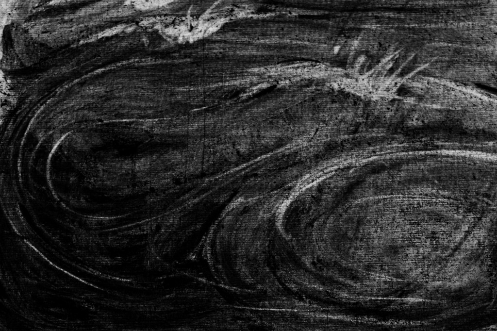
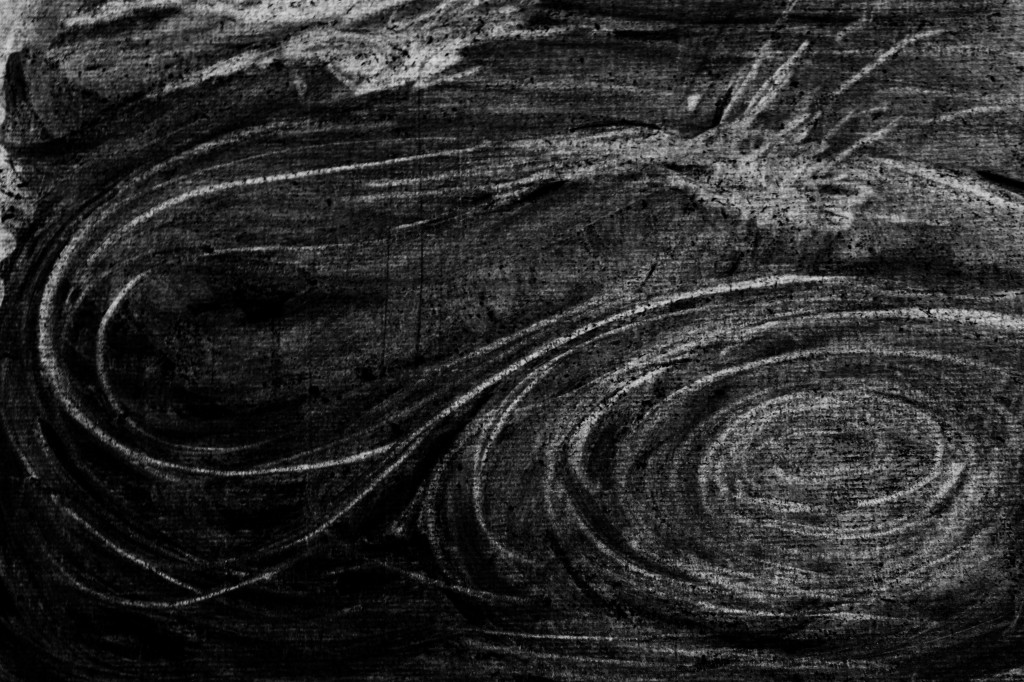
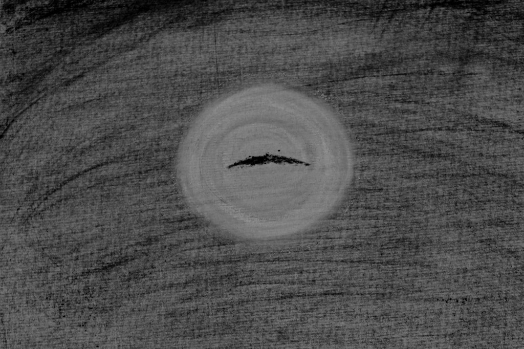
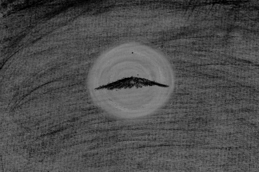
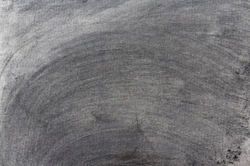
At this point, I  noticed that the page was starting to discolour from the constant erasing and applying, going a strange murky brown colour – the colour of the river at times – so I changed direction to an underwater scene until my camera ran out of battery and I had to stop.

It was very long and very tiring arranging the frames within After Effects using ‘Null Objects’ and ‘Checkbox Control’ expression to create an off an on switch for each drawing. After running through the first play through, I thought back to Assignment Three where music was used to guide the drawing. At the time of arranging the frames I was listening to a band who I associate with the sounds of the sea and the river Axe, the constant changing weather. I wondered if like the vocals in the music I was listening to, I could layer the drawings on top of each other to create an effect of ‘fullness’ at certain stages of the drawing. Where the water is washing in and out, and in other segments through out the animation I have added another animation layer a few frames behind the ‘main’ one, as I found that it gave a smoothing and feeling of fullness, much like vocal layering.

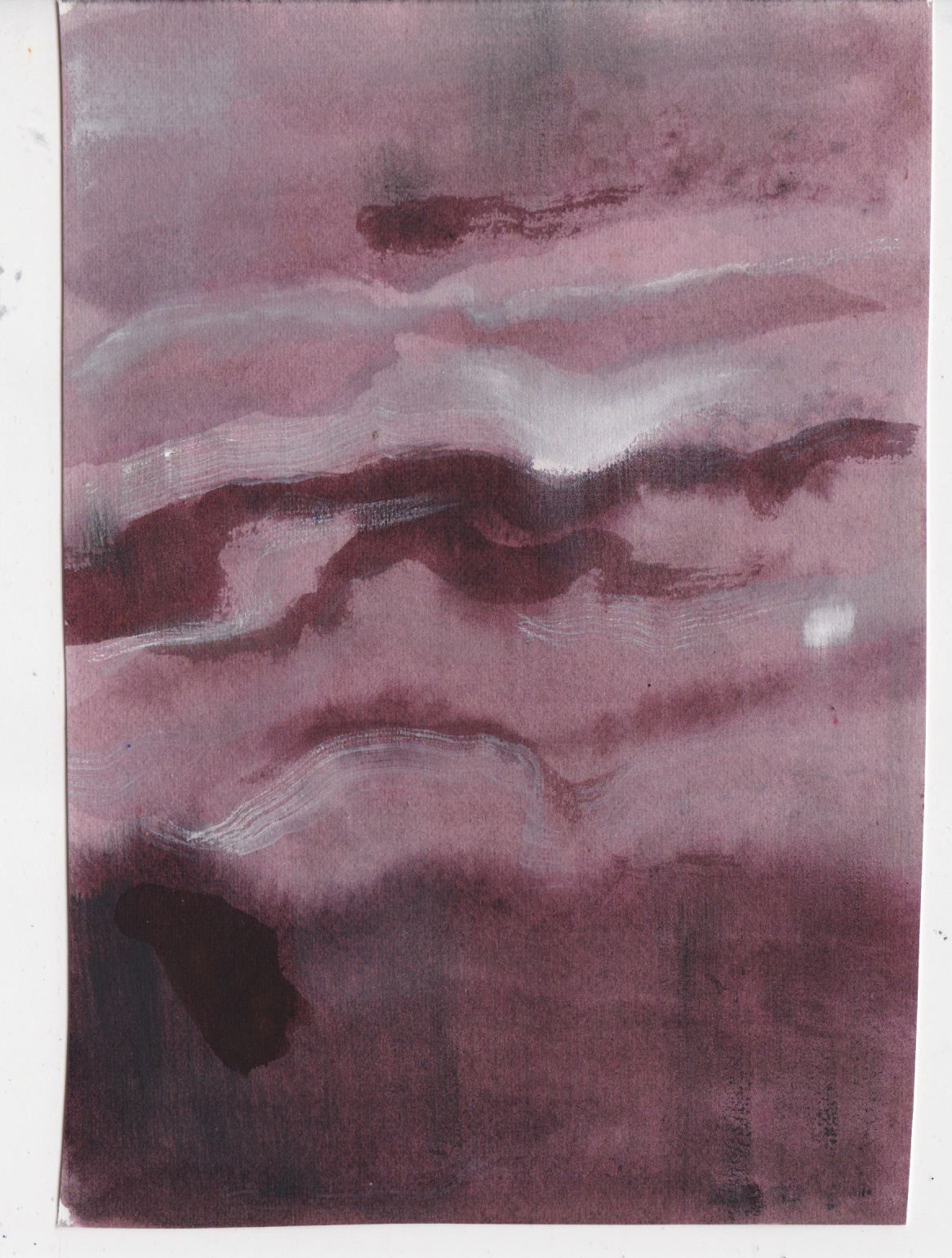
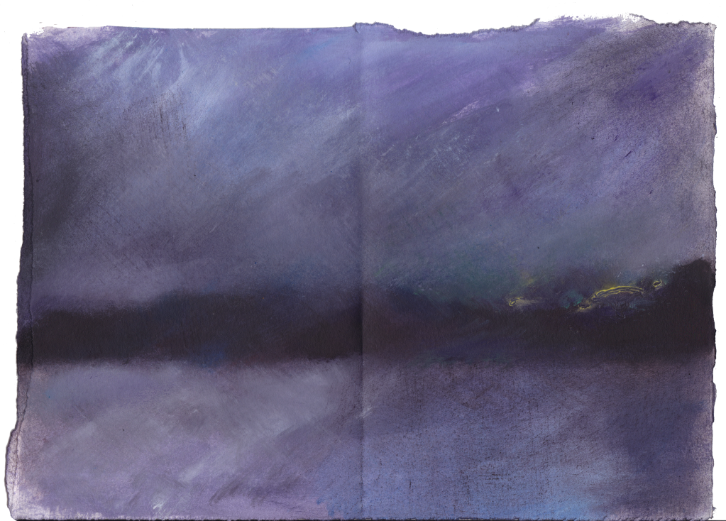
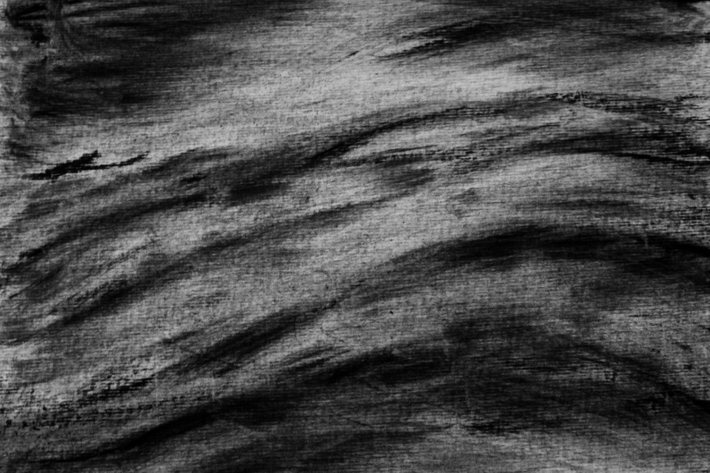
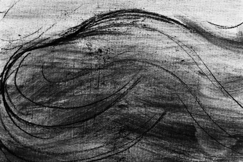
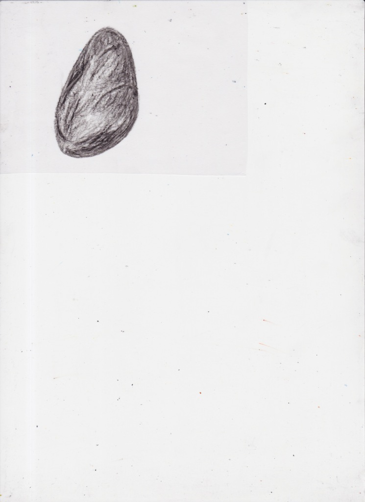
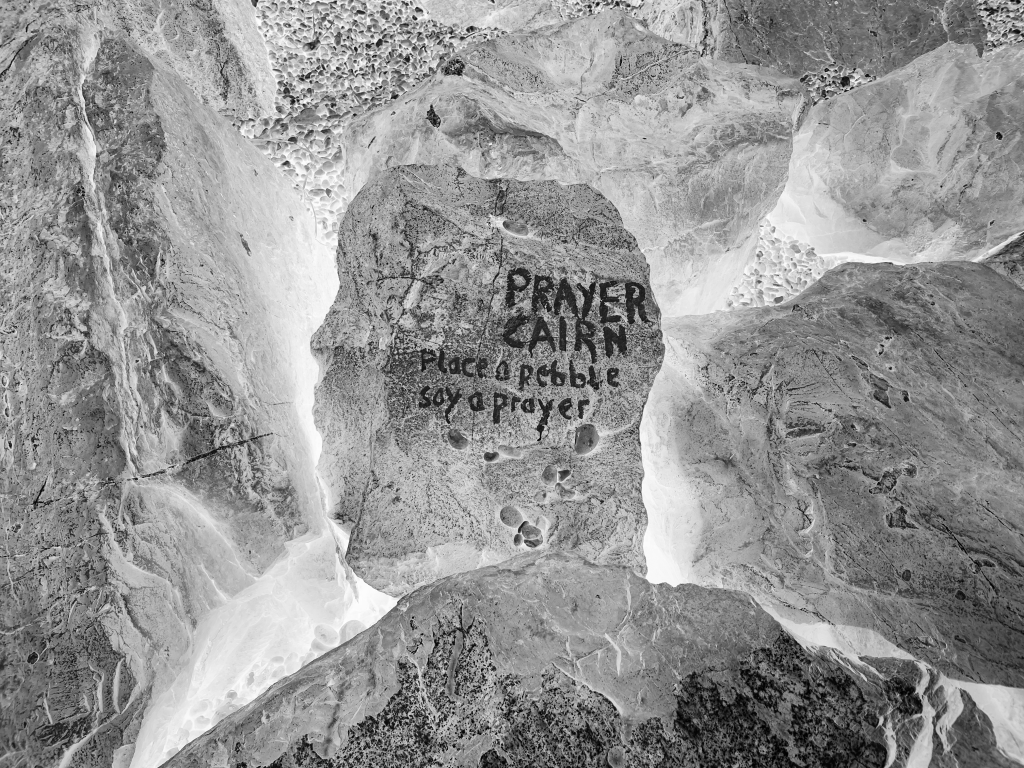
I thought I had completed my animation, but I went out again and came across a prayer cairn – a lot of these have been popping up around Seaton the past few years. I had been thinking that my introduction to the video needed more of a build up, and so I took a photograph of the prayer cairn and used this, alongside hand drawn animation of a pebble to begin my animation. I think that the tossing of the pebble into the prayer cairn sets off the subsequent events, and it may be the River who is making a prayer.

I used this new introduction to go slowly into the rest of my drawings. I had watched Béla Tarr’s The Turin Horse a few nights before, and it’s an incredibly slow film, I was really taken by the way the sound of the storm outside the house is repeated again and again over three hours (example from a clip here), and how by the end it sounds like a human choir – but the sound hasn’t changed at all, only my interpretation of the sound. The film gave me the confidence to be slower than I would normally be, to repeat drawings and sounds when arranging them in After Effects.

Finally, I used my own recordings of the harbour that I had taken in the winter – this is the main tune throughout the animation, wind passing through sails and creating an eerie song. The introduction uses the sound of rain I recorded from the back of my flat. I also added a couple of sounds that I couldn’t record myself, factory sounds of metal creaking and also a drum, all from the BBC Sound Library. Livia Bloom Ingram (2011) described the sound of the wind in The Turin Horse as “a character all its own”, and I tried to think of the sounds I used in a similar way, equal to the drawings.

Creating this animation has really sparked off an interest in creating longer animations in the future, letting drawings draw themselves and being open to new ideas spontaneously, and exploring further how sound can influence the perception of drawings.

Final Animation:

Additional sounds from BBC Sound Effects: 07011250; NHU05097233; NHU05008143; 07067056. bbc.co.uk – © copyright 2022 BBC

(Link to video)

Creating this animation has really sparked off an interest in creating longer animations in the future, letting drawings draw themselves and being open to new ideas spontaneously, and exploring further how sound can influence the perception of drawings.

When I initially read the interview with Tania Kovats suggested by my tutor, I didn’t really understand what Kovats meant by, “you can find your way into a drawing, as they often tell the story of their making. And I trust that that one drawing can speak to another” (Artspace, 2021). Now having completed this assignment/parallel project, I do understand what she means. The two batches of charcoal drawings did at the time seem to be speaking to each other, I had no real idea of whether they would go together until after they had been completed, but they seemed to know each other and it was quite a natural process transitioning from one batch to the other.

Bibliography

ART21, 2010. William Kentridge: “Breathe” | Art21 “Extended Play”, Available at: https://www.youtube.com/watch?v=ja4Wk7g6sdE. 

Artspace, 2021. Tania Kovats – why I draw. Artspace. Available at: https://www.artspace.com/magazine/interviews_features/meet_the_artist/tania-kovats-why-i-draw-56738. 

Bloom Ingram, L., 2011. Sound and fury: Bela Tarr’s “The Turin Horse” plus more at the Cannes Film Festival: Filmmaker Magazine. Filmmaker Magazine | Publication with a focus on independent film, offering articles, links, and resources. Available at: https://filmmakermagazine.com/24093-sound-and-fury-bela-tarrs-the-turin-horse-plus-more-at-the-cannes-film-festival/#.Yqtesy8w1gg. 

Jacobs, D., 2014. The Bigger Picture… the making of. Available at: http://www.thebiggerpicturefilm.com/

Ndiritu, G., 2021. Ways of Seeing: A New Museum Story for Planet Earth. Ways of Seeing – Gropius Bau. Available at: https://www.berlinerfestspiele.de/en/gropiusbau/programm/journal/2021/grace-ndiritu-ways-of-seeing.html. 

The Rivers Trust, 2022. Key issues. The Rivers Trust. Available at: https://theriverstrust.org/key-issues. 

San Francisco Museum of Modern Art, 2010. William Kentridge: transformation with animation, Available at: https://youtu.be/5_UphwAfjhk. 

Categories
Animation Assignment 5 Part 5 Research Project 4: Time and the viewer

Project 4: Time and the viewer

This project was initially going to be my work for assignment 5, but after making the objects themselves I decided that the work was better suited for this project. Further development of the objects into a drawing continued from there.

April 2022:

This was a bit of a fluke, but I’ve been completing EMDR once a week which has, so far, been distilling selected memories into innocuous objects. From what I’ve heard, what the memory turns into is different for everybody, so it’s a bit of luck that mine seem to be turning into objects that I can make and it fits very well into this assignment. The memories have been selected in chronological order, so if each week they continue to turn into objects (or something else), once completed I should have a series of items. I thought it would be interesting to depict these left over objects as they’re being created each week but also reference a time line that spans about 25 years. I tend to shy away from anything really personal but I feel comfortable with this as the origin of the objects is only known to me. The textures of the objects so far have been quite fun and different so it’ll give me the impetus to experiment with different media.

I found it interesting how Grayson Perry used his old childhood toy Alan Measles as a starting place for sculptures, imagining the teddy as a god-like figure or a dug up archaeological find, such as Prehistoric Gold Pubic Alan or Red Alan. Perry described his work as “excavations” which “have been brought up from the deep subconscious” (Anon, 2007). I think approaching my objects as though they are excavations or museum objects would be suited to the theme, it also encourages me to make them all different from each other, they are from different time periods so will be made out of different materials, I can arrange them like an exhibition of my own archaeological finds.

An Argos 1990s telephone was the first object on the list, in my mind it’s a pink, plasticky and toylike but also like a bar of soap. Soap as a material seemed like the only way for me to make the object as I imagined it, but it seemed very unlikely that I could carve a telephone from soap. I found Malia Jensen’s Soap Bed, and I loved how the material made the bed seem even softer but it also creates a sense of nostalgia, sweet and old fashioned. I happened to have a free hotel soap in a packet, and used this to see whether I could carve out a telephone or whether I would need to find a different material.

Maybe soap carving is easier than I thought, or maybe I was very lucky that it didn’t crumble into little pieces. I was happy I managed to get the plastic effect without having to use plastic or a mould. I then moved onto the next object, the scary mask. I couldn’t find the right piece of wood to make the mask face, so I decided to embroider the mask on canvas material, then use felting wool for hair:

A bicycle wheel and children’s slide were next. I didn’t want to fuss too much over the bike wheel and make it overly accurate as I didn’t think this would be possible with the materials I had at hand, so I used a spare bobbin, wire and clay to put it together. For the slide, I wasn’t so sure whether I wanted to include this object so I experimented with carving an old eraser with the approach that if it works it works, if it doesn’t it doesn’t matter. The slide was a partial success, I was surprised I managed to include the steps without it splitting.

Grayson Perry’s shrine to Alan Measles reminded me of an installation I saw a decade ago, where the artist had installed a burial wall (The Followers) in the Saatchi Gallery. I managed to find the artist, Ximena Garrido-Lecca; in contrast with Perry, although her work is informed by her upbringing in Peru, her work does not centre around her own past but Peru’s past and future (Anon, n.d). For Wall of Progress, she used soil to construct adobe bricks, the traditional methods of construction contrasting with the modern advertising painted onto the brickwork (Financial Times, 2011)(CIAC, 2021). Although my work for this project has a completely different theme, a hidden brick under the stairs is one of the objects that have been added to my list of ‘artefacts’. I have some soil left over from assignment 2, the Triassic Mercia Mudstone I collected from Seaton beach. I think creating the brick from local soil I collected and constructing it myself could yield a more personal result than if I were to draw or quickly mould a brick from clay.

Straw is usually used as part of the cement, so I shredded small thin strips of cardboard and combined this with the mudstone, shaped it and left it to dry out in the sun. To my amazement, the mudstone was perfect brick material.

All objects together

After my tutor mentioned Jasper Johns in her last feedback report, I watched the Whitney Museum of American Art exhibition walkthrough of Jasper Johns: Mind/Mirror. Untitled (1992-4) shows a floor plan of Johns’ childhood home, this drawing is collaged with other large drawings/paintings. Scott Rothkopf explained that this was “memory colliding with the real” (Rothkopf, 2021), a floor plan that is considered a factual image is drawn from memory, the work as a whole appears abstract but contains diagrams and representational drawing. In Good Time Charley (1961), Johns has used objects to suggest hedonism and wastefulness; the wooden ruler could be read as a hand of a clock (Solomon, 2021), but in this work I also think of the punishment delivered by school teachers – hitting pupil’s hands with a wooden ruler. Maybe the painting is both a comment on Rauschenberg’s partying but how John might have had a role of doling out punishment. Whatever the meaning, I love how the objects are a part of the painting, they don’t sit awkwardly like they’ve been stuck on as an after thought, they look as at home on the canvas as the paint.

I wanted to see whether I could make my objects sit naturally within a drawing, or maybe a collage of drawings. I took the cardboard box and kept adding drawings and arranging the objects until I felt like I couldn’t move further with it:

Although I liked the composition, I still felt there was something unresolved about the project so I decided to switch back to drawing, and drew my drawing with crayon on paper:

Still feeling as though something was missing – the ‘3D’ and ‘2D’ versions felt too separate, I tried unifying them digitally. This then resulted in animated wheels with digitally drawn rope:

Animation process screen recording (Link to Video)

Final work:

(Link to video)

The animation is mostly based on the crayon drawing, however I overlaid some parts with photographs of my objects. The brick is partly a photo and partly the drawing of it as I couldn’t decide which I preferred.

Reflection: Reflect on time spent by the viewer and how it relates to what you do as an artist.

I’m sure every artist would want as much time spent by the viewer on their work as possible. I haven’t given too much thought as to why I enjoy animating my drawings but I think this may be to do with my own attention span and the way I look at work. I love all kinds of non-animated work but I’m not the kind of viewer who will look for a long time, but I will keep coming back to look again if I enjoy the work or want to understand it more. Animation does manipulate the viewer to possibly stay longer than they had intended, it suggests that there will be a pay off for the time spent – although this isn’t always the case! Some film makers, such as David Lynch, avoid the pay off at the end which can frustrate viewers who want a resolution. Similarly to how Jasper John’s paintings don’t provide easy answers or point to a specific meaning, I’ve learnt over time that animation/film doesn’t have to do this either, it can just be a process of adding, changing, taking away, heading off in a different direction spontaneously.

Tutor feedback update

My tutor suggested to apply a simple soundtrack. I had intended to record the sound of a coffee grinder for the turning wheels but I got sidetracked with A5/PP, so I have now added this and an additional sound I recorded from dragging a wooden spoon in circles around the back of a frying pan. I also adjusted the colour levels of the digital image slightly to try and achieve more unity between the different aspects of the drawing.

(Link to video)

Bibliography

Anon, 2007. My Civilisation, Grayson Perry. 21st Century Museum of Contemporary Art, Kanazawa. Available at: https://www.kanazawa21.jp/tmpImages/videoFiles/file-62-2-e-file.pdf. 

Anon, n.d. Ximena Garrido-Lecca. Ximena Garrido-Lecca – Artist – Saatchi Gallery. Available at: https://www.saatchigallery.com/artist/ximena_garrido.

CIAC, 2021. Entrevista a Ximena Garrido- Lecca. Available at: https://youtu.be/XicdJLPSgPQ. 

Financial Times, 2011. Ximena Garrido-Lecca prepares for Frieze. Available at: https://youtu.be/SGCZQpVCHE8. 

Rothkopf, S., 2021. Jasper Johns: Mind/Mirror | Whitney Walkthrough. Whitney Museum of American Art. Available at: https://youtu.be/CBDtcARVGJ8. 

Solomon, D., 2021. Seeing double with Jasper Johns. The New York Times. Available at: https://www.nytimes.com/2021/09/13/arts/design/jasper-johns-mind-mirror.html. 

Categories
Animation Part 5 Research Project 3: A finer focus Uncategorized

Project 3: A finer focus

For this project I used my drawings from project 1 to create another drawing based on the people at the Abbey Road crossing. I haven’t gone into incredibly fine detail for the drawing as I don’t really enjoy the pressure for perfection that tends to come with it, but I went for a bit more detail than I had in my original project 1 sketches.

Extended focus on one drawing tends to make me tire of the subject quite quickly! I could have continued this drawing, building up more faces outwards but I was running out of time. I enjoy getting to the end of a drawing more than the drawing process itself, especially with pencils.

Huw Messie combines textiles and digital techniques to create stop motion animations, in Rhythms of Winding he used “CAD animated machine embroidery” (Messie, 2021, b), so although not sewn by hand there is a meticulous process of designing the patterns and programming the machine. I really like how the frames sewn side by side on the fabric look just like they could have been made by one of the characters in the animation and Messie has provided a GIF of the template which shows just how much more effective the work is in its final sewn form than as a digital drawing (Messie, 2021, b).

The meticulous detail in M.C. Escher’s Phosphorescent Sea has a calming effect, while the first thing that tends to come to mind with detailed drawings is the painstaking process, Escher’s marks have such a soothing effect that it feels as though I could walk into the waves. I think sometimes hyperrealism can be distracting and cold, in this drawing Escher found a balance between high detail and communicating his love of the sea and the wonder of bioluminescent algae (Nadjézjda Hak, 2021) – it’s poetic rather than robotic. It’s difficult to figure out why this is the case, but it may be to do with how he has simplified the textures. The sand is the same texture as the sky, the waves closest to the shore resemble fabric; there’s detail but not unnecessary amounts of it.

Stephen Walter’s woodland drawings feel very suffocating and sickly, it’s not so much the detail which creates this but the pattern repetition and weird sense of depth to the drawings. Woodland Manifold leads the eye in to the woodland, but then pushes it back out and there is no path through the drawing. Ivan Shishkin’s woodland drawings are very detailed, but even in a scene such as Cobwebs in the Forest, where trees eventually block the view, there is a sense that you could continue to walk through them. Looking into the distance of Woodland Manifold, it becomes impossible to distinguish trees, leaves and space, creating a wall that the eye can’t travel past. High levels of detail communicate an sense of obsession, I think in Shishkin’s work it shows his obsession with the forest and the time he would spend sitting in it trying to capture every inch (Savinov et al., 1981); whereas with Walter’s work I think it is less about a specific woodland and more about communicating a sense of impending doom – in Rewilding 1 the landscape appears so diseased it no longer resembles a landscape at all.

Update post feedback (July-August):

Link to video

My previous work for this exercise didn’t have much time spent on it as I was focusing more on A5/PP. My tutor suggested that the original drawing “might benefit from incidents of colour, or animating part of the drawing (buses for example)”, I agreed with this and decided to focus on colour and movement. In the end, I preferred the original sketches of the drawing to this ‘final version’. so rather than use the drawings from Abbey Road, I used my trip to London to watch the football as the theme for an animation. I decided to concentrate on small movements of people rather than tonal detail. I had taken photographs of the fans and the stadium, after choosing the video size (1080 x 1920) I arranged the composition.

rough illustration

When it came to the animation, I wanted to include the cock/chicken from the Spurs crest on the plinth. My initial idea was to have it kicking a football, but this seemed a bit of a stretch when I’ve never animated a chicken, so I decided to stick to animating it moving between the crest pose and pecking at grain. A chicken skeleton is very similar to a dinosaur, so it wasn’t as difficult to imagine the movements as I initially thought.

Although I had tried oil pastel in animation before I hadn’t tried combining it with digital animation, so tested out an oil pastel background with digitally drawn animation. As I knew I wouldn’t have enough time to add shadows to the figures, I was glad to see the oil pastel drawing gave the animation a sense of depth to make up for it.

The frame-by-frame animated parts were drawn and coloured within Photoshop and then exported to After Effects. The football was drawn within photoshop, but animated in AE by adding position/scale/rotation keyframes.

Frame by frame parts as GIFs:

I had filmed the inside of the stadium on my phone and exported the audio, this fit nicely over the animation. Overall, I’m happy with the work but next time I think I would make time for more detail in the figures, try out different lighting and also plan for larger gestures.

Bibliography

Messie, H., 2021 b. Frank-Ratchye Studio for Creative Inquiry Microgrant. HUW MESSIE. Available at: https://huwmessie.com/2021/05/20/frank-ratchye-studio-for-creative-inquiry-microgrant-documentation/. 

Messie, H., 2021 a. Rhythms of winding. HUW MESSIE. Available at: https://huwmessie.com/2021/03/23/winding-motion/. 

Nadjézjda Hak, D., 2021. Yearning for the sea. Escher in Het Paleis. Available at: https://www.escherinhetpaleis.nl/story-of-escher/yearning-for-the-sea/?lang=en. 

Savinov, A., Federov-Davydov, A. & Shuvalova, I., 1981. Shishkin, London: Pan Books. 

Categories
Animation Exhibitions & Books Hayward Gallery: Louise Bourgeois, The Woven Child Part 5 Part 5 Research Project 2: An Artists Book Uncategorized V&A: Landscape and Language in Artist Books

Project 2: An Artists Book

The V&A had a small exhibition on artist books, Landscape and Language in Artist Books. The selection were behind glass cabinets which made me realise something now very obvious: they’re meant to be held and investigated rather than gazed at through a glass box! I was drawn to Claire Van Vliet’s book, Sky and Earth: Variable Landscape because of the bright, flat colours of the die-cut paper and acetate which could be rearranged to make different landscapes of the reader’s choosing. It was a shame that there wasn’t a replica to play with – I found it interesting how artists books can occupy the spectrum between traditional reading books and children’s flip or pop-up books. Dido and Aenas, a folded accordion book which has pop-out trees and miniature pages between the main folds has a child-friendly appearance which contrasts with the written content of the book; each section is an opera scene (NMWA, 2020). Operas are thought of as formal, while Vliet’s book appears accessible and almost throw-away.

Claire Van Vliet, Sky and Earth: Variable Landscape at the V&A Museum.

I was looking forward to seeing the ‘akunnagaa’ page from Nancy Campbell’s artist book, How to Say ‘I Love You’ in Greenlandic: an Arctic Alphabet, sadly it was missing from the display, but the flatter stencilled pages were on show, depicting icebergs alongside Kalaaliisut words and their definitions. The flatter stencils are a bit boring and I wouldn’t immediately know they are icebergs, I think it would be more interesting if the stencils filled up the whole page, either as they are or by making the pages smaller. The ‘akunnagaa‘ page illustration captures the cold weather with sweeping gestures and adds drama, but this isn’t apparent in the pages on show at the V&A, the flat colour prints are lifeless in comparison.

Nancy Campbell, How to Say ‘I Love You’ in Greenlandic at the V&A Museum

Hamish Fulton is a “walking artist”, his books Horizon to Horizon and Twilight Horizons were included in the exhibition. The latter is “a twenty day walking journey from Dumre to Leder in Mahang and back to Pokhara by way of Khudi” and the former documents a walk from Galway to Derry. The drawings are very mechanical and diagrammatic, more like an ordinance map key than a personal account.

Hamish Fulton, Horizon to Horizon (top) and Twilight Horizons (middle) at the V&A
Museum

I like Fulton’s idea of documenting a journey, although I will try and inject a bit more fun via colour and media choice like Van Vliet, or Louise Bourgeois’ books Ode La Biévre and Ode à l’Oubli. Although the text heavily indicates that there is a sombre undertone to Ode La Biévre and Ode à l’Oubli, the textile drawings themselves are incredibly fun – in her essay, The Fabricated Woman, Rachel Cusk describes the pages as “joyful abstractions of her psyche… They are a non-narrative, a diagrammatic emanation” (Cusk, 2022). I enjoy how the pages are all completely different, but they each have a tone to them which distinguishes one book from another. The pages were displayed really well at the Hayward Gallery exhibition, it’s easy to imagine each page stitched together in book form:

I’ve been watching lots of videos about train journeys recently, and I wanted to see if I could capture the view from a moving train using changing colours and lines, much like a sketchbook. There’s something about a landscape viewed through a train window which adds to the excitement or that can make mundane areas interesting. I also want to see how being loose with lines and colour affects the animation when the pages are viewed in sequence. This should be a good break from working on my black and white assignment.

Journey through Vauxhall station, marker pens and oil pastel:

Looped animation of artists book pages

(Link to video)

I kept the frame rate low for the animation as I wanted it to still be read as a sketchbook or artists book – from my research I found that an artist book can really be anything at all, so why not in video form. I do really like the thickness and quite hefty weight of the physical book – I didn’t consider whether binding would be a problem with this amount of pages, in previous similar exercises I’ve sewn books together but they were much smaller, so I’ve just used a clip:

Physical book

(link to video)

I was quite surprised that the colour changes in the animated version didn’t detract from the sense of motion. It’s a bit dizzying but the inconsistencies in pattern, colour and line don’t overwhelm the animation as I had expected. I also ended up quite liking the marker and oil pastel combination, I initially chose these as I knew it would prevent me from taking too much time on each drawing (although this project still took more time than I had expected), I think I’ll introduce this combination to my sketchbook drawing for often – oil pastel has a heavy texture which brings out areas of flat marker quite nicely.

Tutor feedback update

My tutor suggested to create a ‘recto-verso animation by using the reverse bleed of each drawing’ – this was a great suggestion and I feel very silly that I have never once considered using the back of a drawing. Because there was less detail in the reversed drawings, it became harder to follow what was happening in the animation so the alternating colours became the most prominent feature. I desaturated the drawings which allowed the focus to return to the forms instead. In the original close up version I preferred the inverted version as it emphasised the texture of the bleed through marks:

Inverted verso animation 5fps

(Link to video)

Inverted verso animation 10fps

(Link to video)

I had drawn YES/NO across parts of the ‘recto’ drawings as at the time (in a moment of madness) I was thinking about returning to London. These marks were missing from the ‘verso’ drawings, so I played with adding the text digitally, and I thought in the end it was more interesting to have the text barely legible and extended over the entire drawing as the vertical lines affect the level of detail and place the focus on the shapes of each drawing rather than individual windows and bushes.

Inverted verso animation with type 10fps

(Link to video)

Overall, I prefer the monochrome reversed drawings as its easier for the eye to focus on shape and tone, and they also work better as stand alone drawings:

Bibliography

Cusk, R. 2022. The Fabricated Woman. In: Rugoff, R. & Lorz, J., 2022. Louise Bourgeois, The Woven Child, Berlin: Hatje Cantz Verlag, p. 30. 

NMWA, 2020. Dido and Aeneas: Artwork. NMWA. Available at: https://nmwa.org/art/collection/dido-and-aeneas/ [Accessed June 14, 2022]. 

Categories
Animation Parallel Project Parallel Project work - up to late December Uncategorized

Parallel Project work (last updated March 2022)

At the moment I’m still trying to figure out where to go with the project, animation-wise, so I’ve tested out a couple of different drawings and one felted model just to see what what works on a small scale first.

Drawing on tracing paper with oil pastel and scratching out tone:

It’s short, but I really like this crow and the messy flecked background which looks like old film. I can see this technique being easily transferred to other imagery.

Digital painting

On the beach I found a really horrible artificial lure, I was interested to see what this would look like as an animated drawing. I decided to keep the drawing as representational as I could to ensure it can’t be mistaken for a real fish. I found the object really creepy (and was also angry it was just left in the rocks!) so let the animation be a bit disjointed and unsettling. I could use this animation in the final project in some way, or develop it to be a bit longer.

found artificial lure
digital painting animation

Ink and gouache paintings of reflections of the water against the sea wall:

I was interested in trying to pin down the fast changing reflections of the water, I did accept this was going to be difficult to get down in traditional drawing without being able to keep replaying. It wasn’t particularly successful on its own as an animation but I’m not going to throw the idea out, it just needs less guess work. Afterwards, I thought the drawings could easily be marks in the sand and I tested out manipulating the drawings by stretching and squashing them in the way the sand is pushed and pulled by the water. It was a relatively quick test to see what it would look like in the gif below, a lot more drawings would need to be added in.

Stop motion/felting

I’m not sure I intend to use an anemone in any final work but I thought it was a good starting place as a test to see whether felting an object with wire armatures would be feasible and how this would work with stop motion – I have never tried this before. I’d need to set up a green screen to do this properly (and use a camera tripod), but it was good to do a small test as I quickly realised that the lightness of felted objects makes them quite tricky to move one armature at a time. If I do decide to stick with this, objects would need to be weighted on the inside or tacked down in some way.

very rudimentary stop motion sea anemone

December – January 2022

After reflecting on Gerhard Richter’s drawings at the Hayward Gallery, I remembered the small Grauworld series of painted photographs. I thought I could try a similar combination with video and paint, just to see what happens. I painted the filmed scene in oil paint, then layered this over the video. I also then made an attempt at digitally painting over the video frames just to see whether this would be something I would consider later on. It was quite long and repetitive and required more concentration than just drawing the whole action myself – the end result is fun but very jerky due me losing patience. I’m more interested in the way the texture of the oil paint sits over the video than the manipulations to the video itself.

oil painting on scrap paper

The gif above is jerky and annoying but I do like the right hand side where the lights bleed in with the oil paint:

I wanted to try out the oil pastel on tracing paper again with something less immediately recognisable, one of the photos I took for Part 4 Found Images, seaweed stretched out in the sand was like a freeze frame. I wanted to try filling in the rest of the process but also not worry too much about making it look like seaweed, really just getting the repetitive up-down action. I still had Richer’s imaginary landscape drawings in mind, I roughly drew from the photograph but then allowed my drawing to guide the rest of the series:

I think I’ve reached a point where I know where I’d like to go from here, which is slightly different from where I thought I would be going. The seaweed and marks in the sand have turned into one moving system rather than individual parts and seem to have a role in a robotic process. I’m interested in trying out an inverse process to Rebecca Horn, where she made drawing machines that have a natural/human sense to them, I want to try turning the natural into the robotic, drawing the processes of a natural machine.

February – March 2022

With a single bit of seaweed, I tried using digital collage as I have held onto some sweet wrappers from Christmas, but in the end I preferred the black and blue version, it’s less distracting. From here on I’ll try drawing more frames to get smoother (but still robotic) animation, try different compositions with drawings and use found objects and also try doing the process backwards – drawing it out digitally, printing it and adding colour using analogue methods.

Categories
Animation Assignment 2 Uncategorized

Assignment 2

For this assignment, I tried making my own paint from the Triassic Mercia Mudstone nearby at Seaton Hole. There was recently a mud slide, so the dried powder was easy to scoop up from the footpath.

I mixed a teaspoon of the mudstone with a teaspoon of gum arabic – I’ve never attempted making a paint before but I thought one part pigment to one part binder sounded like a good ratio.

I tested out my new paint by drawing a scene from the beach. I found that it was difficult to achieve the amount of tones you would normally be able to create with purchased watercolours, but it was good enough to paint the rock itself. I also used some sticks I collected from the base of the cliff to draw with, when wet the paint barely made a mark with the stick but when I reached back to find it had dried like a pencil lead, I used this to add a bit more detail – a bit more successful but now more crumbly.

Triassic Mercia Mudstone paint on watercolour paper

While collecting the powder, I filmed the sea as it was coming in. I thought it would be interesting to combine a further drawing of just the mudstone cliff patterns with my paint and collage parts of the sea into it in After Effects. I’m use to seeing both the rock and the sea together, and I thought it would be interesting to bring them together in this way as the sea is a vital component to why the rock has such an interesting texture – it’s being constantly eroded. Both also have interesting lines and forms which are like natures own drawings.

Triassic Mercia Mudstone paint on watercolour paper (still wet)

Dry
Pot of rock powder and collected sticks

I used track mattes to bring in four videos of the sea, and cut out parts of the rock while trying not to lose too much of it and take away the heaviness of it. Overall, I’m not sure whether I prefer this to the drawing above on its own – it is a bit nausea inducing with all the movement, but I’m glad I tried it out. It’ll likely take a couple of weeks for me to make my mind up.

link to video

I’ve noticed after completion that I didn’t consider making a series of drawings to be put together, but I still have enough powder to do so. I also decided early that I didn’t want to mix the paint I had made with any other purchased paint as it felt like cheating, but I am interested to see how it mixes with standard watercolours. I’ll work on a series of drawings with this in mind.

Categories
Animation Coursework Part 2 Project 1: Space, depth and volume Uncategorized

Project 1: Space, depth and volume

I started off by drawing the base of an old tree and pillbox, but I accidentally chose the wrong paper that didn’t have enough tooth to allow me to build up tone, so I finished it as much as I could before moving onto another drawing. As the drawing is black and white I thought it would make good use as an experiment to see whether I could include video footage of a train that I took on my phone the week before. It’s a little wobbly as the footage changed perspectives as I panned across but black and white is more forgiving, and the strange mix of two and three dimensions – after the train disappears it turns back into a charcoal drawing .

Charcoal

Once I had found the right pastel paper, I decided to change the theme to portraits. I used the portrait sessions from Draw Brighton. With Adrian, I decided to pause while he was lying back setting himself up and playing around with the lamp rather than base the drawing on his planned pose. I wanted to see if I could catch him not posing and the angle he briefly had the lamp at created more contrast between him and the bed he was lying on.

Adrian, Charcoal, A3

With Charlie, I did bring in some lines as their expression needed them, and I couldn’t continue to blend without losing the definition of the scrunched up skin. I decided to spend less time on Charlie’s portrait to try and not lose a sense of movement, their head moving quickly towards the viewer – reacting to the viewer, in contrast to how I drew Adrian who looks like he’s alone thinking to himself.

Charlie, Charcoal, A3

I’ve created as much depth in the portraits as I could, this was definitely helped by using a tissue to sweep the charcoal into curves, toward the end of each drawing it became more difficult to add charcoal without taking it away.

How might you make work about the space between the surface and the implied three dimensions?

Incidentally, drawing portraits of people I have only seen on a screen in a way that implies I was physically next to them does make the two portraits about the space between reality (screen or surface) and three dimensions. This would most likely be the case too when making figurative and portrait drawings – I barely see anyone physically anymore, I’ve only met those I work with via video calls. Maybe this topic would be something to draw ideas from – it’s likely I wouldn’t recognise some of the people I see on the screen everyday if they were physically standing next to me as I only see them from a fixed angle, in a tiny box, via a blurry webcam. If this is true, it doesn’t make it any different in ‘digital life drawing’, you can’t truly see a person via a monitor. Being simultaneously in the company of others while being alone fits well with the idea of a drawing being three dimensional whilst also being completely flat.